Ben Anderson
Colour Blind Palettes for Plots (Contact: b.anderson@soton.ac.uk, @dataknut)
Last run at: 2019-02-19 16:21:17
1 Colour Blind palettes
Obviously these aid interpretation of plots by those who are colour blind but the palettes are also useful clear defaults. Note that there are 8 colours in each palette:
- palette with grey: #999999, #E69F00, #56B4E9, #009E73, #F0E442, #0072B2, #D55E00, #CC79A7
- palette with black: #000000, #E69F00, #56B4E9, #009E73, #F0E442, #0072B2, #D55E00, #CC79A7
Source: http://www.cookbook-r.com/Graphs/Colors_(ggplot2)/#a-colorblind-friendly-palette
This means that a plot with more than this number of factors will run out of colours (see below).
1.1 Grey palette
This is a cross-reference to Figure 1.1 which uses the grey palette.
df <- mtcars

df$auto <- ifelse(df$am == 0, "Automatic", "Manual") # set labels
p <- ggplot2::ggplot(df, aes(x = mpg, y = disp, colour = as.factor(carb))) +
  guides(colour = guide_legend(title = "Number of carburetors:")) +
  theme(legend.position="bottom") +
  scale_colour_manual(values=cbgPalette) + # use colour-blind friendly grey palette
  geom_point() # <- make the plot in an object first
p + labs(x = "Miles/(US) gallon", y = "Displacement (cu.in.)") + facet_grid(auto ~ .) # <- draw the plot and add more features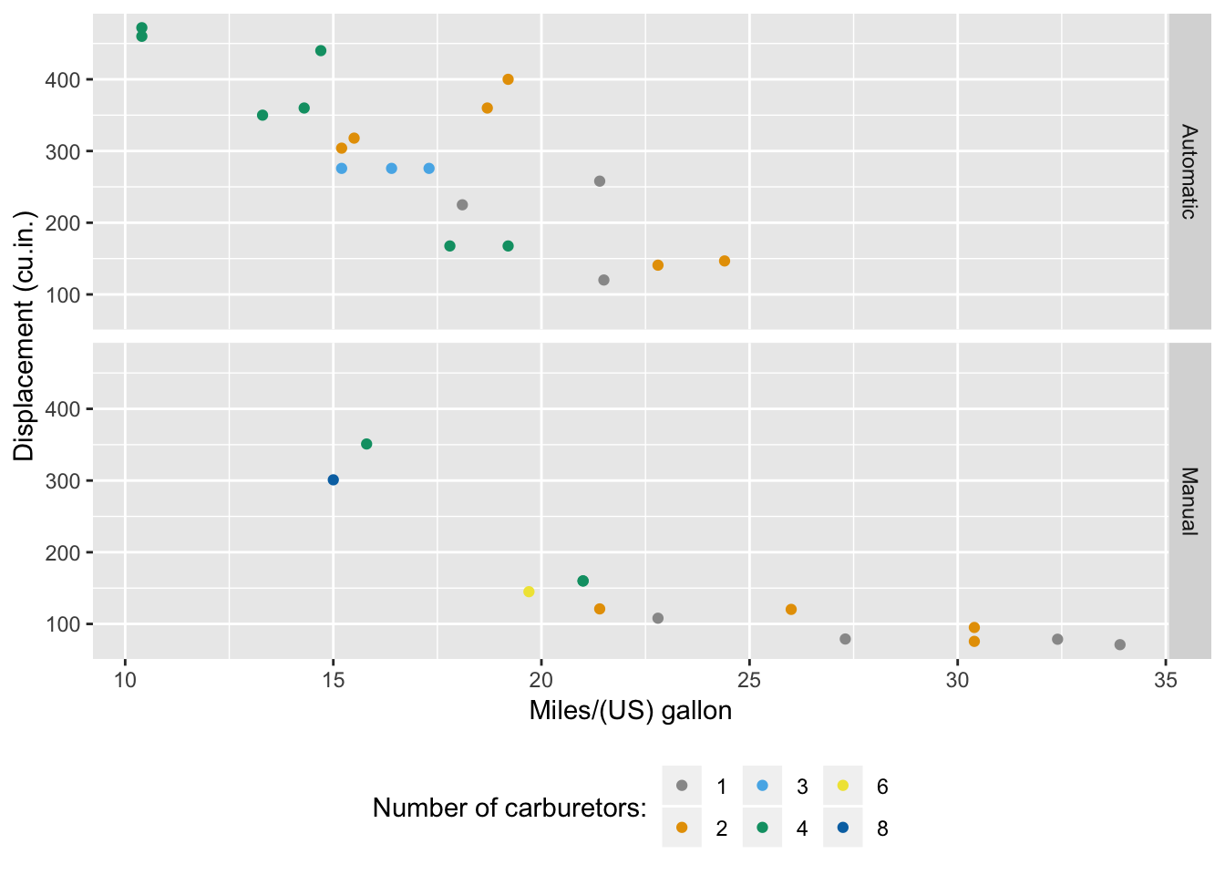
Figure 1.1: Scatter plot of mpg by displacement (grey palette)
1.2 Black palette
This is a cross-reference to Figure 1.2 which uses the black palette.
p <- ggplot2::ggplot(df, aes(x = mpg, y = disp, colour = as.factor(carb))) +
  guides(colour = guide_legend(title = "Number of carburetors:")) +
  theme(legend.position="bottom") +
  scale_colour_manual(values=cbbPalette) + # use colour-blind friendly grey palette
  geom_point() # <- make the plot in an object first
p + labs(x = "Miles/(US) gallon", y = "Displacement (cu.in.)") + facet_grid(auto ~ .) # <- draw the plot and add more features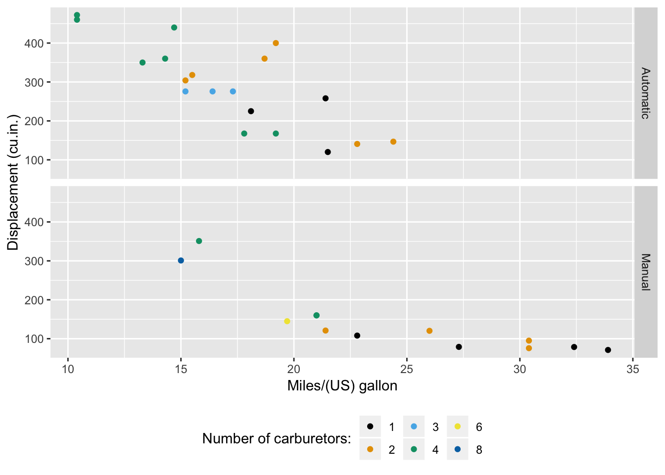
Figure 1.2: Scatter plot of mpg by displacement (black palette)
2 Using viridis
An alternative to the palettes is the viridis package (Garnier 2018). This has the benefit of not having a small number of colours although Figure 2.1 doesn’t really demonstrate this!
library(viridis)## Loading required package: viridisLitep <- ggplot2::ggplot(df, aes(x = mpg, y = disp, colour = carb)) +
guides(colour = guide_legend(title = "Number of carburetors:")) +
theme(legend.position="bottom") +
scale_colour_viridis() + # use viridis
geom_point() # <- make the plot in an object first
p + labs(x = "Miles/(US) gallon", y = "Displacement (cu.in.)") + facet_grid(auto ~ .) # <- draw the plot and add more features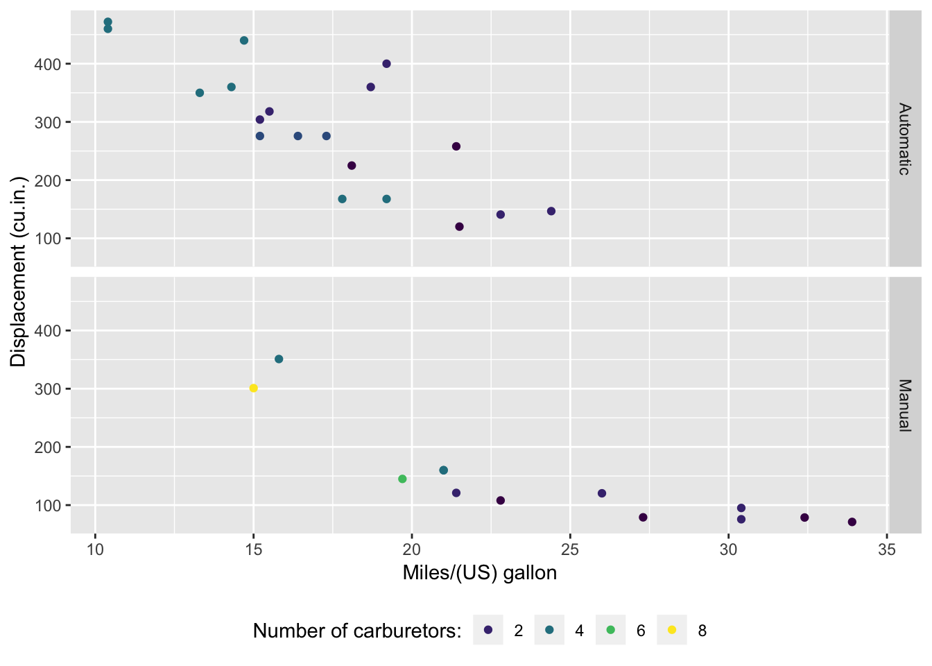
Figure 2.1: Scatter plot of mpg by displacement (viridis palette)
3 Summary
Personally I prefer the colour blind palettes if I have a small number of categories (less than 8) but usually use viridis if I have more than that and if I have continuous data.
4 Ackowledgement
Uses ggplot2 (Wickham 2009) and associated mtcars dataset to draw plots. Palettes available from http://www.cookbook-r.com/Graphs/Colors_(ggplot2)/#a-colorblind-friendly-palette
References
Garnier, Simon. 2018. Viridis: Default Color Maps from ’Matplotlib’. https://CRAN.R-project.org/package=viridis.
Wickham, Hadley. 2009. Ggplot2: Elegant Graphics for Data Analysis. Springer-Verlag New York. http://ggplot2.org.