Air Quality in Southampton (UK)
Exploring the effect of UK covid 19 lockdown on air quality
Ben Anderson (b.anderson@soton.ac.uk @dataknut)
Last run at: 2020-06-18 22:28:33 (Europe/London)
1 Introduction
This report describes exploratory analysis of changes in air quality in the City of Southampton, UK in Spring 2020.
lastHA <- max(fixedDT[source == "hantsAir"]$dateTimeUTC)
diffHA <- lubridate::now() - lastHA
lastAURN <- max(fixedDT[source == "AURN"]$dateTimeUTC)
diffAURN <- lubridate::now() - lastAURN
Data for Southampton downloaded from :
- http://www.hantsair.org.uk/hampshire/asp/Bulletin.asp?la=Southampton (see also https://www.southampton.gov.uk/environmental-issues/pollution/air-quality/);
- https://uk-air.defra.gov.uk/networks/network-info?view=aurn
Southampton City Council collects various forms of air quality data at the sites shown in Table 2.1. The data is available in raw form from http://www.hantsair.org.uk/hampshire/asp/Bulletin.asp?la=Southampton&bulletin=daily&site=SH5.
Some of these sites feed data to AURN. The data that goes via AURN is ratified to check for outliers and instrument/measurement error. AURN data less than six months old has not undergone this process. AURN data is (c) Crown 2020 copyright Defra and available for re-use via https://uk-air.defra.gov.uk, licenced under the Open Government Licence (OGL).
2 Data
In this report we use data from the following sources:
- http://www.hantsair.org.uk/hampshire/asp/Bulletin.asp?la=Southampton last updated at 2020-06-08 10:00:00;
- https://uk-air.defra.gov.uk/networks/network-info?view=aurn last updated at 2020-06-07 23:00:00.
Table 2.1 shows the available sites and sources. Note that some of the non-AURN sites appear to have stopped updating recently. For a detailed analysis of recent missing data see Section 13.1.
t <- fixedDT[!is.na(value), .(nObs = .N, firstData = min(dateTimeUTC), latestData = max(dateTimeUTC), nMeasures = uniqueN(pollutant)),
    keyby = .(site, source)]

kableExtra::kable(t, caption = "Sites, data source and number of valid observations. note that measures includes wind speed and direction in the AURN sourced data",
digits = 2) %>% kable_styling()| site | source | nObs | firstData | latestData | nMeasures |
|---|---|---|---|---|---|
| Southampton - A33 Roadside (near docks, AURN site) | hantsAir | 85918 | 2017-01-01 00:00:00 | 2020-06-08 10:00:00 | 3 |
| Southampton - Background (near city centre, AURN site) | hantsAir | 162148 | 2017-01-25 11:00:00 | 2020-06-08 10:00:00 | 6 |
| Southampton - Onslow Road (near RSH) | hantsAir | 82232 | 2017-01-01 00:00:00 | 2020-04-15 07:00:00 | 3 |
| Southampton - Victoria Road (Woolston) | hantsAir | 60078 | 2017-01-01 00:00:00 | 2020-04-01 06:00:00 | 3 |
| Southampton A33 (via AURN) | AURN | 220010 | 2017-01-01 00:00:00 | 2020-06-07 23:00:00 | 8 |
| Southampton Centre (via AURN) | AURN | 343216 | 2017-01-01 00:00:00 | 2020-06-07 23:00:00 | 13 |
Table 2.2 shows the poillutants recorded at each site.
t <- with(fixedDT[!is.na(value)], table(pollutant, site))

kableExtra::kable(t, caption = "Sites, pollutant and number of valid observations", digits = 2) %>% kable_styling()| Southampton - A33 Roadside (near docks, AURN site) | Southampton - Background (near city centre, AURN site) | Southampton - Onslow Road (near RSH) | Southampton - Victoria Road (Woolston) | Southampton A33 (via AURN) | Southampton Centre (via AURN) | |
|---|---|---|---|---|---|---|
| no | 29055 | 28702 | 27412 | 20026 | 29641 | 28657 |
| no2 | 29020 | 28702 | 27408 | 20026 | 29640 | 28657 |
| nox | 0 | 22877 | 27412 | 20026 | 29640 | 28658 |
| nv10 | 0 | 0 | 0 | 0 | 23208 | 21105 |
| nv2.5 | 0 | 0 | 0 | 0 | 0 | 22627 |
| o3 | 0 | 0 | 0 | 0 | 0 | 28645 |
| pm10 | 27843 | 26124 | 0 | 0 | 25681 | 26180 |
| pm2.5 | 0 | 27632 | 0 | 0 | 0 | 27702 |
| so2 | 0 | 0 | 0 | 0 | 0 | 28261 |
| sp2 | 0 | 28111 | 0 | 0 | 0 | 0 |
| v10 | 0 | 0 | 0 | 0 | 23208 | 21105 |
| v2.5 | 0 | 0 | 0 | 0 | 0 | 22627 |
| wd | 0 | 0 | 0 | 0 | 29496 | 29496 |
| ws | 0 | 0 | 0 | 0 | 29496 | 29496 |
To avoid confusion and 'double counting', in the remainder of the analysis we replace the Southampton AURN site data with the data for the same site sourced via AURN as shown in Table 2.3. This has the disadvantage that the data is slightly less up to date (see Table 2.1). As will be explained below in the comparative analysis we will use only the AURN data to avoid missing data issues.
fixedDT <- fixedDT[!(site %like% "AURN site")]

t <- fixedDT[!is.na(value), .(nObs = .N, nPollutants = uniqueN(pollutant), lastDate = max(dateTimeUTC)), keyby = .(site,
    source)]

kableExtra::kable(t, caption = "Sites, data source and number of valid observations", digits = 2) %>% kable_styling()| site | source | nObs | nPollutants | lastDate |
|---|---|---|---|---|
| Southampton - Onslow Road (near RSH) | hantsAir | 82232 | 3 | 2020-04-15 07:00:00 |
| Southampton - Victoria Road (Woolston) | hantsAir | 60078 | 3 | 2020-04-01 06:00:00 |
| Southampton A33 (via AURN) | AURN | 220010 | 8 | 2020-06-07 23:00:00 |
| Southampton Centre (via AURN) | AURN | 343216 | 13 | 2020-06-07 23:00:00 |
We use this data to compare:
- pre and during-lockdown air quality measures
- air quality measures during lockdown 2020 with average measures for the same time periods in the preceding 3 years (2017-2019)
It should be noted that air pollution levels in any given period of time are highly dependent on the prevailing meteorological conditions. As a result it can be very difficult to disentangle the affects of a reduction in source strength from the affects of local surface conditions. This is abundantly clear in the analysis which follows given that the Easter weekend was forecast to have very high import of pollution from Europe and that the wind direction and speed was highly variable across the lockdown period (see Figure 10.1).
Further, air quality is not wholly driven by sources that lockdown might suppress and indeed that suppression may lead to rebound affects. For example we might expect more emissions due to increased domestic heating during cooler lockdown periods. As a result the analysis presented below must be considered a preliminary ‘before meteorological adjustment’ and ‘before controlling for other sources’ analysis of the affect of lockdown on air quality in Southampton.
For much more detailed analysis see a longer and very messy data report.
3 WHO air quality thresholds
A number of the following plots show the relevant WHO air quality thresholds and limits. These are taken from:
4 Nitrogen Dioxide (no2)
yLab <- "Nitrogen Dioxide (ug/m3)"
no2dt <- fixedDT[pollutant == "no2"]
Figure 4.1 shows the NO2 trend over time. Is lockdown below trend?
no2dt[, `:=`(date, as.Date(dateTimeUTC))]  # set date to date for this one

oaNO2 <- openair::TheilSen(no2dt[date < as.Date("2020-06-01")], "value", ylab = "NO2", deseason = TRUE, xlab = "Year",
    date.format = "%Y", date.breaks = 4)
## [1] "Taking bootstrap samples. Please wait."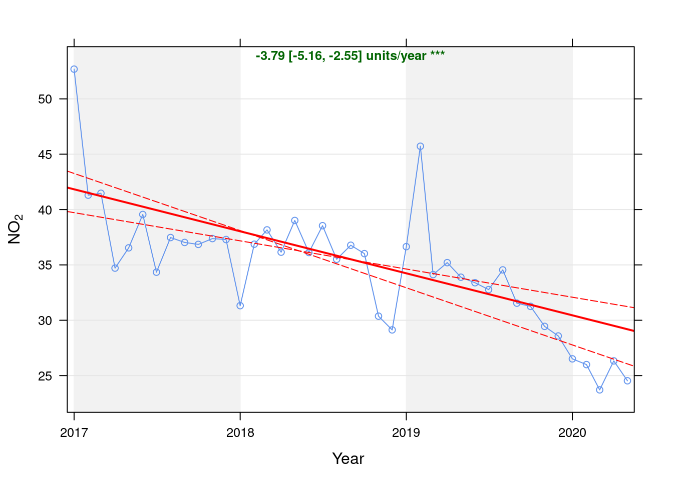
Figure 4.1: Theil-Sen de-seasoned trend (NO2)
p <- oaNO2$plot

getModelTrendTable <- function(oa, fname) {
    # oa is an openAir object created by theilSen calculates the % below trend using the theil sen slope line
    # parameters oa <- oaGWh
    oaData <- as.data.table(oa$data$main.data)
    rDT <- oaData[, .(date, conc, a, b, slope)]
    # https://github.com/davidcarslaw/openair/blob/master/R/TheilSen.R#L192 and
    # https://github.com/davidcarslaw/openair/blob/master/R/TheilSen.R#L625
    rDT[, `:=`(x, time_length(date - as.Date("1970-01-01"), unit = "days"))]  # n days since x = 0
    rDT[, `:=`(expectedVal, a + (b * x))]  # b = slope / 365

    # checks
    p <- ggplot2::ggplot(rDT, aes(x = date)) + geom_line(aes(y = conc)) + labs(y = "Value", caption = fname)
    p <- p + geom_line(aes(y = expectedVal), linetype = "dashed")
    ggplot2::ggsave(here::here("docs", "plots", paste0("SSC_trendModelTestPlot_", fname, ".png")))
    rDT[, `:=`(diff, conc - expectedVal)]
    rDT[, `:=`(pcDiff, (diff/expectedVal) * 100)]

    t <- rDT[, .(date, conc, a, b, slope, expectedVal, diff, pcDiff)]
    return(t)
}

t <- getModelTrendTable(oaNO2, fname = "NO2")

ft <- dcast(t[date >= as.Date("2020-01-01") & date < as.Date("2020-06-01")], date ~ ., value.var = c("diff", "pcDiff"))
ft[, `:=`(date, format.Date(date, format = "%b %Y"))]
kableExtra::kable(ft, caption = "Units and % above/below expected", digits = 2) %>% kable_styling()| date | diff | pcDiff |
|---|---|---|
| Jan 2020 | -3.93 | -12.91 |
| Feb 2020 | -4.13 | -13.70 |
| Mar 2020 | -6.11 | -20.49 |
| Apr 2020 | -3.17 | -10.75 |
| May 2020 | -4.65 | -15.94 |
Figure 4.2 shows the most recent hourly data.
recentDT <- no2dt[obsDate > myParams$recentCutDate]
p <- makeDotPlot(recentDT, xVar = "dateTimeUTC", xLab = "Date & Time", yVar = "value", byVar = "site", yLab = yLab)

p <- p + scale_x_datetime(date_breaks = "2 day", date_labels = "%a %d %b") + theme(axis.text.x = element_text(angle = 90,
    hjust = 1))

p <- p + geom_hline(yintercept = myParams$hourlyNo2Threshold_WHO) + labs(caption = paste0(myParams$lockdownCap,
    myParams$weekendCap, "\nReference line = WHO hourly threshold (", myParams$hourlyNo2Threshold_WHO, ")"))

# final plot - adds annotations
yMin <- min(recentDT$value)
yMax <- max(recentDT$value)

p <- addLockdownRectDateTime(p, yMin, yMax)
addWeekendsDateTime(p, yMin, yMax) + guides(colour = guide_legend(ncol = 2))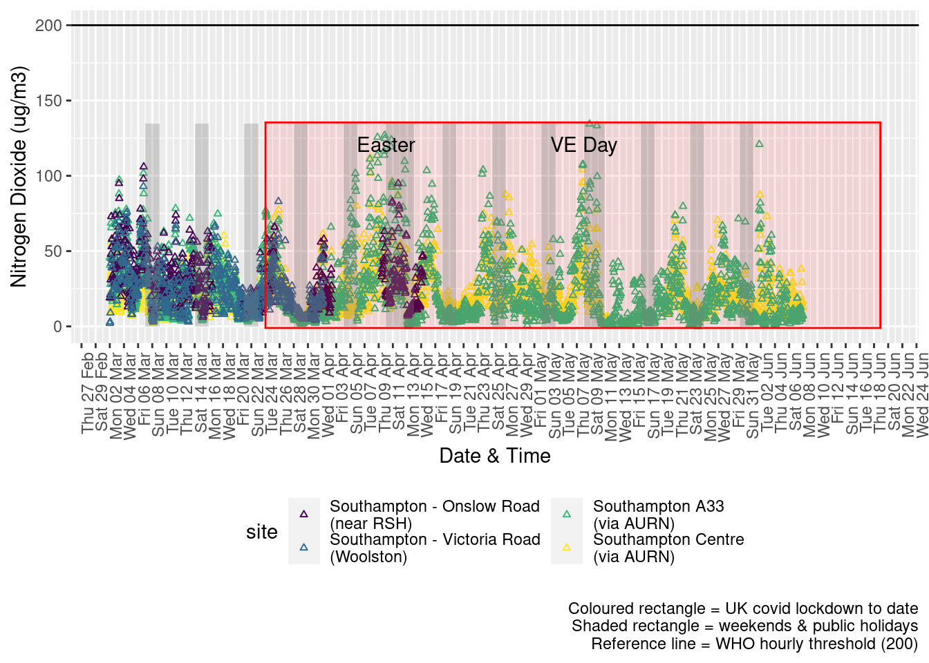
Figure 4.2: Nitrogen Dioxide levels, Southampton (hourly, recent)
Figure 4.3 shows the most recent hourly data by date and time of day.
recentDT[, `:=`(time, hms::as_hms(dateTimeUTC))]
yMin <- min(recentDT$time)
yMax <- max(recentDT$time)
p <- profileTilePlot(recentDT, yLab)
p <- addLockdownRectDate(p, yMin, yMax)
addWeekendsDate(p, yMin, yMax) + labs(caption = paste0(myParams$lockdownCap, myParams$weekendCap))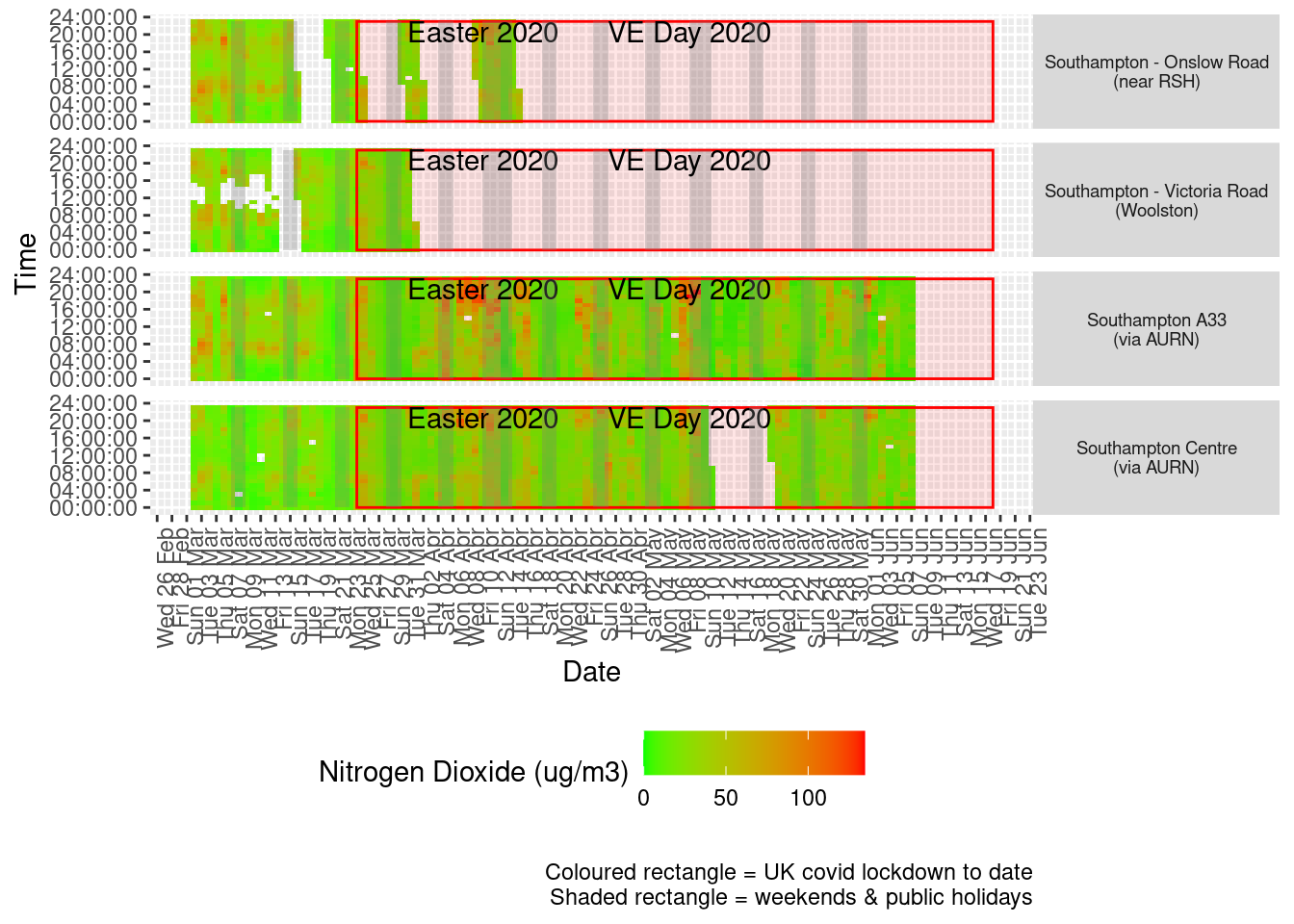
Figure 4.3: Nitrogen Dioxide levels, Southampton (hourly, recent)
Figure 4.4 shows the most recent mean daily values compared to previous years for the two AURN sites which do not have missing data. We have shifted the dates for the comparison years to ensure that weekdays and weekends line up. Note that this plot shows daily means with no indications of variance. Visible differences are therefore purely indicative at this stage.
plotDT <- no2dt[site %like% "via AURN" & fixedDate <= lubridate::today() & fixedDate >= myParams$comparePlotCut,
    .(meanVal = mean(value), medianVal = median(value), nSites = uniqueN(site)), keyby = .(fixedDate, compareYear,
        site)]

# final plot - adds annotations
yMin <- min(plotDT$meanVal)
yMax <- max(plotDT$meanVal)

p <- compareYearsPlot(plotDT, xVar = "fixedDate", yVar = "meanVal", colVar = "compareYear")

p <- addLockdownRectDate(p, yMin, yMax) + labs(x = "Date", y = "Daily mean", caption = paste0(myParams$lockdownCap,
    myParams$weekendCap, myParams$noThresh))

p <- addWeekendsDate(p, yMin, yMax) + scale_x_date(date_breaks = "7 day", date_labels = "%a %d %b", date_minor_breaks = "1 day")

p + facet_grid(site ~ .) + theme(strip.text.y.right = element_text(angle = 90))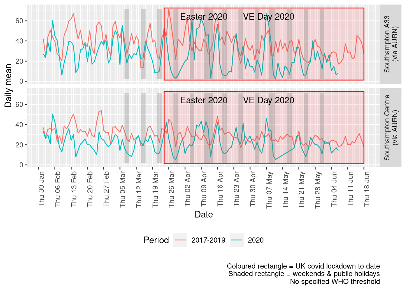
Figure 4.4: Comparative Nitrogen Dioxide levels 2020 vs 2017-2019, Southampton (daily mean)
Figure 4.5 and 4.6 show the % difference between the daily means for 2020 vs 2017-2019 (reference period). In both cases we can see that NO2 levels in 2020 were generally already lower than the reference period yet are not consistently lower even during the lockdown period. The affects of covid lockdown are not clear cut...
dailyDT <- makeDailyComparisonDT(no2dt[site %like% "via AURN" & fixedDate >= myParams$comparePlotCut])

p <- compareYearsDiffPlotDaily(dailyDT) + labs(caption = paste0(myParams$lockdownCap, myParams$weekendCap))

yMin <- min(dailyDT$pcDiffMean)
yMax <- max(dailyDT$pcDiffMean)
print(paste0("Max drop %:", round(yMin)))
## [1] "Max drop %:-93"print(paste0("Max increase %:", round(yMax)))## [1] "Max increase %:124"p <- addLockdownRectDate(p, yMin, yMax)
addWeekendsDate(p, yMin, yMax)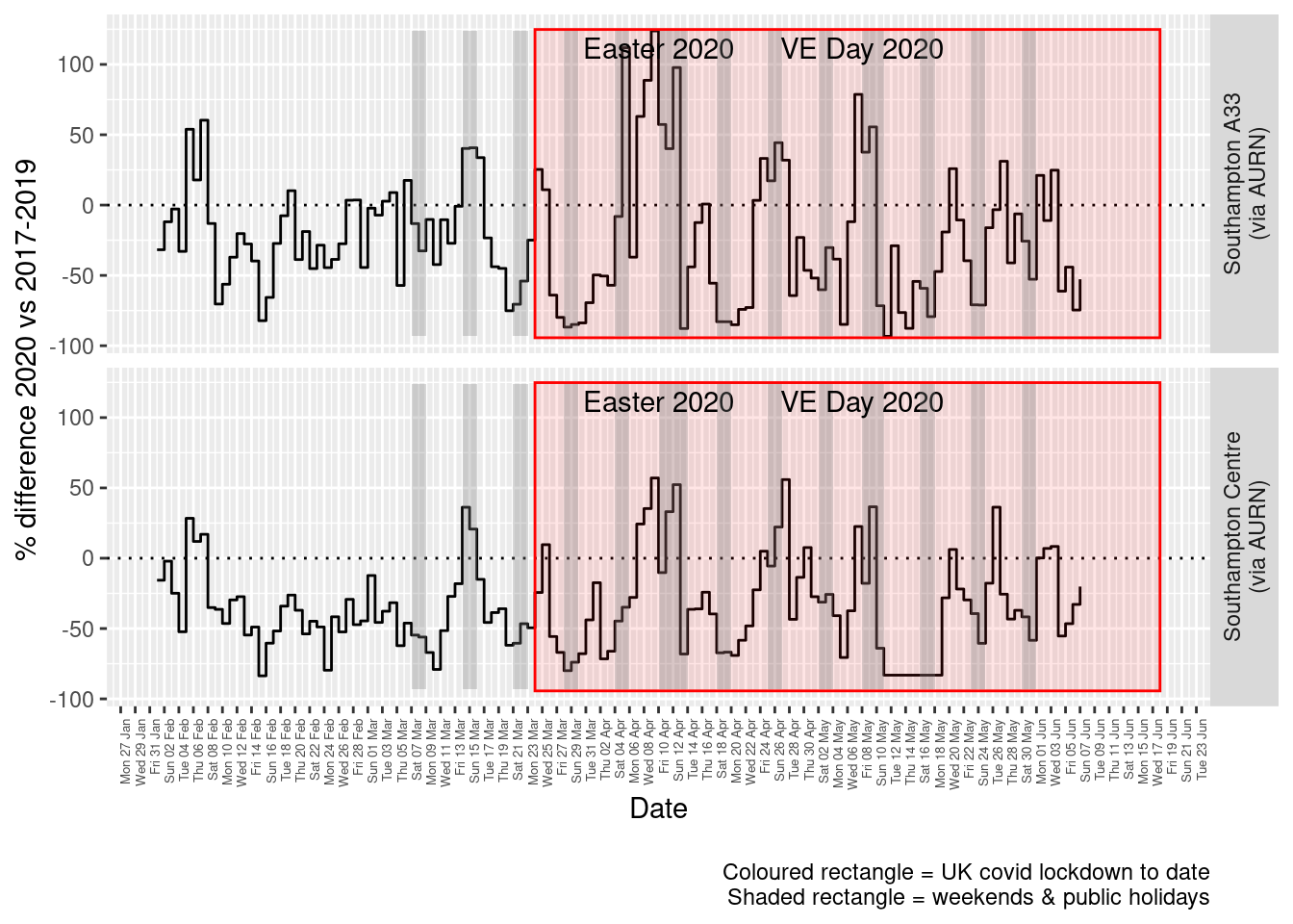
Figure 4.5: Percentage difference in daily mean Nitrogen Dioxide levels 2020 vs 2017-2019, Southampton
weeklyDT <- makeWeeklyComparisonDT(no2dt[site %like% "via AURN" & fixedDate >= myParams$comparePlotCut])

p <- compareYearsDiffPlotWeekly(weeklyDT, ldStart = myParams$lockDownStartDate, ldEnd = myParams$lockDownEndDate) +
    labs(caption = paste0(myParams$lockdownCap))

yMin <- min(weeklyDT$pcDiffMean)
yMax <- max(weeklyDT$pcDiffMean)
print(paste0("Max drop %:", round(yMin)))
## [1] "Max drop %:-64"print(paste0("Max increase %:", round(yMax)))## [1] "Max increase %:38"addLockdownRectWeek(p, yMin, yMax)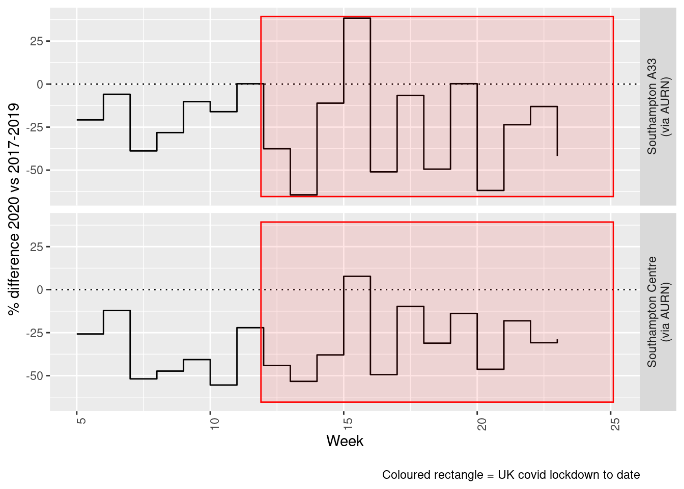
Figure 4.6: Percentage difference in weekly mean Nitrogen Dioxide levels 2020 vs 2017-2019, Southampton
Beware seasonal trends and meteorological affects
5 Oxides of Nitrogen (nox)
yLab <- "Oxides of Nitrogen (ug/m3)"
noxdt <- fixedDT[pollutant == "nox"]
Figure 5.1 shows the NOx trend over time. Is lockdown below trend?
noxdt[, `:=`(date, as.Date(dateTimeUTC))]  # set date to date for this one

oaNOx <- openair::TheilSen(noxdt[date < as.Date("2020-06-01")], "value", ylab = "NOx", deseason = TRUE, xlab = "Year",
    date.format = "%Y", date.breaks = 4)
## [1] "Taking bootstrap samples. Please wait."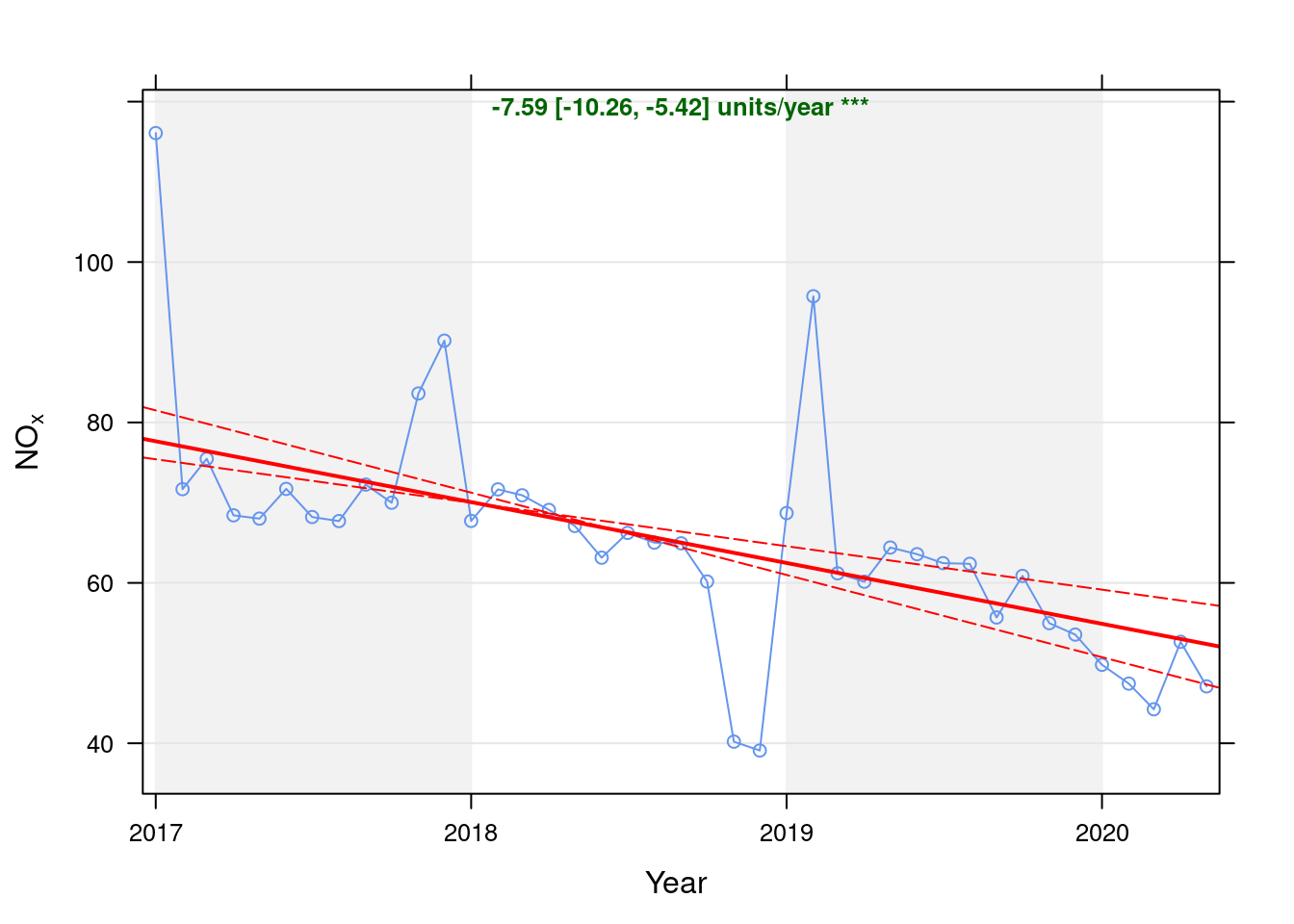
Figure 5.1: Theil-Sen de-seasoned trend (NOx)
p <- oaNOx$plot

t <- getModelTrendTable(oaNOx, fname = "NOx")

ft <- dcast(t[date >= as.Date("2020-01-01") & date < as.Date("2020-06-01")], date ~ ., value.var = c("diff", "pcDiff"))
ft[, `:=`(date, format.Date(date, format = "%b %Y"))]
kableExtra::kable(ft, caption = "Units and % above/below expected", digits = 2) %>% kable_styling()| date | diff | pcDiff |
|---|---|---|
| Jan 2020 | -5.11 | -9.30 |
| Feb 2020 | -6.81 | -12.55 |
| Mar 2020 | -9.41 | -17.54 |
| Apr 2020 | -0.35 | -0.66 |
| May 2020 | -5.28 | -10.08 |
Figure 5.2 shows the most recent hourly data.
recentDT <- noxdt[!is.na(value) & obsDate > myParams$recentCutDate]
p <- makeDotPlot(recentDT, xVar = "dateTimeUTC", xLab = "Date & Time", yVar = "value", byVar = "site", yLab = yLab)

p <- p + scale_x_datetime(date_breaks = "2 day", date_labels = "%a %d %b") + theme(axis.text.x = element_text(angle = 90,
    hjust = 1)) + labs(caption = paste0(myParams$lockdownCap, myParams$weekendCap, myParams$noThresh))

# final plot - adds annotations
yMin <- min(recentDT$value)
yMax <- max(recentDT$value)

p <- addLockdownRectDateTime(p, yMin, yMax)

addWeekendsDateTime(p, yMin, yMax)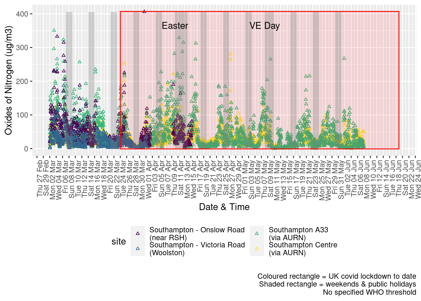
Figure 5.2: Oxides of nitrogen levels, Southampton (hourly, recent)
Figure 5.3 shows the most recent hourly data by date and time of day.
recentDT[, `:=`(time, hms::as_hms(dateTimeUTC))]
yMin <- min(recentDT$time)
yMax <- max(recentDT$time)
p <- profileTilePlot(recentDT, yLab)
addWeekendsDate(p, yMin, yMax) + labs(caption = paste0(myParams$lockdownCap, myParams$weekendCap))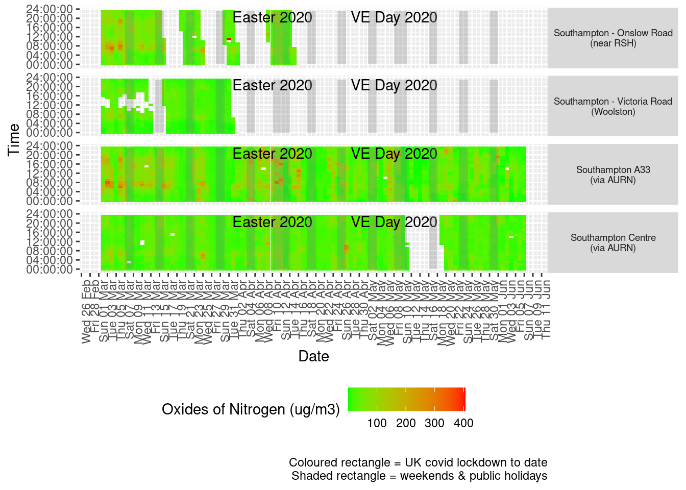
Figure 5.3: Oxides of nitrogen levels, Southampton (hourly, recent)
Figure 5.4 shows the most recent mean daily values compared to previous years for the two AURN sites.
plotDT <- noxdt[site %like% "via AURN" & fixedDate <= lubridate::today() & fixedDate >= myParams$comparePlotCut,
    .(meanVal = mean(value), medianVal = median(value), nSites = uniqueN(site)), keyby = .(fixedDate, compareYear,
        site)]

# final plot - adds annotations
yMin <- min(plotDT$meanVal)
yMax <- max(plotDT$meanVal)

p <- compareYearsPlot(plotDT, xVar = "fixedDate", yVar = "meanVal", colVar = "compareYear")
p <- addLockdownRectDate(p, yMin, yMax) + labs(x = "Date", y = "Daily mean", caption = paste0(myParams$lockdownCap,
    myParams$weekendCap, myParams$noThresh))
p <- addWeekendsDate(p, yMin, yMax)

p + facet_grid(site ~ .) + theme(strip.text.y.right = element_text(angle = 90))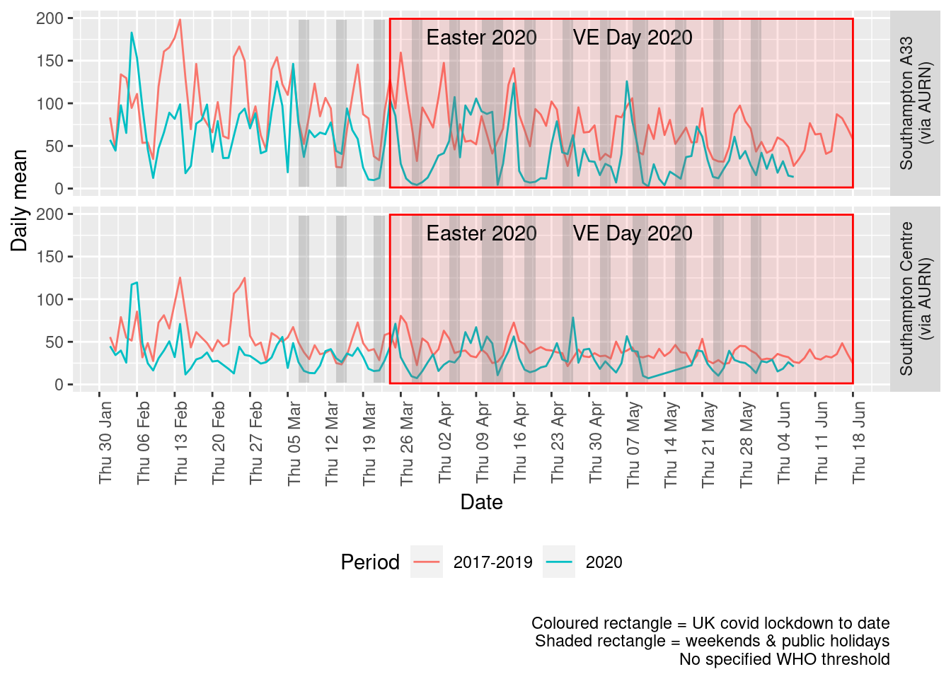
Figure 5.4: Oxides of nitrogen levels, Southampton (daily mean)
Figure 5.5 and 5.6 show the % difference between the daily and weekly means for 2020 vs 2017-2019 (reference period).
dailyDT <- makeDailyComparisonDT(noxdt[site %like% "via AURN" & fixedDate >= myParams$comparePlotCut])

p <- compareYearsDiffPlotDaily(dailyDT) + labs(caption = paste0(myParams$lockdownCap, myParams$weekendCap))

yMin <- min(dailyDT$pcDiffMean)
yMax <- max(dailyDT$pcDiffMean)
print(paste0("Max drop %:", round(yMin)))
## [1] "Max drop %:-96"print(paste0("Max increase %:", round(yMax)))## [1] "Max increase %:172"p <- addLockdownRectDate(p, yMin, yMax)
addWeekendsDate(p, yMin, yMax)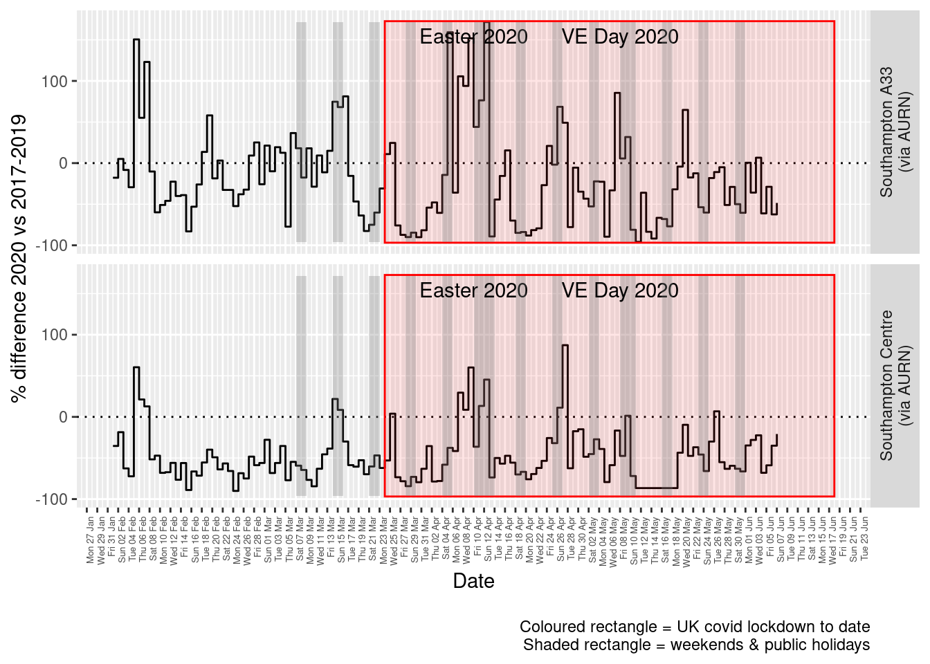
Figure 5.5: % difference in daily mean Oxides of Nitrogen levels 2020 vs 2017-2019, Southampton
weeklyDT <- makeWeeklyComparisonDT(noxdt[site %like% "via AURN" & fixedDate >= myParams$comparePlotCut])

p <- compareYearsDiffPlotWeekly(weeklyDT, ldStart = myParams$lockDownStartDate, ldEnd = myParams$lockDownEndDate) +
    labs(caption = paste0(myParams$lockdownCap, myParams$weekendCap))

yMin <- min(weeklyDT$pcDiffMean)
yMax <- max(weeklyDT$pcDiffMean)
print(paste0("Max drop %:", round(yMin)))
## [1] "Max drop %:-70"print(paste0("Max increase %:", round(yMax)))## [1] "Max increase %:51"addLockdownRectWeek(p, yMin, yMax)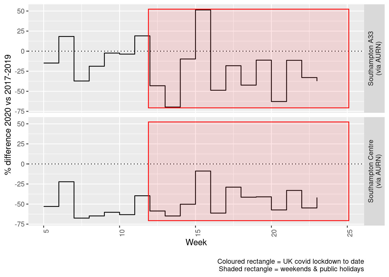
Figure 5.6: % difference in weekly mean Oxides of Nitrogen levels 2020 vs 2017-2019, Southampton
6 Sulphour Dioxide
yLab <- "Sulphour Dioxide (ug/m3)"
so2dt <- fixedDT[pollutant == "so2"]
Figure 6.1 shows the SO2 trend over time. Is lockdown below trend?
so2dt[, `:=`(date, as.Date(dateTimeUTC))]  # set date to date for this one

oaSO2 <- openair::TheilSen(so2dt[date < as.Date("2020-06-01")], "value", ylab = "SO2", deseason = TRUE, xlab = "Year",
    date.format = "%Y", date.breaks = 4)
## [1] "Taking bootstrap samples. Please wait."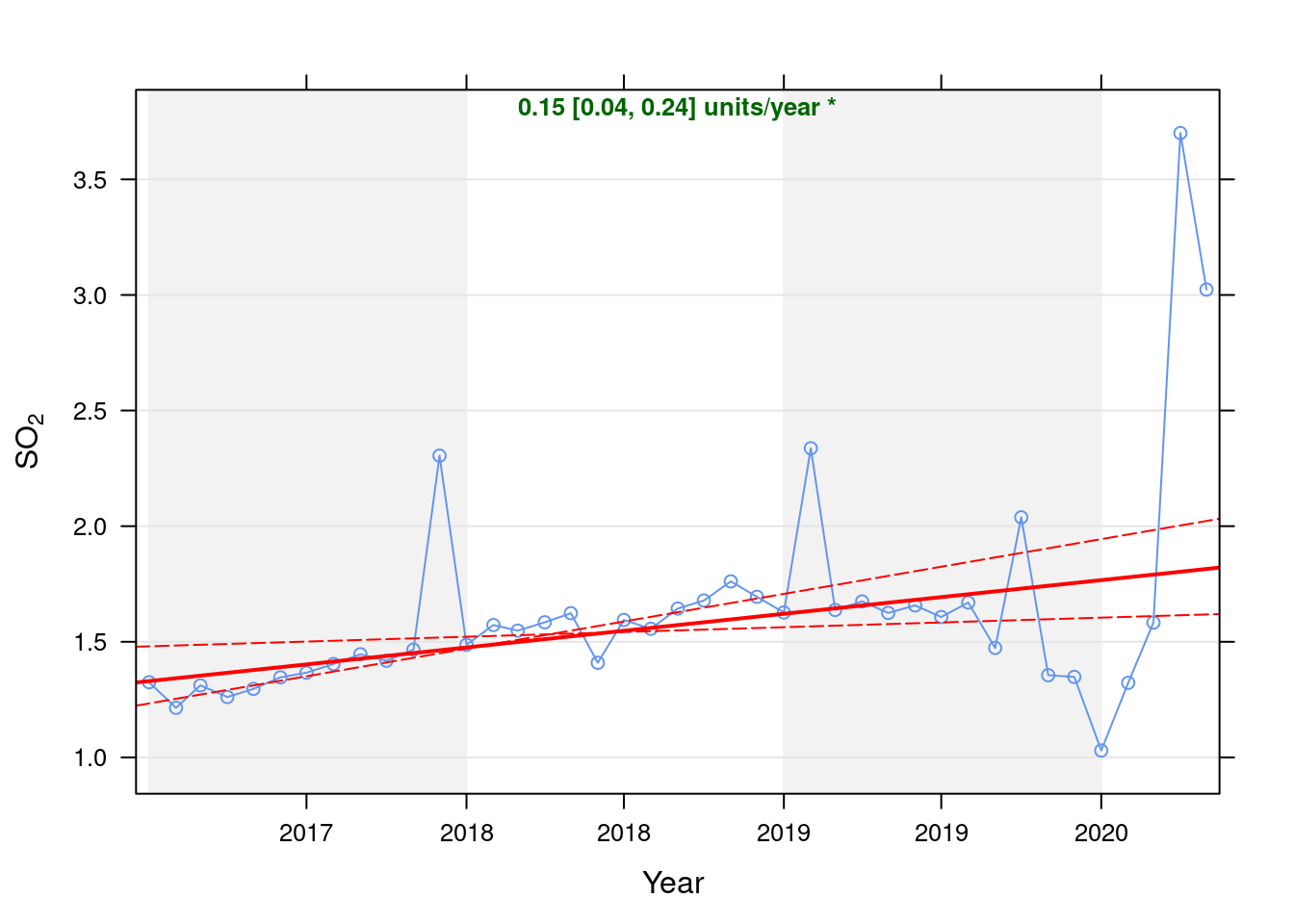
Figure 6.1: Theil-Sen de-seasoned trend (SO2)
t <- getModelTrendTable(oaSO2, fname = "SO2")

ft <- dcast(t[date >= as.Date("2020-01-01") & date < as.Date("2020-06-01")], date ~ ., value.var = c("diff", "pcDiff"))
ft[, `:=`(date, format.Date(date, format = "%b %Y"))]
kableExtra::kable(ft, caption = "Units and % above/below expected", digits = 2) %>% kable_styling()| date | diff | pcDiff |
|---|---|---|
| Jan 2020 | -0.74 | -41.70 |
| Feb 2020 | -0.46 | -25.66 |
| Mar 2020 | -0.21 | -11.60 |
| Apr 2020 | 1.90 | 105.20 |
| May 2020 | 1.21 | 66.56 |
Figure 6.2 shows the most recent hourly data.
recentDT <- so2dt[!is.na(value) & obsDate > myParams$recentCutDate]
p <- makeDotPlot(recentDT, xVar = "dateTimeUTC", xLab = "Date & Time", yVar = "value", byVar = "site", yLab = yLab)

p <- p + scale_x_datetime(date_breaks = "2 day", date_labels = "%a %d %b") + theme(axis.text.x = element_text(angle = 90,
    hjust = 1)) + labs(caption = paste0(myParams$lockdownCap, myParams$weekendCap, myParams$noThresh))

yMax <- max(recentDT$value)
yMin <- min(recentDT$value)
p <- addLockdownRectDateTime(p, yMin, yMax)
addWeekendsDateTime(p, yMin, yMax)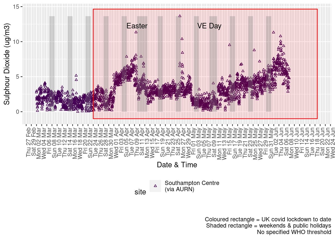
Figure 6.2: Sulphour Dioxide levels, Southampton (hourly, recent)
Figure 6.3 shows the most recent hourly data by date and time of day and time of day.
recentDT[, `:=`(time, hms::as_hms(dateTimeUTC))]

yMin <- min(recentDT$time)
yMax <- max(recentDT$time)
p <- profileTilePlot(recentDT, yLab)
addWeekendsDate(p, yMin, yMax) + labs(caption = paste0(myParams$lockdownCap, myParams$weekendCap))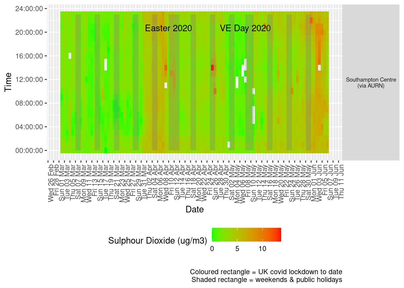
Figure 6.3: Sulphour Dioxide levels, Southampton (hourly, recent)
Figure 6.4 shows the most recent mean daily values compared to previous years.
plotDT <- so2dt[site %like% "via AURN" & fixedDate <= lubridate::today() & fixedDate >= myParams$comparePlotCut,
    .(meanVal = mean(value), medianVal = median(value), nSites = uniqueN(site)), keyby = .(fixedDate, compareYear,
        site)]

# final plot - adds annotations
yMin <- min(plotDT$mean)
yMax <- max(plotDT$mean)

p <- compareYearsPlot(plotDT, xVar = "fixedDate", yVar = "meanVal", colVar = "compareYear")
p <- addLockdownRectDate(p, yMin, yMax) + geom_hline(yintercept = myParams$dailySo2Threshold_WHO) + labs(x = "Date",
    y = "Daily mean", caption = paste0(myParams$lockdownCap, myParams$weekendCap, "\nReference line = WHO daily threshold (",
        myParams$dailySo2Threshold_WHO, ")"))
p <- addWeekendsDate(p, yMin, yMax)

p + facet_grid(site ~ .) + theme(strip.text.y.right = element_text(angle = 90))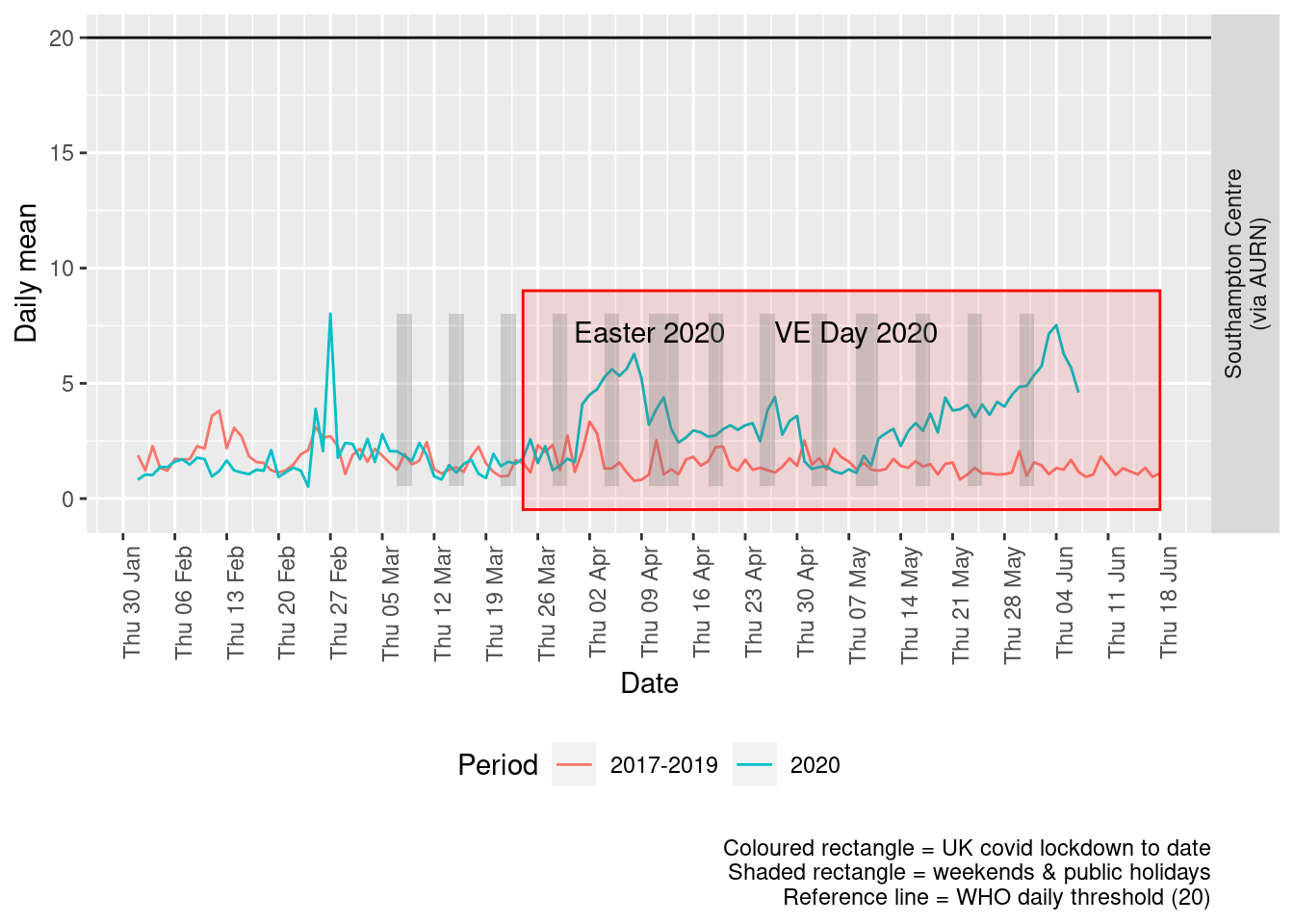
Figure 6.4: Sulphour dioxide levels, Southampton (daily mean)
Figure 6.5 and 6.6 show the % difference between the daily and weekly means for 2020 vs 2017-2019 (reference period).
dailyDT <- makeDailyComparisonDT(so2dt[site %like% "via AURN" & fixedDate >= myParams$comparePlotCut])

p <- compareYearsDiffPlotDaily(dailyDT) + labs(caption = paste0(myParams$lockdownCap))

yMin <- min(dailyDT$pcDiffMean)
yMax <- max(dailyDT$pcDiffMean)
print(paste0("Max drop %:", round(yMin)))
## [1] "Max drop %:-75"print(paste0("Max increase %:", round(yMax)))## [1] "Max increase %:714"p <- addLockdownRectDate(p, yMin, yMax)
addWeekendsDate(p, yMin, yMax)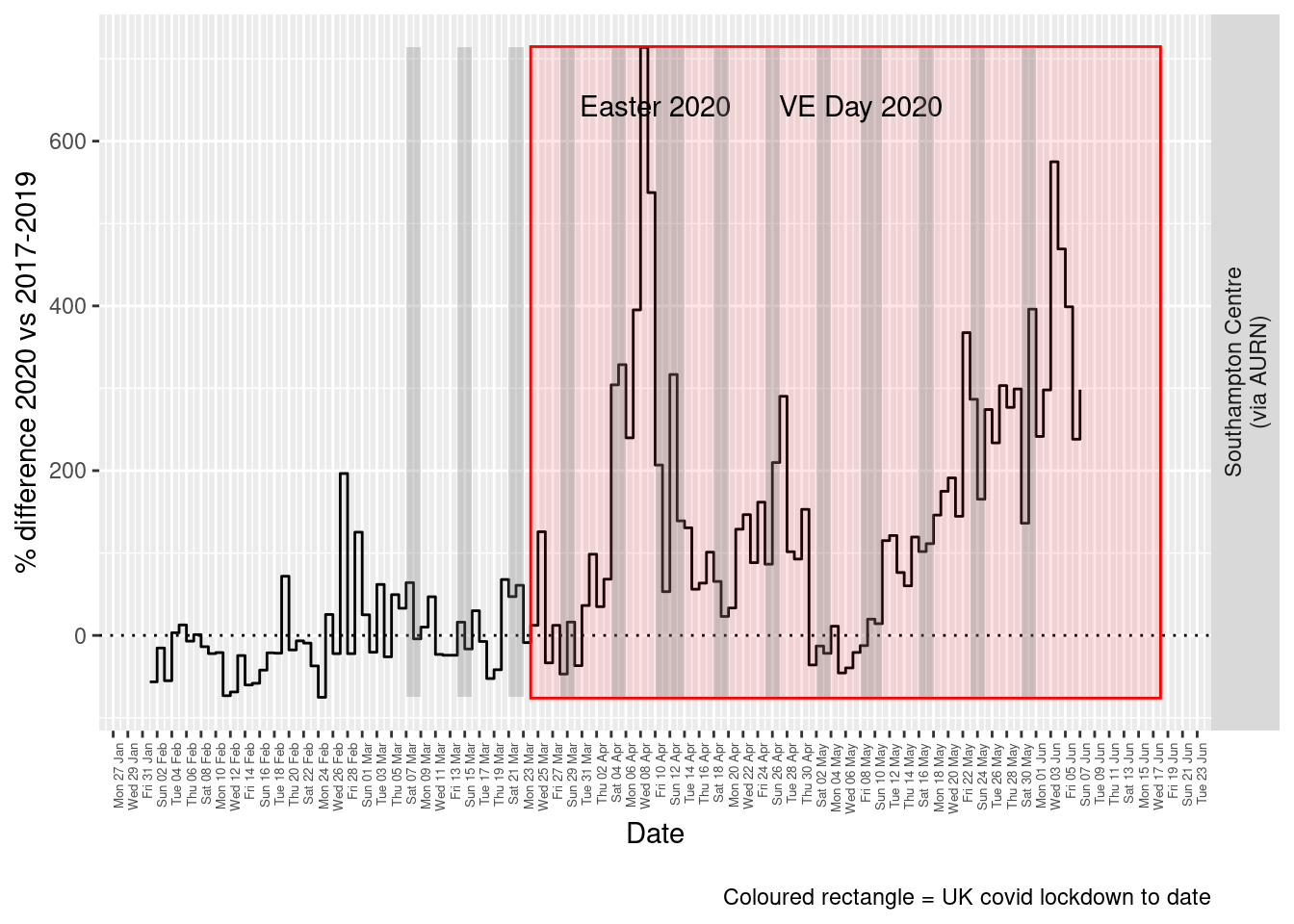
Figure 6.5: % difference in daily mean Sulphour Dioxide levels 2020 vs 2017-2019, Southampton
weeklyDT <- makeWeeklyComparisonDT(so2dt[site %like% "via AURN" & fixedDate >= myParams$comparePlotCut])

p <- compareYearsDiffPlotWeekly(weeklyDT, ldStart = myParams$lockDownStartDate, ldEnd = myParams$lockDownEndDate) +
    labs(caption = paste0(myParams$lockdownCap))

yMin <- min(weeklyDT$pcDiffMean)
yMax <- max(weeklyDT$pcDiffMean)
print(paste0("Max drop %:", round(yMin)))
## [1] "Max drop %:-48"print(paste0("Max increase %:", round(yMax)))## [1] "Max increase %:415"addLockdownRectWeek(p, yMin, yMax)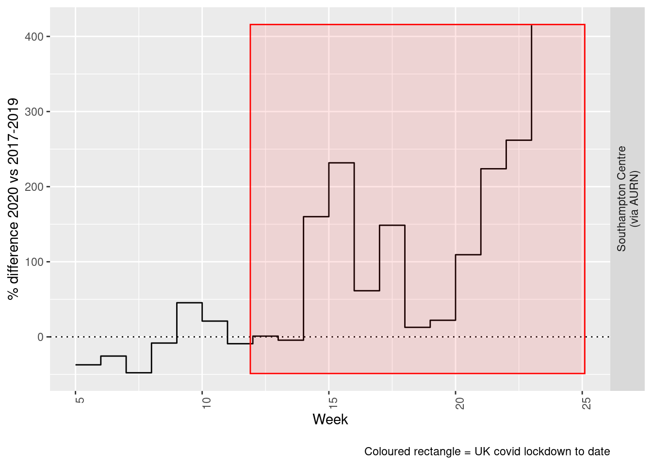
Figure 6.6: % difference in weekly mean Sulphour Dioxide levels 2020 vs 2017-2019, Southampton
Beware seasonal trends and meteorological affects
7 Ozone
yLab <- "Ozone (ug/m3)"
o3dt <- fixedDT[pollutant == "o3"]
Figure 7.1 shows the O3 trend over time. Is lockdown below trend?
o3dt[, `:=`(date, as.Date(dateTimeUTC))]  # set date to date for this one

oaO3 <- openair::TheilSen(o3dt[date < as.Date("2020-06-01")], "value", ylab = "O3", deseason = TRUE, xlab = "Year",
    date.format = "%Y", date.breaks = 4)
## [1] "Taking bootstrap samples. Please wait."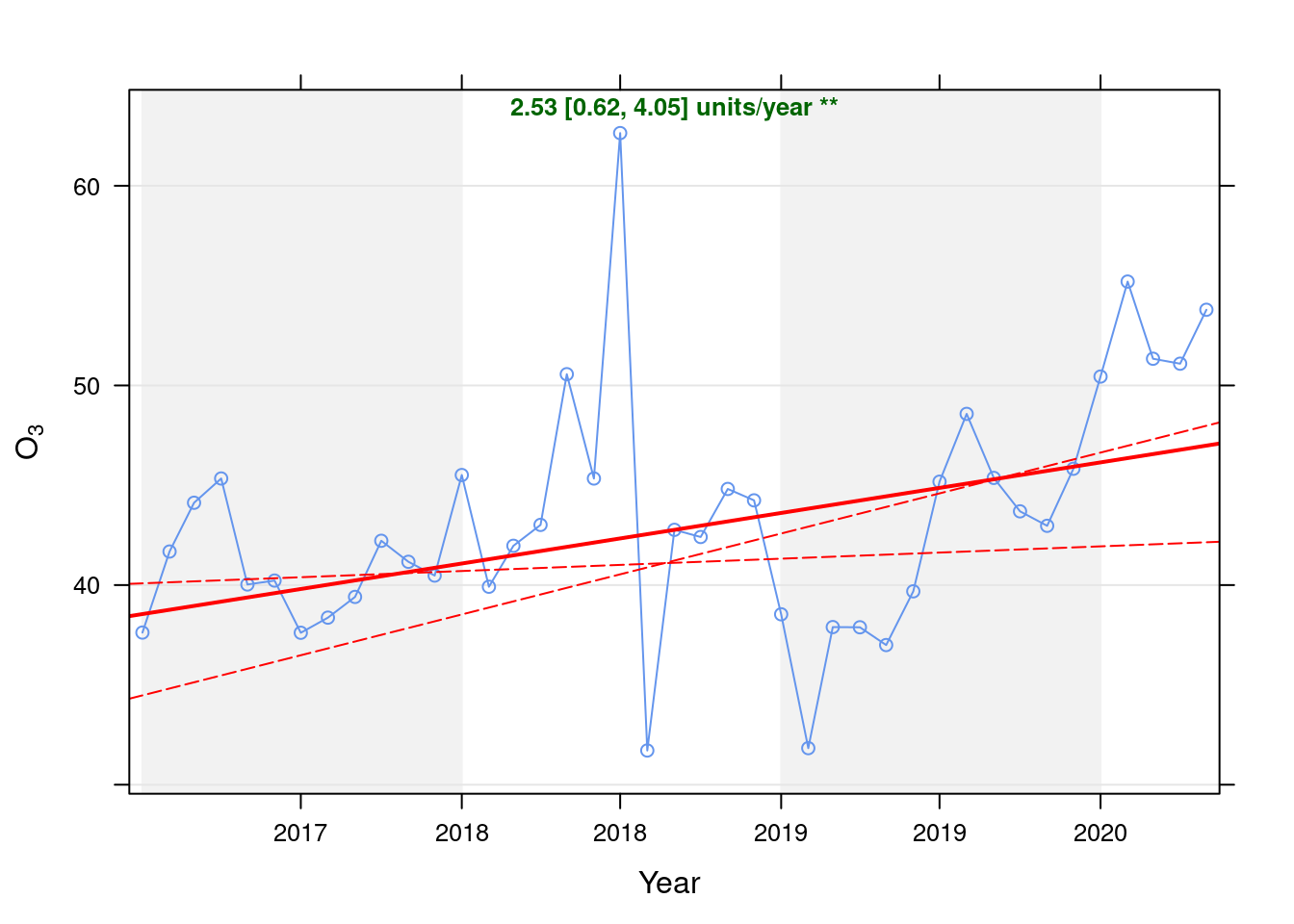
Figure 7.1: Theil-Sen de-seasoned trend (O3)
t <- getModelTrendTable(oaO3, fname = "O3")

ft <- dcast(t[date >= as.Date("2020-01-01") & date < as.Date("2020-06-01")], date ~ ., value.var = c("diff", "pcDiff"))
ft[, `:=`(date, format.Date(date, format = "%b %Y"))]
kableExtra::kable(ft, caption = "Units and % above/below expected", digits = 2) %>% kable_styling()| date | diff | pcDiff |
|---|---|---|
| Jan 2020 | 4.30 | 9.31 |
| Feb 2020 | 8.84 | 19.07 |
| Mar 2020 | 4.77 | 10.25 |
| Apr 2020 | 4.31 | 9.22 |
| May 2020 | 6.80 | 14.48 |
Figure 7.2 shows the most recent hourly data.
recentDT <- o3dt[!is.na(value) & obsDate > myParams$recentCutDate]
p <- makeDotPlot(recentDT, xVar = "dateTimeUTC", xLab = "Date & Time", yVar = "value", byVar = "site", yLab = yLab)

p <- p + scale_x_datetime(date_breaks = "2 day", date_labels = "%a %d %b") + theme(axis.text.x = element_text(angle = 90,
    hjust = 1)) + labs(caption = paste0(myParams$lockdownCap, myParams$weekendCap, myParams$noThresh))

yMax <- max(recentDT$value)
yMin <- min(recentDT$value)
p <- addLockdownRectDateTime(p, yMin, yMax)
addWeekendsDateTime(p, yMin, yMax)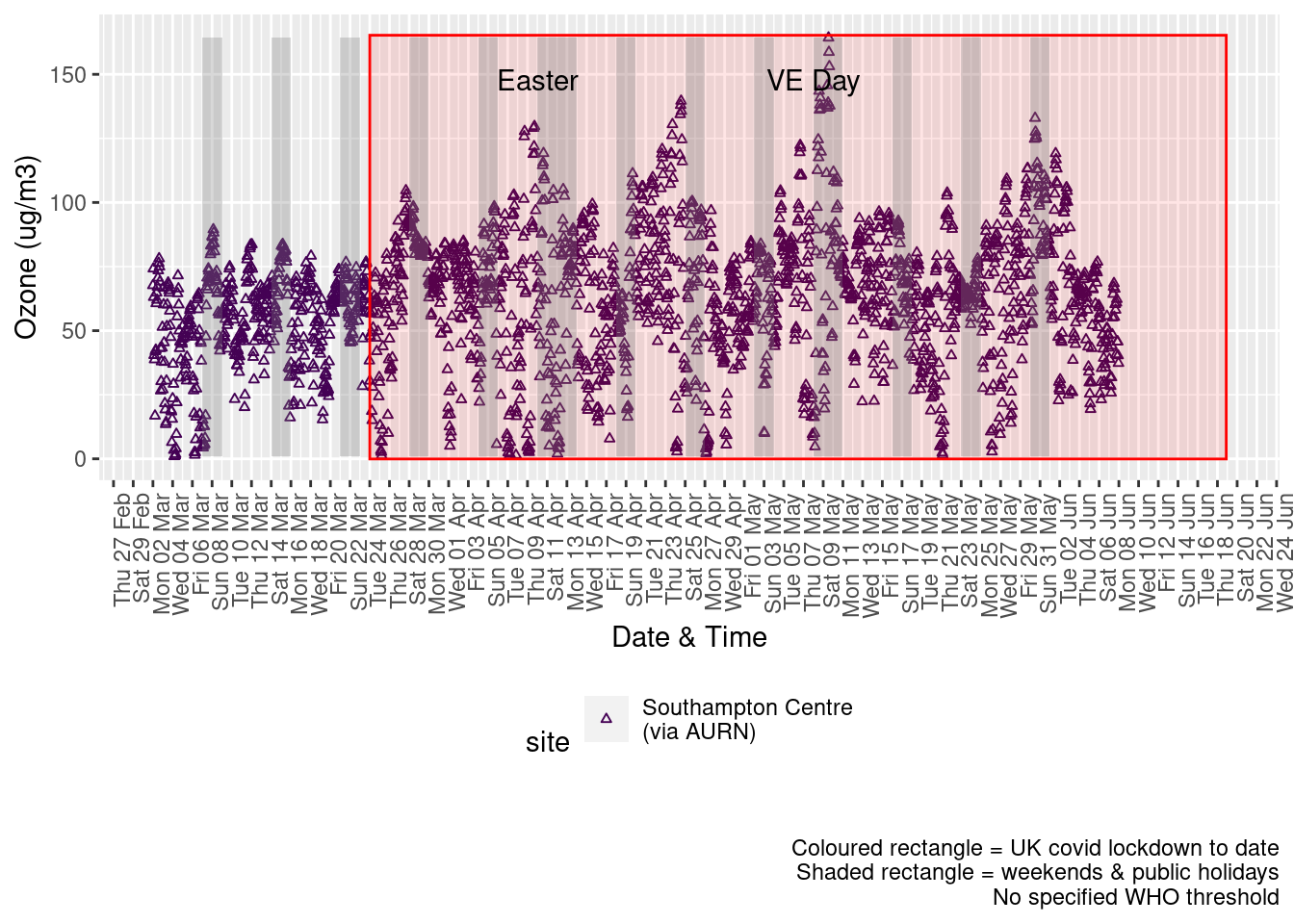
Figure 7.2: 03 levels, Southampton (hourly, recent)
Figure 7.3 shows the most recent hourly data by date and time of day.
recentDT[, `:=`(time, hms::as_hms(dateTimeUTC))]

yMin <- min(recentDT$time)
yMax <- max(recentDT$time)
p <- profileTilePlot(recentDT, yLab)
addWeekendsDate(p, yMin, yMax) + labs(caption = paste0(myParams$lockdownCap, myParams$weekendCap))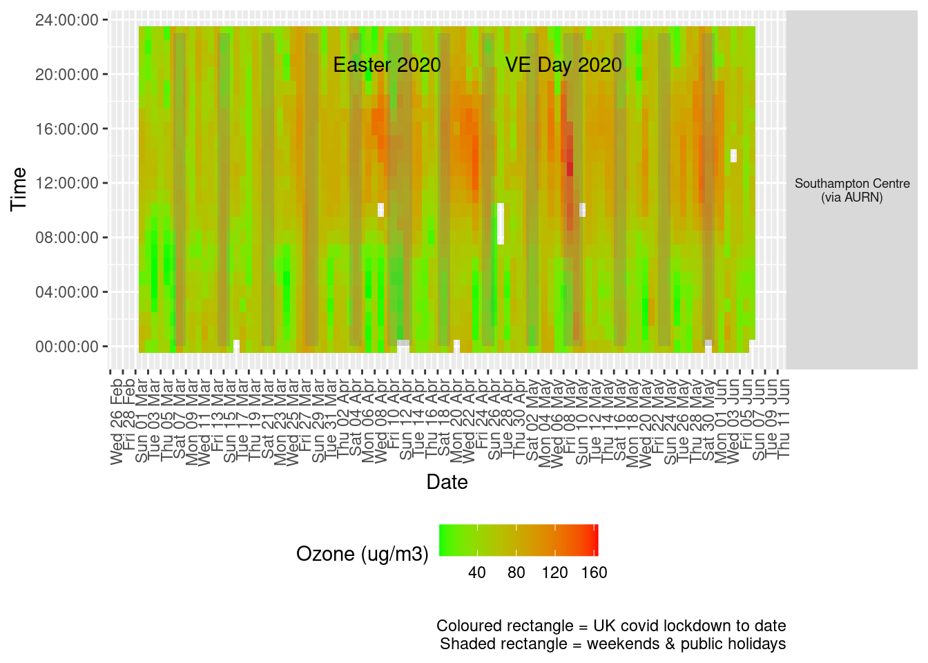
Figure 7.3: Ozone levels, Southampton (hourly, recent)
Figure 7.4 shows the most recent mean daily values compared to previous years.
plotDT <- o3dt[site %like% "via AURN" & fixedDate <= lubridate::today() & fixedDate >= myParams$comparePlotCut,
    .(meanVal = mean(value), medianVal = median(value), nSites = uniqueN(site)), keyby = .(fixedDate, compareYear,
        site)]

# final plot - adds annotations
yMin <- min(plotDT$mean)
yMax <- max(plotDT$mean)

p <- compareYearsPlot(plotDT, xVar = "fixedDate", yVar = "meanVal", colVar = "compareYear")
p <- addLockdownRectDate(p, yMin, yMax) + geom_hline(yintercept = myParams$dailyO3Threshold_WHO) + labs(x = "Date",
    y = "Daily mean", caption = paste0(myParams$lockdownCap, myParams$weekendCap, "\nReference line = WHO daily threshold (",
        myParams$dailyO3Threshold_WHO, ")"))
p <- addWeekendsDate(p, yMin, yMax)
p + facet_grid(site ~ .) + theme(strip.text.y.right = element_text(angle = 90))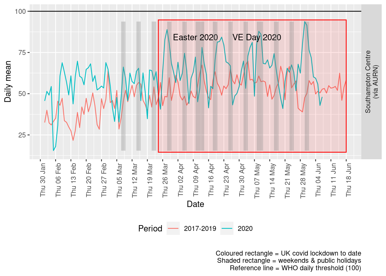
Figure 7.4: Ozone levels, Southampton (daily mean)
Figure 7.5 and 7.6 show the % difference between the daily and weekly means for 2020 vs 2017-2019 (reference period).
dailyDT <- makeDailyComparisonDT(o3dt[site %like% "via AURN" & fixedDate >= myParams$comparePlotCut])

p <- compareYearsDiffPlotDaily(dailyDT) + labs(caption = paste0(myParams$lockdownCap))

yMin <- min(dailyDT$pcDiffMean)
yMax <- max(dailyDT$pcDiffMean)
print(paste0("Max drop %:", round(yMin)))
## [1] "Max drop %:-53"print(paste0("Max increase %:", round(yMax)))## [1] "Max increase %:121"p <- addLockdownRectDate(p, yMin, yMax)
addWeekendsDate(p, yMin, yMax)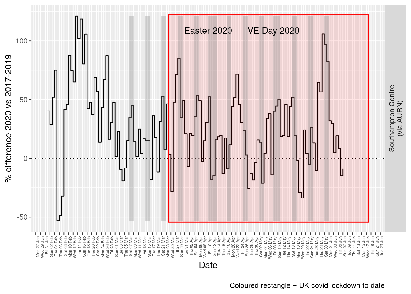
Figure 7.5: % difference in daily mean Ozone levels 2020 vs 2017-2019, Southampton
weeklyDT <- makeWeeklyComparisonDT(o3dt[site %like% "via AURN" & fixedDate >= myParams$comparePlotCut])

p <- compareYearsDiffPlotWeekly(weeklyDT, ldStart = myParams$lockDownStartDate, ldEnd = myParams$lockDownEndDate) +
    labs(caption = paste0(myParams$lockdownCap))

yMin <- min(weeklyDT$pcDiffMean)
yMax <- max(weeklyDT$pcDiffMean)
print(paste0("Max drop %:", round(yMin)))
## [1] "Max drop %:1"print(paste0("Max increase %:", round(yMax)))## [1] "Max increase %:87"addLockdownRectWeek(p, yMin, yMax)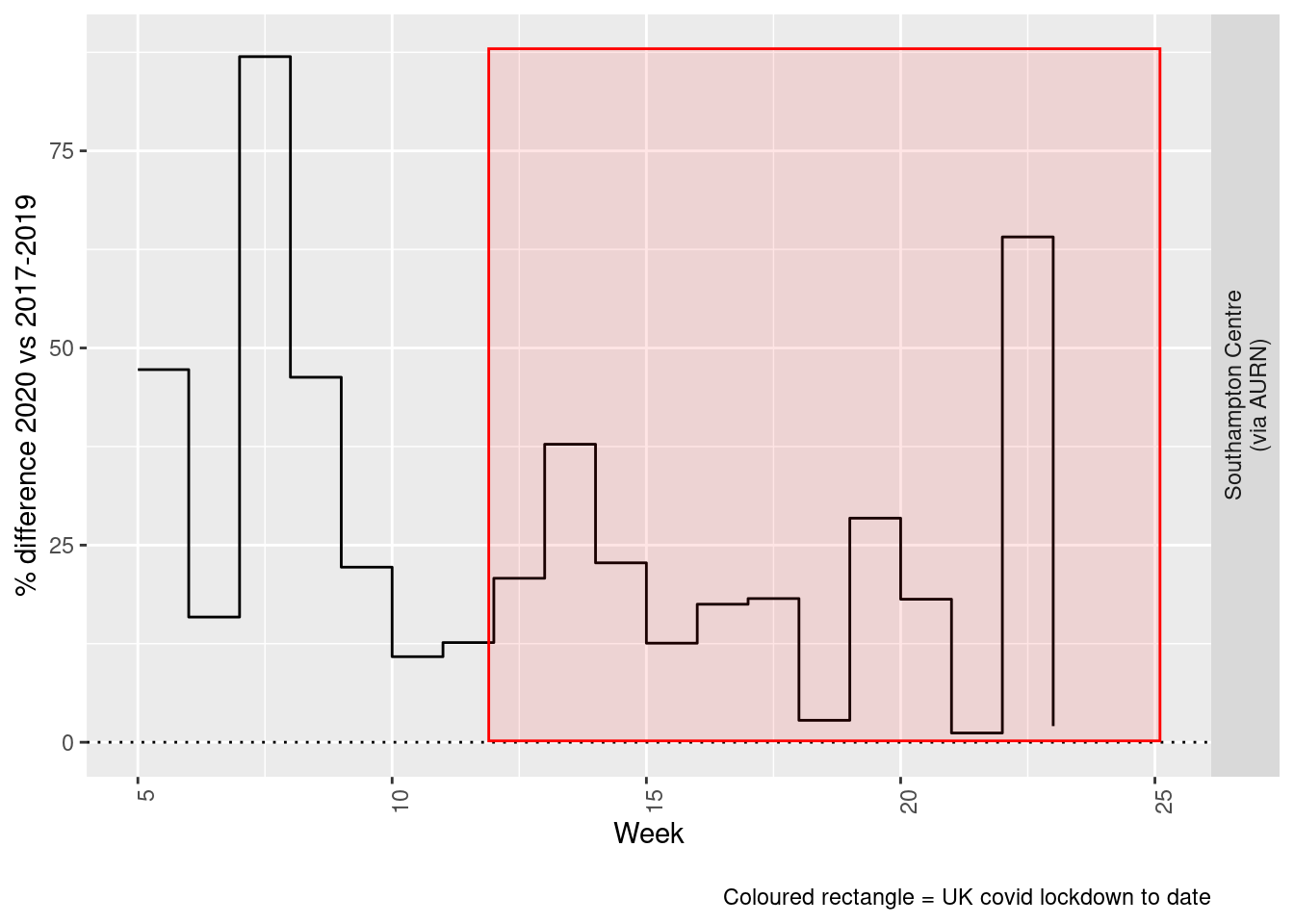
Figure 7.6: % difference in weekly mean Ozone levels 2020 vs 2017-2019, Southampton
Beware seasonal trends and meteorological affects
8 PM 10
yLab <- "PM 10 (ug/m3)"
pm10dt <- fixedDT[pollutant == "pm10"]
Figure 8.1 shows the PM10 trend over time. Is lockdown below trend?
pm10dt[, `:=`(date, as.Date(dateTimeUTC))]  # set date to date for this one

oaPM10 <- openair::TheilSen(pm10dt[date < as.Date("2020-06-01")], "value", ylab = "PM10", deseason = TRUE, xlab = "Year",
    date.format = "%Y", date.breaks = 4)
## [1] "Taking bootstrap samples. Please wait."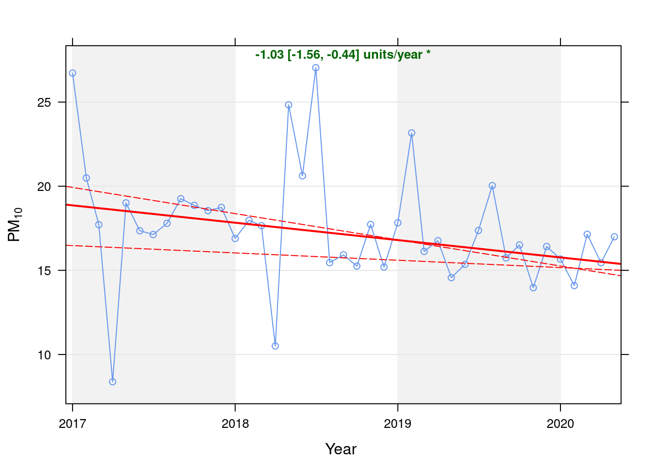
Figure 8.1: Theil-Sen de-seasoned trend (PM10)
t <- getModelTrendTable(oaPM10, fname = "SPM10")

ft <- dcast(t[date >= as.Date("2020-01-01") & date < as.Date("2020-06-01")], date ~ ., value.var = c("diff", "pcDiff"))
ft[, `:=`(date, format.Date(date, format = "%b %Y"))]
kableExtra::kable(ft, caption = "Units and % above/below expected", digits = 2) %>% kable_styling()| date | diff | pcDiff |
|---|---|---|
| Jan 2020 | -0.10 | -0.62 |
| Feb 2020 | -1.58 | -10.10 |
| Mar 2020 | 1.55 | 9.91 |
| Apr 2020 | -0.06 | -0.38 |
| May 2020 | 1.57 | 10.19 |
Figure 8.2 shows the most recent hourly data.
recentDT <- pm10dt[!is.na(value) & obsDate > myParams$recentCutDate]
p <- makeDotPlot(recentDT, xVar = "dateTimeUTC", xLab = "Date & Time", yVar = "value", byVar = "site", yLab = yLab)

p <- p + scale_x_datetime(date_breaks = "2 day", date_labels = "%a %d %b") + theme(axis.text.x = element_text(angle = 90,
    hjust = 1)) + labs(caption = paste0(myParams$lockdownCap, myParams$weekendCap, myParams$noThresh))

yMax <- max(recentDT$value)
yMin <- min(recentDT$value)
p <- addLockdownRectDateTime(p, yMin, yMax)
addWeekendsDateTime(p, yMin, yMax)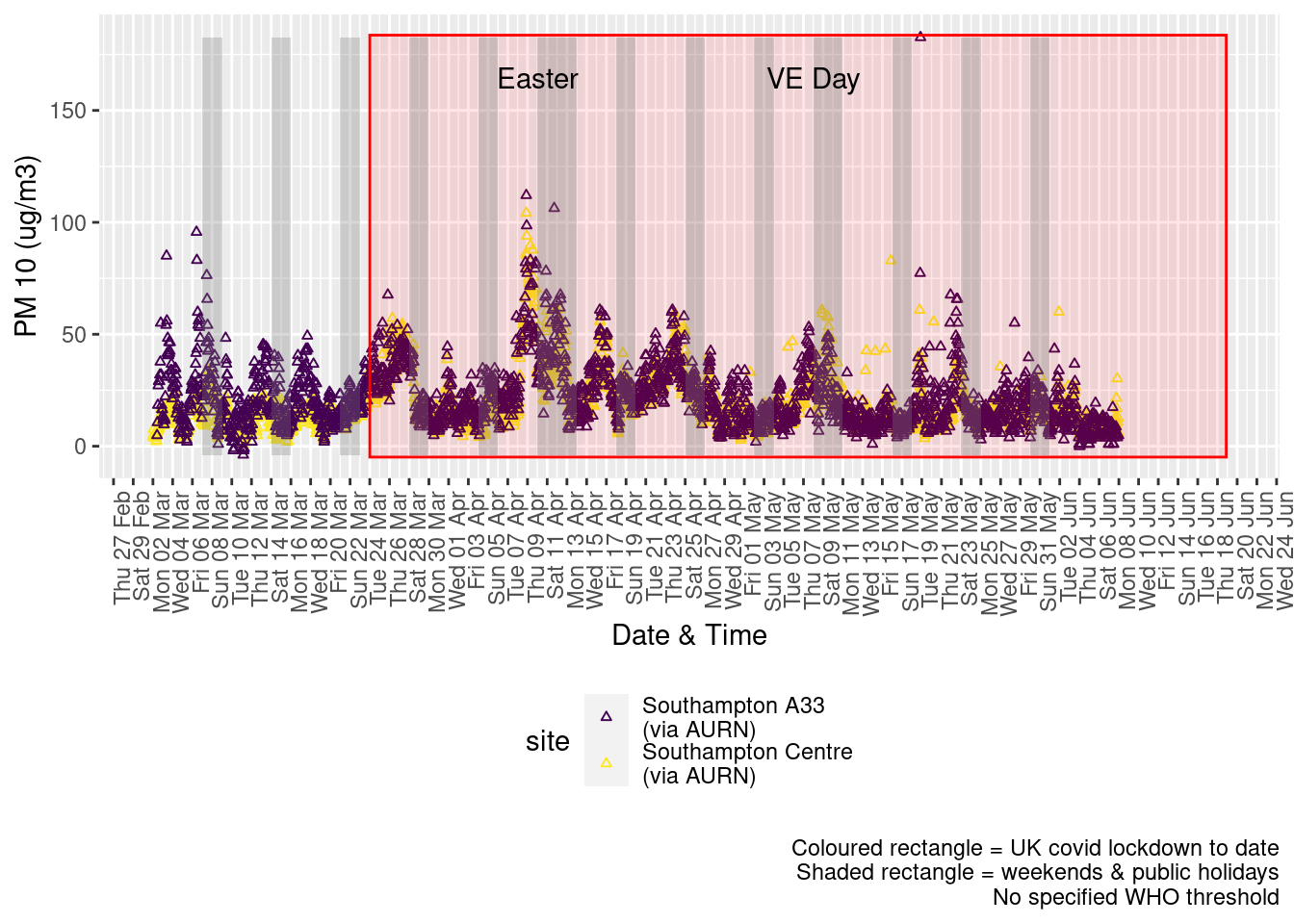
Figure 8.2: PM10 levels, Southampton (hourly, recent)
Figure 8.3 shows the most recent hourly data by date and time of day.
recentDT[, `:=`(time, hms::as_hms(dateTimeUTC))]

yMin <- min(recentDT$time)
yMax <- max(recentDT$time)
p <- profileTilePlot(recentDT, yLab)
addWeekendsDate(p, yMin, yMax) + labs(caption = paste0(myParams$lockdownCap, myParams$weekendCap))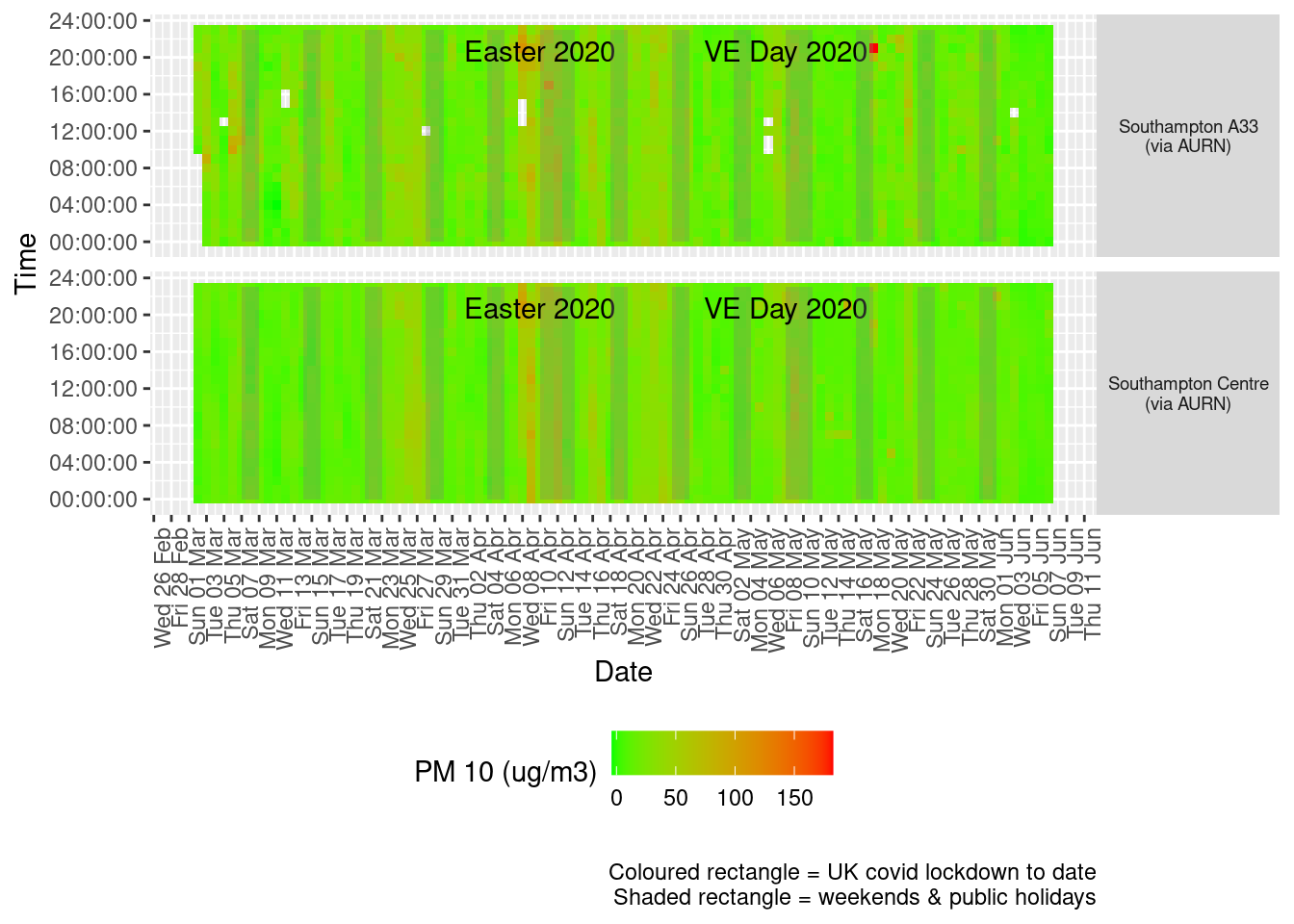
Figure 8.3: PM10 levels, Southampton (hourly, recent)
Figure 8.4 shows the most recent mean daily values compared to previous years.
plotDT <- pm10dt[site %like% "via AURN" & fixedDate <= lubridate::today() & fixedDate >= myParams$comparePlotCut,
    .(meanVal = mean(value), medianVal = median(value), nSites = uniqueN(site)), keyby = .(fixedDate, compareYear,
        site)]

# final plot - adds annotations
yMin <- min(plotDT$mean)
yMax <- max(plotDT$mean)

p <- compareYearsPlot(plotDT, xVar = "fixedDate", yVar = "meanVal", colVar = "compareYear")
p <- addLockdownRectDate(p, yMin, yMax) + geom_hline(yintercept = myParams$dailyPm10Threshold_WHO) + labs(x = "Date",
    y = "Daily mean", caption = paste0(myParams$lockdownCap, myParams$weekendCap, "\nReference line = WHO daily threshold (",
        myParams$dailyPm10Threshold_WHO, ")"))
p <- addWeekendsDate(p, yMin, yMax)
p + facet_grid(site ~ .) + theme(strip.text.y.right = element_text(angle = 90))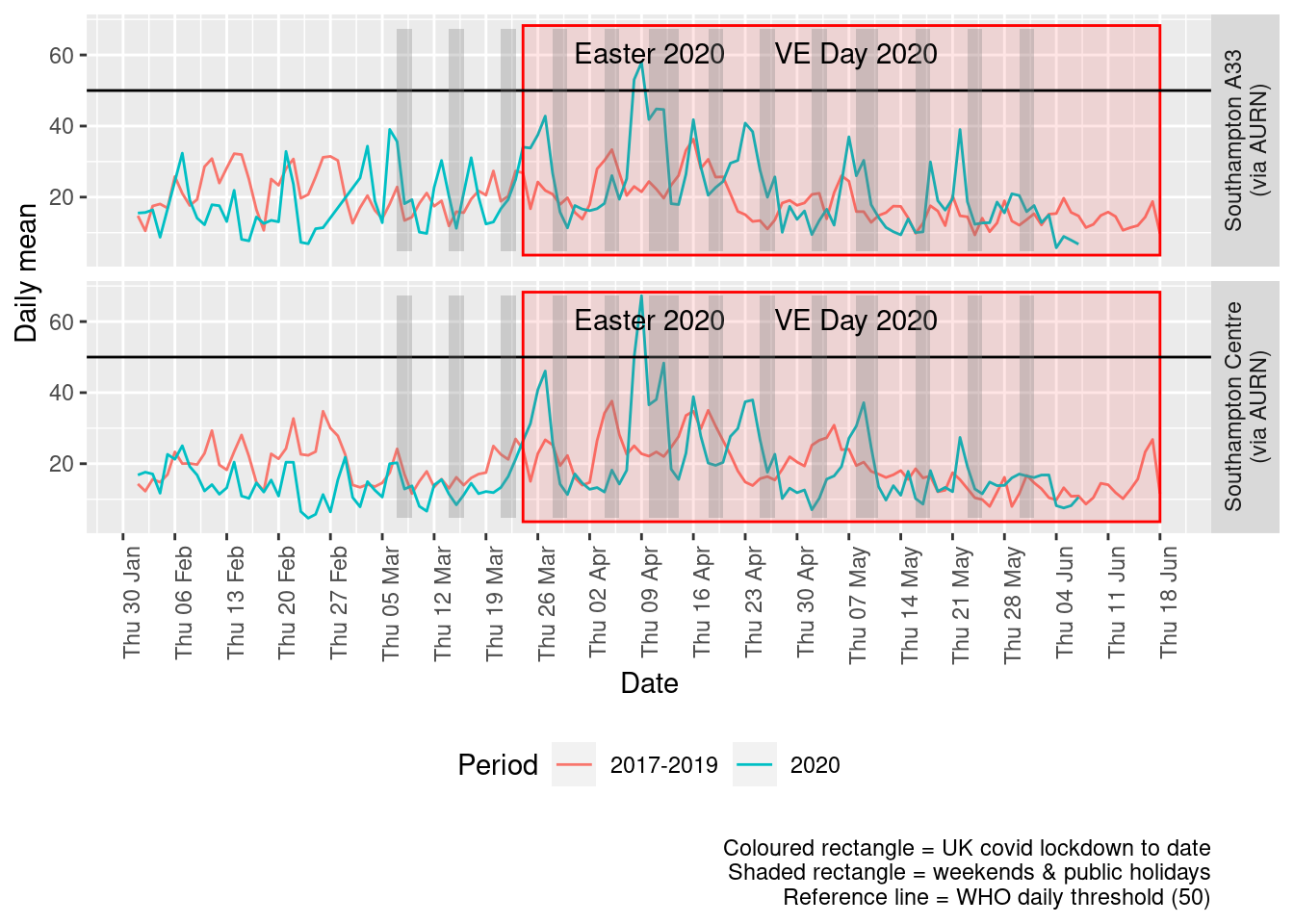
Figure 8.4: PM10 levels, Southampton (daily mean)
Figure 8.5 and 8.6 show the % difference between the daily and weekly means for 2020 vs 2017-2019 (reference period).
dailyDT <- makeDailyComparisonDT(pm10dt[site %like% "via AURN" & fixedDate >= myParams$comparePlotCut])

p <- compareYearsDiffPlotDaily(dailyDT) + labs(caption = paste0(myParams$lockdownCap))

yMin <- min(dailyDT$pcDiffMean)
yMax <- max(dailyDT$pcDiffMean)
print(paste0("Max drop %:", round(yMin)))
## [1] "Max drop %:-79"print(paste0("Max increase %:", round(yMax)))## [1] "Max increase %:203"p <- addLockdownRectDate(p, yMin, yMax)
addWeekendsDate(p, yMin, yMax)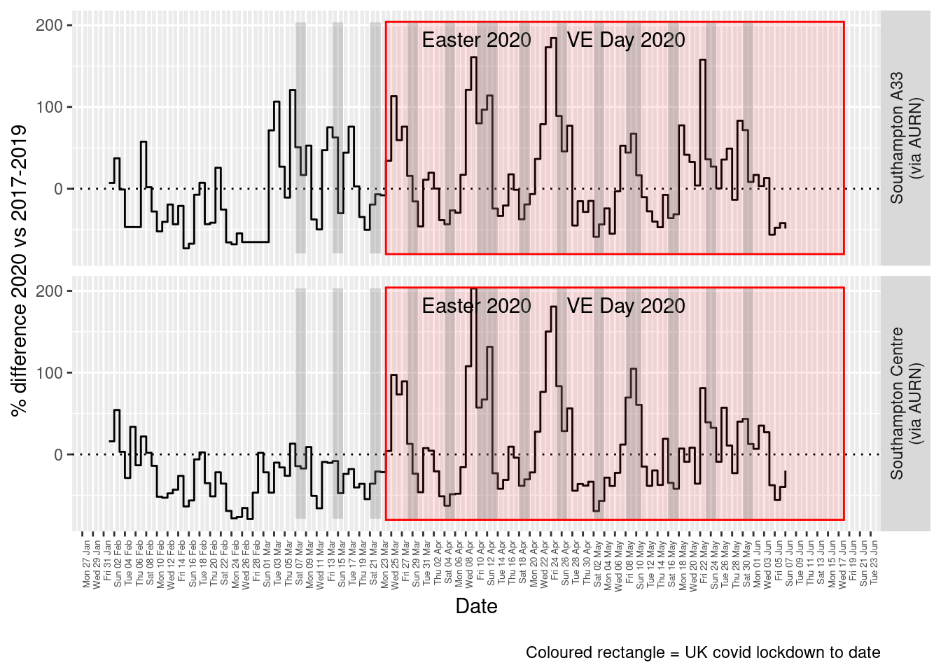
Figure 8.5: % difference in daily mean PM10 levels 2020 vs 2017-2019, Southampton
weeklyDT <- makeWeeklyComparisonDT(pm10dt[site %like% "via AURN" & fixedDate >= myParams$comparePlotCut])

p <- compareYearsDiffPlotWeekly(weeklyDT, ldStart = myParams$lockDownStartDate, ldEnd = myParams$lockDownEndDate) +
    labs(caption = paste0(myParams$lockdownCap))

yMin <- min(weeklyDT$pcDiffMean)
yMax <- max(weeklyDT$pcDiffMean)
print(paste0("Max drop %:", round(yMin)))
## [1] "Max drop %:-46"print(paste0("Max increase %:", round(yMax)))## [1] "Max increase %:81"addLockdownRectWeek(p, yMin, yMax)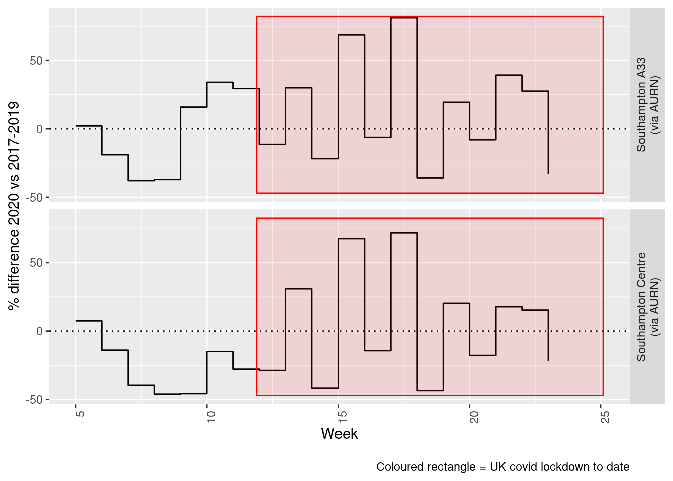
Figure 8.6: % difference in weekly mean PM10 levels 2020 vs 2017-2019, Southampton
Beware seasonal trends and meteorological affects
9 PM 2.5
yLab <- "PM 2.5 (ug/m3)"
pm25dt <- fixedDT[pollutant == "pm2.5"]
Figure 9.1 shows the PM10 trend over time. Is lockdown below trend?
pm25dt[, `:=`(date, as.Date(dateTimeUTC))]  # set date to date for this one

oaPM25 <- openair::TheilSen(pm25dt[date < as.Date("2020-06-01")], "value", ylab = "PM2.5", deseason = TRUE, xlab = "Year",
    date.format = "%Y", date.breaks = 4)
## [1] "Taking bootstrap samples. Please wait."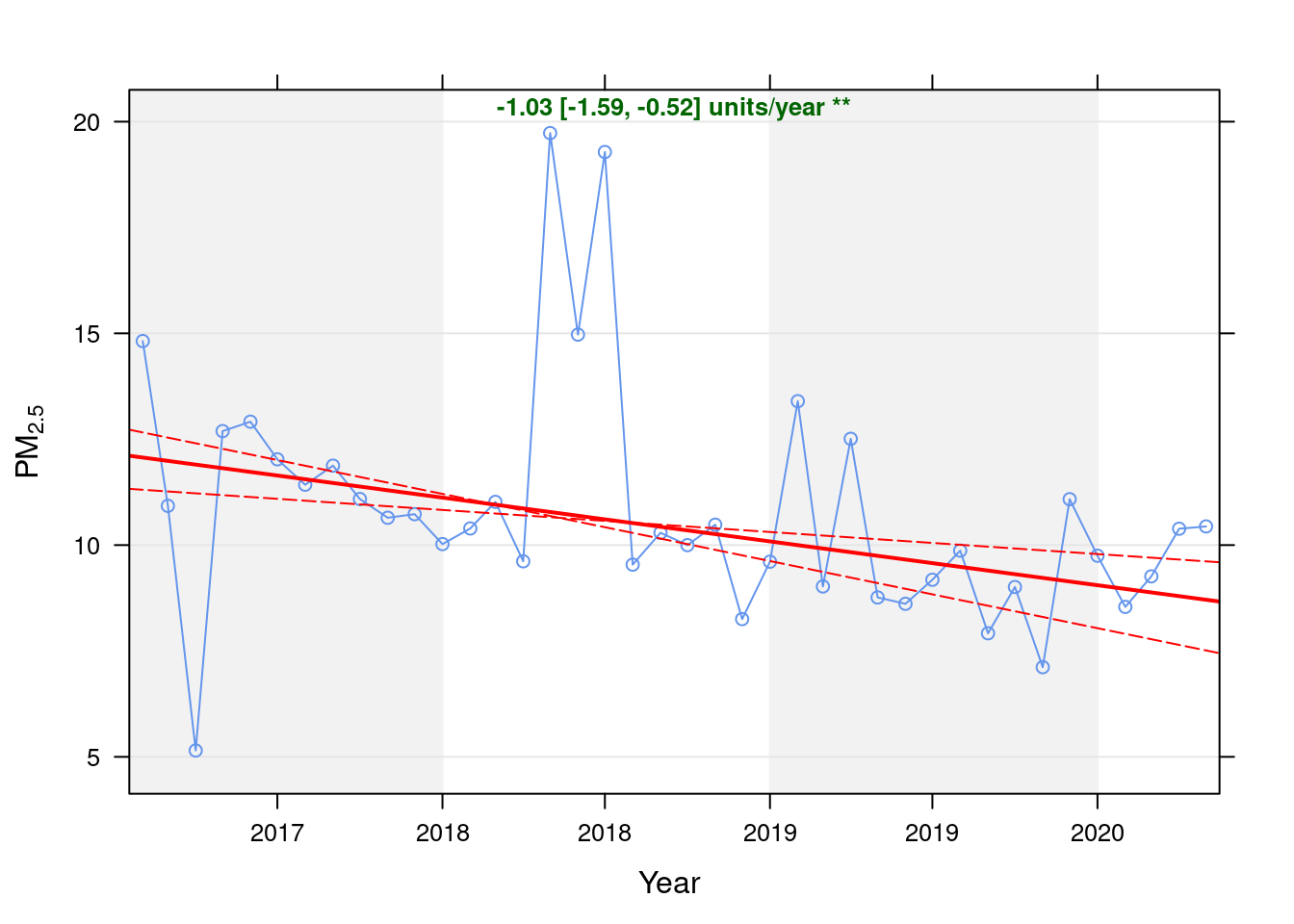
Figure 9.1: Theil-Sen de-seasoned trend (PM2.5)
t <- getModelTrendTable(oaPM25, fname = "PM2.5")

ft <- dcast(t[date >= as.Date("2020-01-01") & date < as.Date("2020-06-01")], date ~ ., value.var = c("diff", "pcDiff"))
ft[, `:=`(date, format.Date(date, format = "%b %Y"))]
kableExtra::kable(ft, caption = "Units and % above/below expected", digits = 2) %>% kable_styling()| date | diff | pcDiff |
|---|---|---|
| Jan 2020 | 0.70 | 7.70 |
| Feb 2020 | -0.42 | -4.72 |
| Mar 2020 | 0.38 | 4.27 |
| Apr 2020 | 1.59 | 18.11 |
| May 2020 | 1.73 | 19.89 |
Figure 9.2 shows the most recent hourly data.
recentDT <- pm25dt[!is.na(value) & obsDate > myParams$recentCutDate]
p <- makeDotPlot(recentDT, xVar = "dateTimeUTC", xLab = "Date & Time", yVar = "value", byVar = "site", yLab = yLab)

p <- p + scale_x_datetime(date_breaks = "2 day", date_labels = "%a %d %b") + theme(axis.text.x = element_text(angle = 90,
    hjust = 1)) + labs(caption = paste0(myParams$lockdownCap, myParams$weekendCap, myParams$noThresh))

yMax <- max(recentDT$value)
yMin <- min(recentDT$value)
p <- addLockdownRectDateTime(p, yMin, yMax)
addWeekendsDateTime(p, yMin, yMax)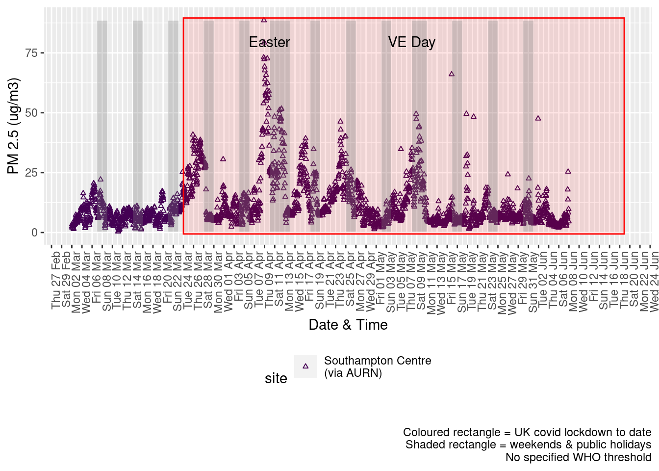
Figure 9.2: PM2.5 levels, Southampton (hourly, recent)
Figure 9.3 shows the most recent hourly data by date and time of day.
recentDT[, `:=`(time, hms::as_hms(dateTimeUTC))]

yMin <- min(recentDT$time)
yMax <- max(recentDT$time)
p <- profileTilePlot(recentDT, yLab)
addWeekendsDate(p, yMin, yMax) + labs(caption = paste0(myParams$lockdownCap, myParams$weekendCap))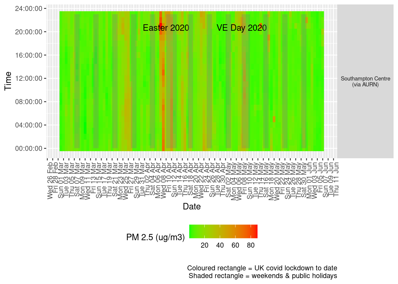
Figure 9.3: PM2.5 levels, Southampton (hourly, recent)
Figure 9.4 shows the most recent mean daily values compared to previous years.
plotDT <- pm25dt[site %like% "via AURN" & fixedDate <= lubridate::today() & fixedDate >= myParams$comparePlotCut,
    .(meanVal = mean(value), medianVal = median(value), nSites = uniqueN(site)), keyby = .(fixedDate, compareYear,
        site)]

# final plot - adds annotations
yMin <- min(plotDT$mean)
yMax <- max(plotDT$mean)

p <- compareYearsPlot(plotDT, xVar = "fixedDate", yVar = "meanVal", colVar = "compareYear")
p <- addLockdownRectDate(p, yMin, yMax) + geom_hline(yintercept = myParams$dailyPm2.5Threshold_WHO) + labs(x = "Date",
    y = "Daily mean", caption = paste0(myParams$lockdownCap, myParams$weekendCap, "\nReference line = WHO daily threshold (",
        myParams$dailyPm2.5Threshold_WHO, ")"))
p <- addWeekendsDate(p, yMin, yMax)
p + facet_grid(site ~ .) + theme(strip.text.y.right = element_text(angle = 90))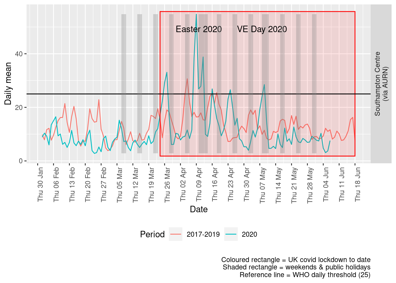
Figure 9.4: PM2.5 levels, Southampton (daily mean)
Figure 9.5 and 9.6 show the % difference between the daily and weekly means for 2020 vs 2017-2019 (reference period).
dailyDT <- makeDailyComparisonDT(pm25dt[site %like% "via AURN" & fixedDate >= myParams$comparePlotCut])

p <- compareYearsDiffPlotDaily(dailyDT) + labs(caption = paste0(myParams$lockdownCap))

yMin <- min(dailyDT$pcDiffMean)
yMax <- max(dailyDT$pcDiffMean)
print(paste0("Max drop %:", round(yMin)))
## [1] "Max drop %:-81"print(paste0("Max increase %:", round(yMax)))## [1] "Max increase %:263"p <- addLockdownRectDate(p, yMin, yMax)
addWeekendsDate(p, yMin, yMax)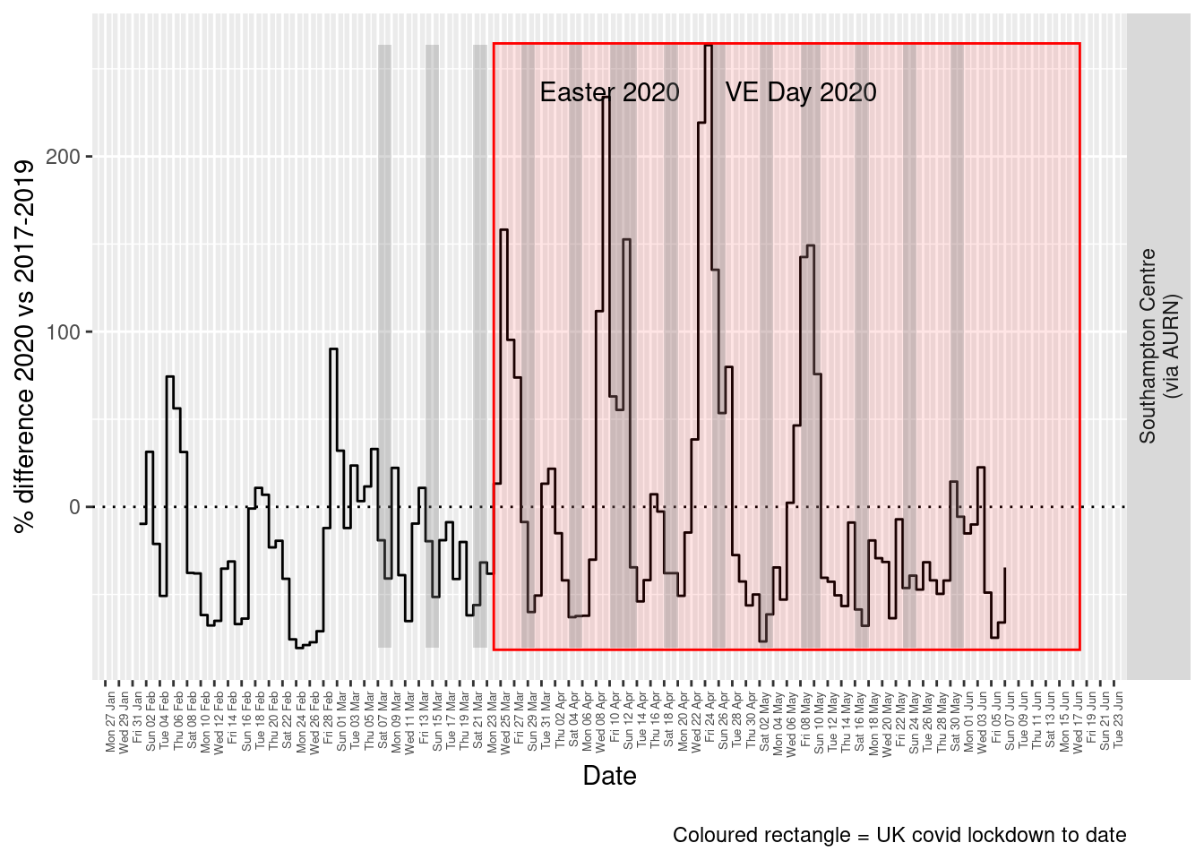
Figure 9.5: % difference in daily mean PM2.5 levels 2020 vs 2017-2019, Southampton
weeklyDT <- makeWeeklyComparisonDT(pm25dt[site %like% "via AURN" & fixedDate >= myParams$comparePlotCut])

p <- compareYearsDiffPlotWeekly(weeklyDT, ldStart = myParams$lockDownStartDate, ldEnd = myParams$lockDownEndDate) +
    labs(caption = paste0(myParams$lockdownCap))

yMin <- min(weeklyDT$pcDiffMean)
yMax <- max(weeklyDT$pcDiffMean)
print(paste0("Max drop %:", round(yMin)))
## [1] "Max drop %:-54"print(paste0("Max increase %:", round(yMax)))## [1] "Max increase %:95"addLockdownRectWeek(p, yMin, yMax)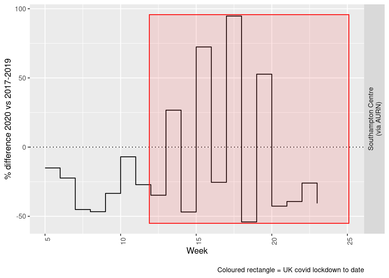
Figure 9.6: % difference in weekly mean PM2.5 levels 2020 vs 2017-2019, Southampton
Beware seasonal trends and meteorological affects
10 Wind direction and speed
As noted above, air pollution levels in any given time period are highly dependent on the prevailing meteorological conditions.
Figure 10.1 shows the wind direction and speed over the period of lockdown and can be compared with the equivalent pollutant level plots above such as Figure 4.2.
# windDT[, .(mean = mean(wd)), keyby = .(site)] # they're identical across AURN sites
windDirDT <- fixedDT[pollutant == "wd" & site %like% "A33"]
windDirDT[, `:=`(wd, value)]
setkey(windDirDT, dateTimeUTC, site, source)
windSpeedDT <- fixedDT[pollutant == "ws" & site %like% "A33"]
windSpeedDT[, `:=`(ws, value)]
setkey(windSpeedDT, dateTimeUTC, site, source)

windDT <- windSpeedDT[windDirDT]
windDT[, `:=`(rTime, hms::as_hms(dateTimeUTC))]
p <- ggplot2::ggplot(windDT[obsDate > as.Date("2020-03-23")], aes(x = dateTimeUTC, y = ws, angle = -wd + 90, colour = ws)) +
    geom_text(label = "→") + theme(legend.position = "bottom") + guides(colour = guide_legend(title = "Wind speed")) +
    scale_color_continuous(high = "#132B43", low = "#56B1F7")  # normal blue reversed


yMin <- min(windDT[obsDate > as.Date("2020-03-23")]$ws)
yMax <- max(windDT[obsDate > as.Date("2020-03-23")]$ws)
p <- addWeekendsDateTime(p, yMin, yMax)
# p <- addLockdownRectDateTime(p, yMin, yMax)
p <- p + labs(y = "Wind speed", x = "Time", caption = paste0(myParams$weekendCap)) + theme(axis.text.x = element_text(angle = 90,
    hjust = 1, size = 9))
p + xlim(lubridate::as_datetime("2020-03-23 23:59:59"), NA)  # do this last otherwise adding the weekends takes the plot back to the earliest weekend we annotate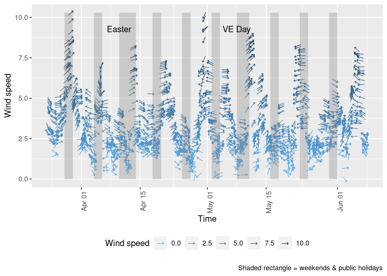
Figure 10.1: Wind direction and speed in Southampton since 23rd March 2020
Figure 10.2 shows a windrose for each of the periods of low/high pollutant levels visible in Figure 4.5:
- 26 March - 4 April (lower NO2)
- 7 April - 12 April (higher NO2)
- 16 April - 23 April (lower NO2)
The windroses indicate the direction the prevailing wind was blowing from and the colour of the 'paddles' indicates the strength while the length of the paddles indicates the proportion of observations. As we can see there are clear differences in the wind conditions which correlate with the pollution patterns observed:
- the first period with low NO2 was dominated by north-north easterly winds (likely to bring city and motorway air);
- the second period when NO2 and particulates were high was dominated by low speed south easterly winds (bringing continental air);
- the third period when NO2 was low was again dominated by north easterly winds.
fixedDT[, `:=`(aqPeriod, ifelse(obsDate >= as.Date("2020-03-26") & obsDate <= as.Date("2020-04-04"), "Period 1 - Low: 26/3 - 4/4",
    NA))]
fixedDT[, `:=`(aqPeriod, ifelse(obsDate >= as.Date("2020-04-07") & obsDate <= as.Date("2020-04-12"), "Period 2 - High: 7/4 - 12/4",
    aqPeriod))]
fixedDT[, `:=`(aqPeriod, ifelse(obsDate >= as.Date("2020-04-16") & obsDate <= as.Date("2020-04-23"), "Period 3 - Low: 16/4 - 23/4",
    aqPeriod))]

plotDT <- fixedDT[!is.na(aqPeriod) & (pollutant == "ws" | pollutant == "wd") & site %like% "A33"]

t <- plotDT[, .(start = min(dateTimeUTC), end = max(dateTimeUTC)), keyby = .(aqPeriod)]

kableExtra::kable(t, caption = "Check period start/end times") %>% kable_styling()| aqPeriod | start | end |
|---|---|---|
| Period 1 - Low: 26/3 - 4/4 | 2020-03-26 | 2020-04-04 23:00:00 |
| Period 2 - High: 7/4 - 12/4 | 2020-04-07 | 2020-04-12 23:00:00 |
| Period 3 - Low: 16/4 - 23/4 | 2020-04-16 | 2020-04-23 23:00:00 |
# make a dt openair will accept
wdDT <- plotDT[pollutant == "wd", .(dateTimeUTC, site, wd = value, aqPeriod)]
setkey(wdDT, dateTimeUTC, site, aqPeriod)
wsDT <- plotDT[pollutant == "ws", .(dateTimeUTC, site, ws = value, aqPeriod)]
setkey(wsDT, dateTimeUTC, site, aqPeriod)
wrDT <- wdDT[wsDT]
openair::windRose(wrDT, type = "aqPeriod")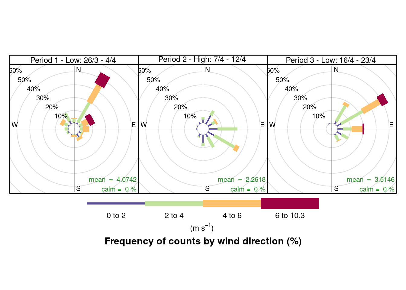
Figure 10.2: Wind rose for Southampton sites since 23rd March 2020
11 Save data
Save long form fixed-date data to savedData for re-use.
fixedDT[, `:=`(weekDay, lubridate::wday(dateTimeUTC, label = TRUE, abbr = TRUE))]
f <- paste0(here::here(), "/savedData/sotonExtract2017_2020_v2.csv")
data.table::fwrite(fixedDT, f)
dkUtils::gzipIt(f)
Saved data description:
skimr::skim(fixedDT)| Name | fixedDT |
| Number of rows | 705536 |
| Number of columns | 19 |
| _______________________ | |
| Column type frequency: | |
| character | 6 |
| Date | 3 |
| factor | 4 |
| numeric | 5 |
| POSIXct | 1 |
| ________________________ | |
| Group variables | None |
Variable type: character
| skim_variable | n_missing | complete_rate | min | max | empty | n_unique | whitespace |
|---|---|---|---|---|---|---|---|
| pollutant | 0 | 1.00 | 2 | 5 | 0 | 13 | 0 |
| source | 0 | 1.00 | 4 | 8 | 0 | 2 | 0 |
| site | 0 | 1.00 | 26 | 38 | 0 | 4 | 0 |
| ratified | 0 | 1.00 | 1 | 1 | 0 | 3 | 0 |
| compareYear | 0 | 1.00 | 4 | 9 | 0 | 2 | 0 |
| aqPeriod | 695980 | 0.01 | 26 | 27 | 0 | 3 | 0 |
Variable type: Date
| skim_variable | n_missing | complete_rate | min | max | median | n_unique |
|---|---|---|---|---|---|---|
| obsDate | 0 | 1 | 2017-01-01 | 2020-06-07 | 2018-09-02 | 1254 |
| date2020 | 0 | 1 | 2020-01-01 | 2020-12-30 | 2020-06-06 | 365 |
| fixedDate | 0 | 1 | 2019-12-29 | 2020-12-29 | 2020-06-05 | 367 |
Variable type: factor
| skim_variable | n_missing | complete_rate | ordered | n_unique | top_counts |
|---|---|---|---|---|---|
| origDoW | 0 | 1 | TRUE | 7 | Sat: 101713, Sun: 101470, Fri: 101241, Wed: 100565 |
| day2020 | 0 | 1 | TRUE | 7 | Wed: 111805, Mon: 101210, Tue: 101007, Fri: 100141 |
| fixedDoW | 0 | 1 | TRUE | 7 | Sat: 101713, Sun: 101470, Fri: 101241, Wed: 100565 |
| weekDay | 0 | 1 | TRUE | 7 | Sat: 101713, Sun: 101470, Fri: 101241, Wed: 100565 |
Variable type: numeric
| skim_variable | n_missing | complete_rate | mean | sd | p0 | p25 | p50 | p75 | p100 | hist |
|---|---|---|---|---|---|---|---|---|---|---|
| value | 0 | 1 | 40.79 | 68.33 | -9.6 | 4.83 | 15.59 | 42.00 | 1058.00 | ▇▁▁▁▁ |
| year | 0 | 1 | 2018.19 | 0.98 | 2017.0 | 2017.00 | 2018.00 | 2019.00 | 2020.00 | ▇▇▁▇▂ |
| month | 0 | 1 | 6.13 | 3.47 | 1.0 | 3.00 | 6.00 | 9.00 | 12.00 | ▇▅▅▅▆ |
| decimalDate | 0 | 1 | 2018.65 | 0.96 | 2017.0 | 2017.82 | 2018.67 | 2019.46 | 2020.43 | ▇▇▇▇▆ |
| weekNo | 0 | 1 | 24.79 | 15.15 | 1.0 | 12.00 | 23.00 | 38.00 | 53.00 | ▇▇▆▆▆ |
Variable type: POSIXct
| skim_variable | n_missing | complete_rate | min | max | median | n_unique |
|---|---|---|---|---|---|---|
| dateTimeUTC | 0 | 1 | 2017-01-01 | 2020-06-07 23:00:00 | 2018-09-02 20:00:00 | 30096 |
Saved data sites by year:
t <- table(fixedDT$site, fixedDT$year)

kableExtra::kable(t, caption = "Sites available by year") %>% kable_styling()| 2017 | 2018 | 2019 | 2020 | |
|---|---|---|---|---|
| Southampton - Onslow Road (near RSH) | 25307 | 25755 | 24762 | 6408 |
| Southampton - Victoria Road (Woolston) | 19251 | 23091 | 11541 | 6195 |
| Southampton A33 (via AURN) | 67278 | 62214 | 65751 | 24767 |
| Southampton Centre (via AURN) | 103806 | 100155 | 105871 | 33384 |
Saved pollutants by site:
t <- table(fixedDT$site, fixedDT$pollutant)

kableExtra::kable(t, caption = "Pollutants available by site") %>% kable_styling()| no | no2 | nox | nv10 | nv2.5 | o3 | pm10 | pm2.5 | so2 | v10 | v2.5 | wd | ws | |
|---|---|---|---|---|---|---|---|---|---|---|---|---|---|
| Southampton - Onslow Road (near RSH) | 27412 | 27408 | 27412 | 0 | 0 | 0 | 0 | 0 | 0 | 0 | 0 | 0 | 0 |
| Southampton - Victoria Road (Woolston) | 20026 | 20026 | 20026 | 0 | 0 | 0 | 0 | 0 | 0 | 0 | 0 | 0 | 0 |
| Southampton A33 (via AURN) | 29641 | 29640 | 29640 | 23208 | 0 | 0 | 25681 | 0 | 0 | 23208 | 0 | 29496 | 29496 |
| Southampton Centre (via AURN) | 28657 | 28657 | 28658 | 21105 | 22627 | 28645 | 26180 | 27702 | 28261 | 21105 | 22627 | 29496 | 29496 |
NB:
- ws = wind speed
- wd = wind direction
- v* = volatiles
We have also produced wind/pollution roses for these sites.
12 About
12.1 Code
Source:
History:
12.3 Citation
If you wish to refer to any of the material from this report please cite as:
- Anderson, B., (2020) Air Quality in Southampton (UK): Exploring the effect of UK covid 19 lockdown on air quality , Sustainable Energy Research Group, University of Southampton: Southampton, UK.
Report circulation:
- Public
This work is (c) 2020 the University of Southampton and is part of a collection of air quality data analyses.
13 Annex
13.1 Missing data
Several of these datasets suffer from missing data or have stopped updating. This is visualised below for all data for all sites from January 2020.
For example 13.1 shows missing data patterns for Nitrogen Dioxide.
# dt,xvar, yvar,fillVar, yLab
yLab <- "NO2"
tileDT <- fixedDT[pollutant == "no2" & dateTimeUTC > as.Date("2020-02-01") & !is.na(value)]
p <- makeTilePlot(tileDT, xVar = "dateTimeUTC", xLab = "Date & Time", yVar = "site", fillVar = "value", yLab = yLab)

p + scale_x_datetime(date_breaks = "7 day", date_labels = "%a %d %b") + theme(axis.text.x = element_text(angle = 90,
    hjust = 1))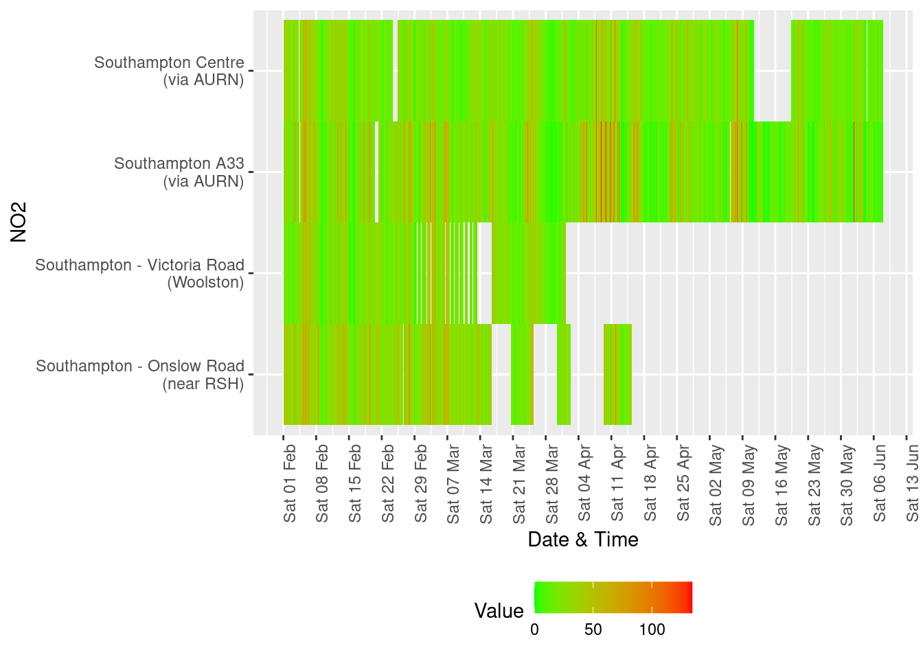
Figure 13.1: Nitrogen Dioxide data availability and levels over time
yLab <- "NOx"
# dt,xvar, yvar,fillVar, yLab
tileDT <- fixedDT[pollutant == "nox" & dateTimeUTC > as.Date("2020-02-01") & !is.na(value)]
p <- makeTilePlot(tileDT, xVar = "dateTimeUTC", xLab = "Date & Time", yVar = "site", fillVar = "value", yLab = yLab)

p + scale_x_datetime(date_breaks = "7 day", date_labels = "%a %d %b") + theme(axis.text.x = element_text(angle = 90,
    hjust = 1))
Figure 13.2: Oxides of nitrogen data availability and levels over time
yLab <- "SO2"
# dt,xvar, yvar,fillVar, yLab
tileDT <- fixedDT[pollutant == "so2" & dateTimeUTC > as.Date("2020-02-01") & !is.na(value)]
p <- makeTilePlot(tileDT, xVar = "dateTimeUTC", xLab = "Date & Time", yVar = "site", fillVar = "value", yLab = yLab)

p + scale_x_datetime(date_breaks = "7 day", date_labels = "%a %d %b") + theme(axis.text.x = element_text(angle = 90,
    hjust = 1))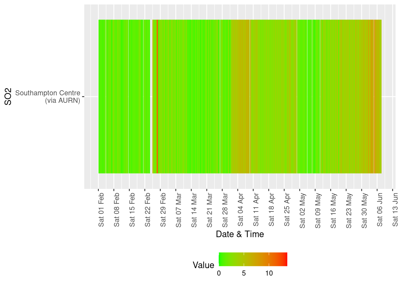
Figure 13.3: Sulphour Dioxide data availability and levels over time
yLab <- "O3"
tileDT <- fixedDT[pollutant == "o3" & dateTimeUTC > as.Date("2020-02-01") & !is.na(value)]
p <- makeTilePlot(tileDT, xVar = "dateTimeUTC", xLab = "Date & Time", yVar = "site", fillVar = "value", yLab = yLab)

p + scale_x_datetime(date_breaks = "7 day", date_labels = "%a %d %b") + theme(axis.text.x = element_text(angle = 90,
    hjust = 1))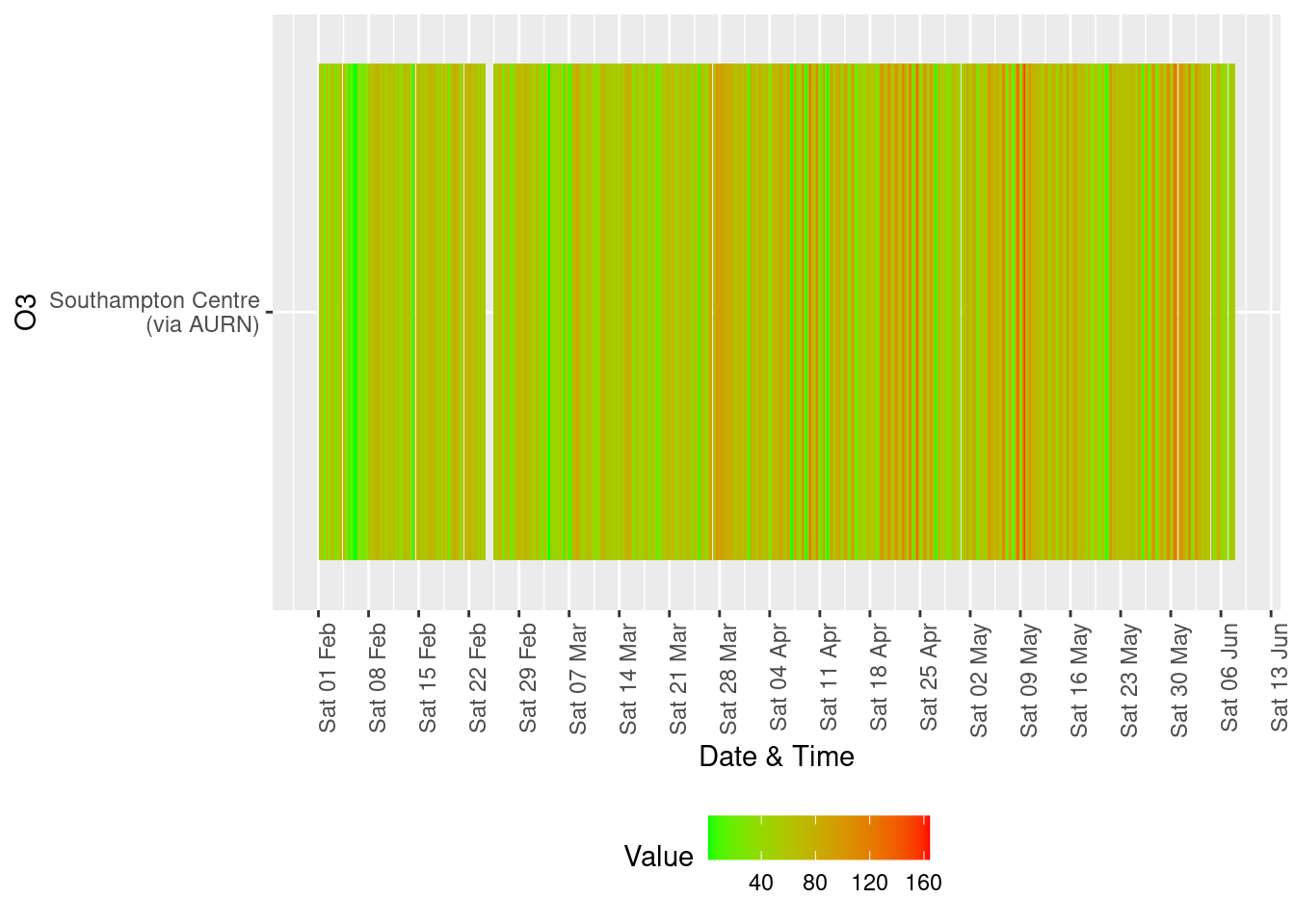
Figure 13.4: Availability and level of o3 data over time
yLab <- "PM10"
tileDT <- fixedDT[pollutant == "pm10" & dateTimeUTC > as.Date("2020-02-01") & !is.na(value)]
p <- makeTilePlot(tileDT, xVar = "dateTimeUTC", xLab = "Date & Time", yVar = "site", fillVar = "value", yLab = yLab)

p + scale_x_datetime(date_breaks = "7 day", date_labels = "%a %d %b") + theme(axis.text.x = element_text(angle = 90,
    hjust = 1))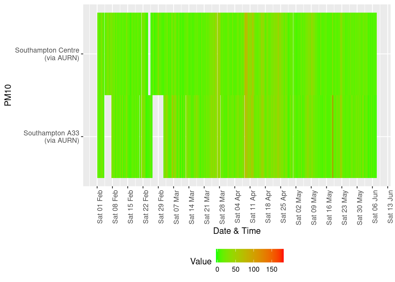
Figure 13.5: Availability and level of PM 10 data over time
yLab <- "PM2.5"
tileDT <- fixedDT[pollutant == "pm2.5" & dateTimeUTC > as.Date("2020-02-01") & !is.na(value)]
p <- makeTilePlot(tileDT, xVar = "dateTimeUTC", xLab = "Date & Time", yVar = "site", fillVar = "value", yLab = yLab)

p + scale_x_datetime(date_breaks = "7 day", date_labels = "%a %d %b") + theme(axis.text.x = element_text(angle = 90,
    hjust = 1))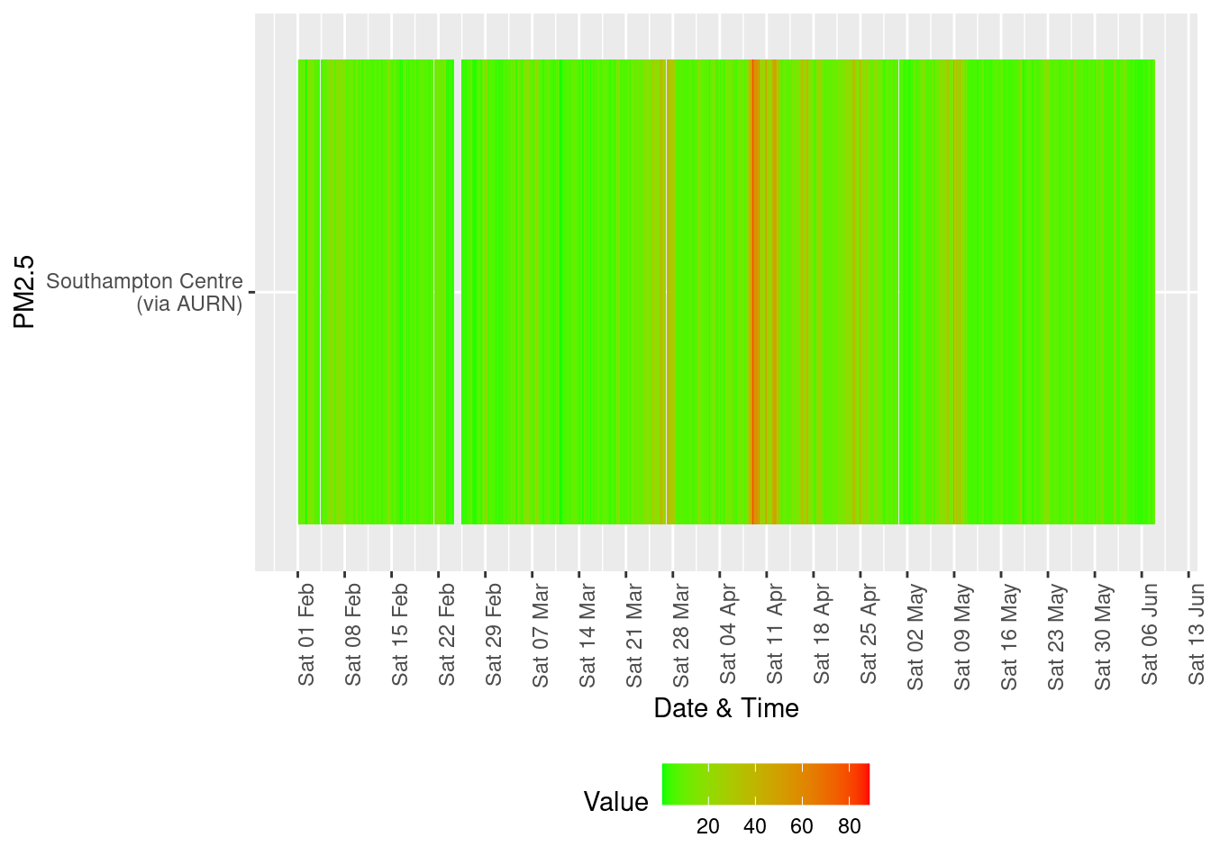
Figure 13.6: Availability and level of PM 2.5 data over time
13.2 Ship activity
Exploration of correlations between wind direction, recorded ship activity and pollutants.
Data:
- Air quality: AURN
- Ship counts: Western docks forum
- WHO reference thresholds: https://www.who.int/news-room/fact-sheets/detail/ambient-(outdoor)-air-quality-and-health
It is important to consider the relative locations of the air quality stations and the port activities when interpreting this data. The map below shows the rough location of the stations (coloured circles: green 2 = A33, orange 4 = City Centre) as well as the locations of monitoring stations that, as of June 4th 2020, are not collecting data.

Latest air quality snaphot (June 4th 2020)
shipsDailyDT <- data.table::fread(paste0(aqParams$SCCdataPath, "/shipNumbers/shipNumbersSouthampton.csv"))
shipsDailyDT[, `:=`(rDate, lubridate::dmy(Date))]
shipsDailyDT <- shipsDailyDT[!is.na(rDate)]
# summary(shipsDailyDT$rDate)

shipsDailyDT[, `:=`(allShips, cargo + max_cruise)]
shipsDailyDT[, `:=`(allShipsCoded, ifelse(allShips == 0, "0", NA))]
shipsDailyDT[, `:=`(allShipsCoded, ifelse(allShips == 1 | allShips == 2, "1-2", allShipsCoded))]
shipsDailyDT[, `:=`(allShipsCoded, ifelse(allShips == 3 | allShips == 4, "3-4", allShipsCoded))]
shipsDailyDT[, `:=`(allShipsCoded, ifelse(allShips == 5 | allShips == 6, "5-6", allShipsCoded))]
shipsDailyDT[, `:=`(allShipsCoded, ifelse(allShips > 6, "7+", allShipsCoded))]

# re-code all ships to something more intuitive than openair does
shipsDailyDT[, `:=`(maxCruiseCoded, ifelse(max_cruise == 0, "0", NA))]
shipsDailyDT[, `:=`(maxCruiseCoded, ifelse(max_cruise == 1 | max_cruise == 2, "1-2", maxCruiseCoded))]
shipsDailyDT[, `:=`(maxCruiseCoded, ifelse(max_cruise == 3 | max_cruise == 4, "3-4", maxCruiseCoded))]
shipsDailyDT[, `:=`(maxCruiseCoded, ifelse(max_cruise > 4, "5+", maxCruiseCoded))]
t <- with(shipsDailyDT, table(maxCruiseCoded, allShipsCoded))

kableExtra::kable(addmargins(t), caption = "Number of days with max n cruise ships (rows) vs all ships") %>% kable_styling()| 1-2 | 3-4 | 5-6 | 7+ | Sum | |
|---|---|---|---|---|---|
| 0 | 1 | 0 | 0 | 0 | 1 |
| 1-2 | 4 | 0 | 0 | 0 | 4 |
| 3-4 | 0 | 15 | 12 | 3 | 30 |
| 5+ | 0 | 0 | 14 | 12 | 26 |
| Sum | 5 | 15 | 26 | 15 | 61 |
dailyNO2DT <- no2dt[obsDate >= as.Date("2020-04-01"), .(meanNO2 = mean(value), maxNO2 = max(value), nObs = .N),
    keyby = .(site, rDate = obsDate)]
dailyPM10DT <- pm10dt[obsDate >= as.Date("2020-04-01"), .(meanPM10 = mean(value), maxPM10 = max(value), nObs = .N),
    keyby = .(site, rDate = obsDate)]
# summary(dailyNO2DT$rDate)

windDirDT <- fixedDT[pollutant == "wd", .(site, dateTimeUTC, wd = value)]
windSpeedDT <- fixedDT[pollutant == "ws", .(site, dateTimeUTC, ws = value)]
setkey(windDirDT, site, dateTimeUTC)
setkey(windSpeedDT, site, dateTimeUTC)
windDT <- windSpeedDT[windDirDT]
dailyWindDT <- windDT[dateTimeUTC >= as.Date("2020-04-01"), .(meanWd = mean(wd), meanWs = mean(ws), nObs = .N),
    keyby = .(site, rDate = as.Date(dateTimeUTC))]


setkey(shipsDailyDT, rDate)
setkey(dailyNO2DT, rDate)
setkey(dailyPM10DT, rDate)

plotNO2DT <- shipsDailyDT[dailyNO2DT]
plotNO2DT <- plotNO2DT[!is.na(cruise)]  # filter out

plotPM10DT <- shipsDailyDT[dailyPM10DT]
plotPM10DT <- plotPM10DT[!is.na(cruise)]  # filter out

setkey(dailyWindDT, site, rDate)
setkey(plotNO2DT, site, rDate)
plotNO2DT <- dailyWindDT[plotNO2DT[site %like% "AURN"]]  # keep AURN only

setkey(dailyWindDT, site, rDate)
setkey(plotPM10DT, site, rDate)
plotPM10DT <- dailyWindDT[plotPM10DT[site %like% "AURN"]]  # keep AURN only
# nrow(plotDT)
Table 13.1 shows the number of days for which there are different maximum numbers of cruise ships (rows) and total cargo and cruise ships (columns). There is only 1 day when there are 0 cruise ships and no days when there are 0 ships. The sparseness of the data (only 61 days) and the relative lack of variation in ship numbers means that a relationship between ship numbers and pollution will be difficult to detect.
In addition, and most importantly, these analyses only show correlations. It it quite possible, for example, that higher pollution levels are due to prevailing environmental/meteorological conditions that happen to coincide with more ships.
13.2.1 NO2
Figures 13.7 and 13.8 shows the distribution of mean and max daily NO2 by maximum cruise ship counts for the day. There are no clear relationships.
myCap <- "April & May 2020 \nSources: AURN hourly observations & Western docks forum"

ggplot2::ggplot(plotNO2DT, aes(x = maxCruiseCoded, y = meanNO2, group = maxCruiseCoded, color = site)) + geom_boxplot() +
    labs(x = "Max number of cruise ships", y = "Mean daily NO2", caption = myCap) + facet_grid(. ~ site)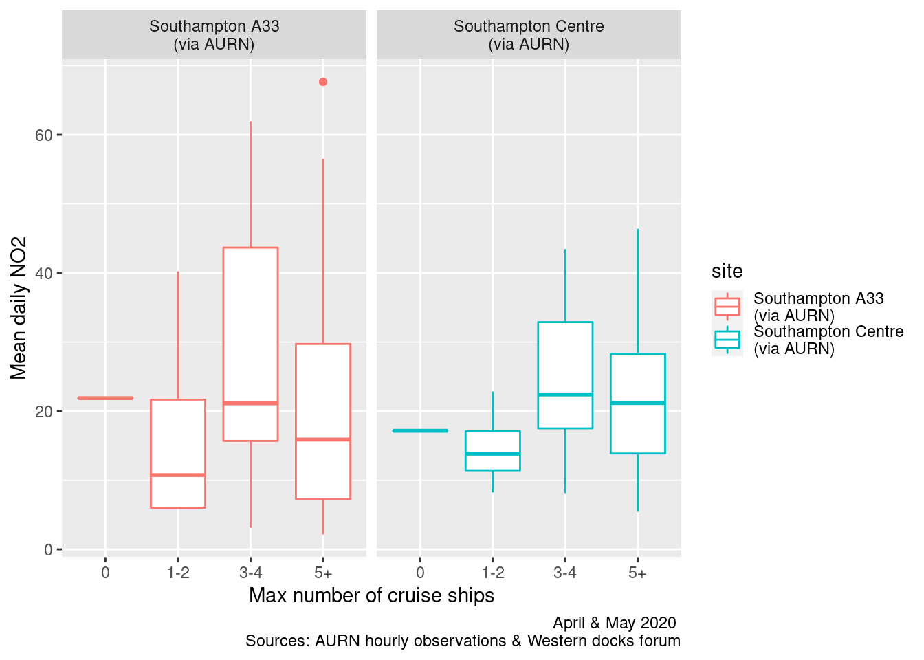
Figure 13.7: Box plots of daily mean NO2 by maximum cruise ship counts
ggplot2::ggplot(plotNO2DT, aes(x = maxCruiseCoded, y = maxNO2, group = maxCruiseCoded, color = site)) + geom_boxplot() +
    labs(x = "Max number of cruise ships", y = "Max daily NO2", caption = paste0(myCap, "\nReference line: WHO hourly threshold")) +
    facet_grid(. ~ site) + geom_hline(yintercept = myParams$hourlyNo2Threshold_WHO)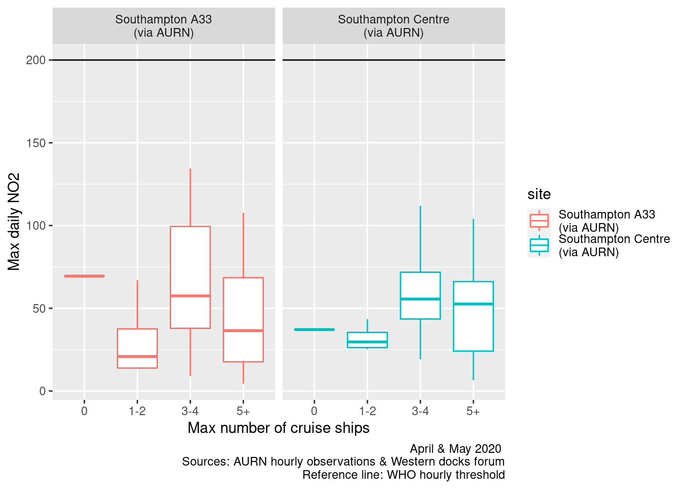
Figure 13.8: Box plots of daily max NO2 by maximum cruise ship counts
Figures 13.9 and 13.10 repeats this for all ships. In this case there appears to be slightly more of a rising trend as the number of ships increases.
ggplot2::ggplot(plotNO2DT, aes(x = allShipsCoded, y = meanNO2, group = allShipsCoded, color = site)) + geom_boxplot() +
    labs(x = "Max number of ships", y = "Mean daily NO2 (hourly observations)", caption = myCap) + facet_grid(. ~
    site)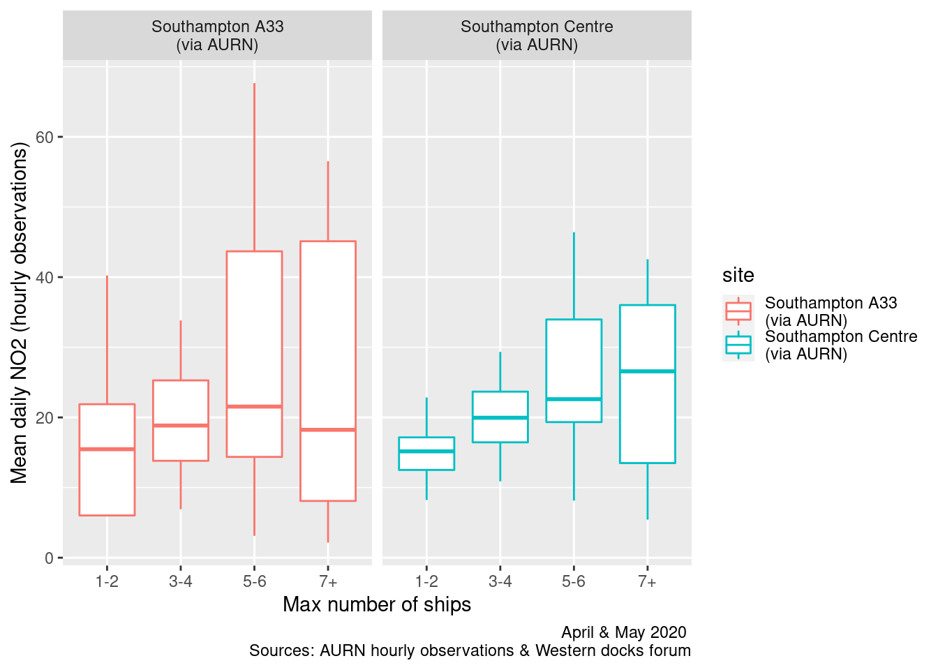
Figure 13.9: Box plots of daily mean NO2 by cargo + cruise ship counts
ggplot2::ggplot(plotNO2DT, aes(x = allShipsCoded, y = maxNO2, group = allShipsCoded, color = site)) + geom_boxplot() +
    labs(x = "Max number of ships", y = "Max daily NO2 (hourly observations)", caption = paste0(myCap, "\nReference line: WHO hourly threshold")) +
    facet_grid(. ~ site) + geom_hline(yintercept = myParams$hourlyNo2Threshold_WHO)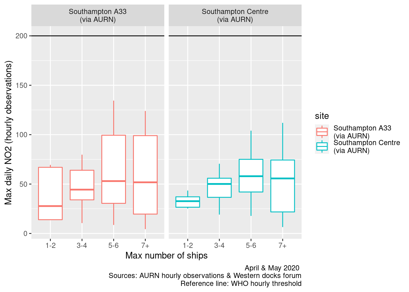
Figure 13.10: Box plots of daily max NO2 by cargo + cruise ship counts
Figures 13.11 and 13.12 show pollution roses for daily mean and daily max NO2 by the maximum number of cruise ships alongside per day. These show the most frequent wind directions (wind rose) overlain by the proportion of pollution concentrations in the calculated groups.
It appears that when the wind is from the South East/East and more cruise ships are alongside then higher levels of NO2 are more frequent. But this could also be due to wind-blown continental pollution when the wind is from this direction as was known to be the case during April 2020.
plotNO2DT[, `:=`(wd, meanWd)]
plotNO2DT[, `:=`(ws, meanWs)]
plotNO2DT[site %like% "A33", `:=`(shortSite, "A33")]
plotNO2DT[site %like% "Centre", `:=`(shortSite, "Centre")]

openair::pollutionRose(plotNO2DT[max_cruise != 0], pollutant = "meanNO2", type = c("maxCruiseCoded", "shortSite"))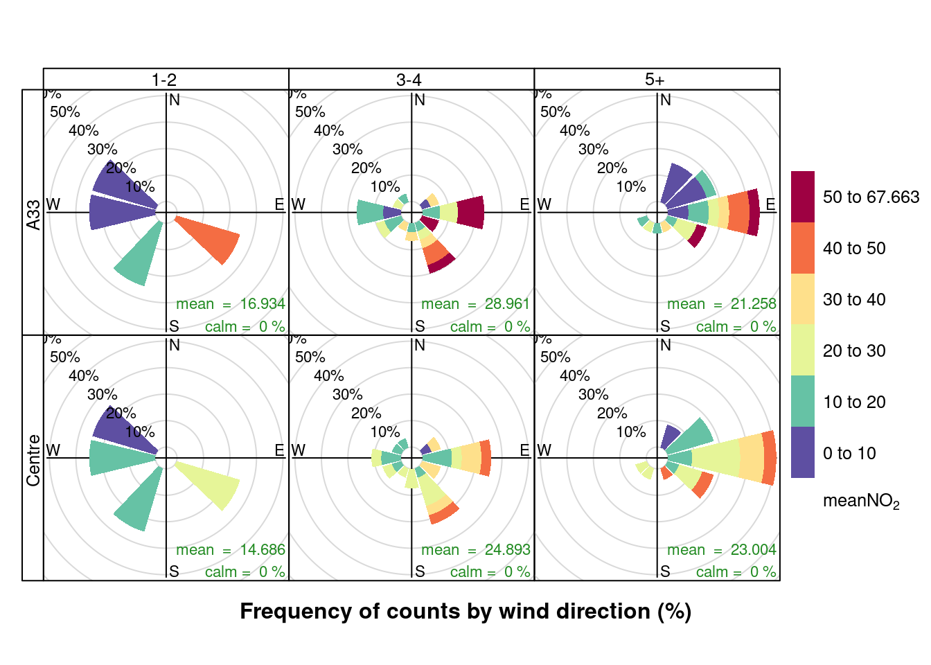
Figure 13.11: Pollution rose for mean NO2 for April & May 2020 by max number of cruise ships (AURN sites, single day with 0 cruise ships excluded)
openair::pollutionRose(plotNO2DT[max_cruise != 0], pollutant = "maxNO2", type = c("maxCruiseCoded", "shortSite"))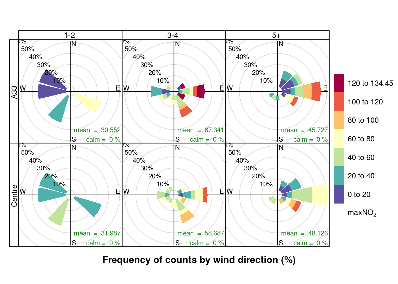
Figure 13.12: Pollution rose for max NO2 for April & May 2020 by max number of cruise ships (AURN sites, single day with 0 cruise ships excluded)
Figures 13.13 and 13.14 show pollution roses for daily mean and daily max NO2 by the number of all ships alongside per day. As we would expect, these plots appear to show a similar effect.
openair::pollutionRose(plotNO2DT, pollutant = "meanNO2", type = c("allShipsCoded", "shortSite"))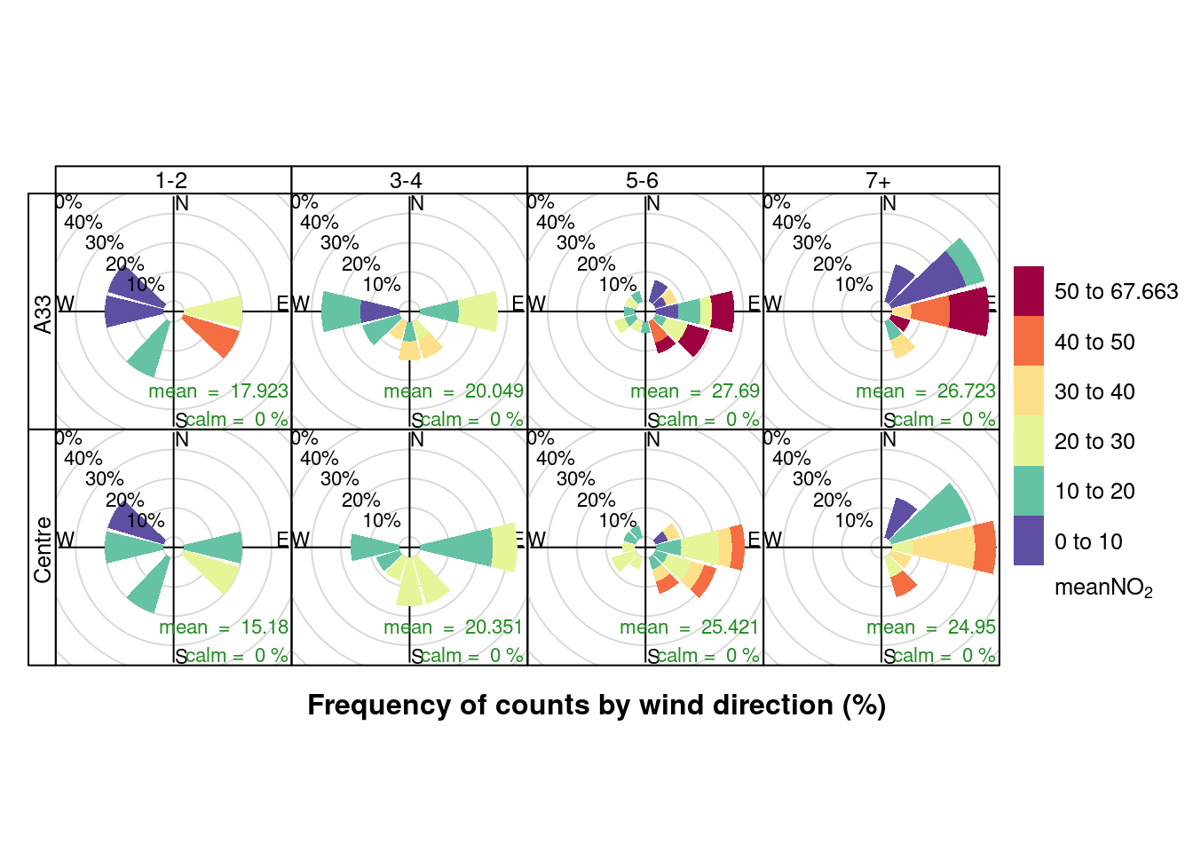
Figure 13.13: Pollution rose for mean NO2 for April & May 2020 by number of cruise + cargo ships (AURN sites)
openair::pollutionRose(plotNO2DT, pollutant = "maxNO2", type = c("allShipsCoded", "shortSite"))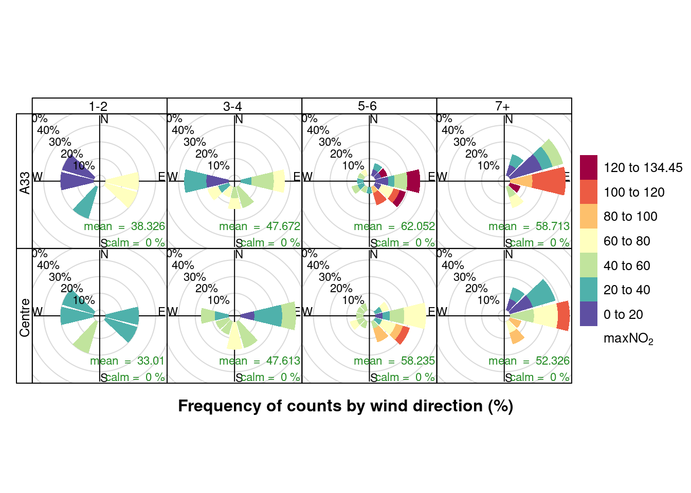
Figure 13.14: Pollution rose for max NO2 for April & May 2020 by number of cruise + cargo ships (AURN sites)
13.2.2 PM10
Figures 13.15 and 13.16 show the distribution of mean and max daily PM10 by maximum cruise ship counts for the day. There is no clear relationship.
ggplot2::ggplot(plotPM10DT, aes(x = maxCruiseCoded, y = meanPM10, group = maxCruiseCoded, color = site)) + geom_boxplot() +
    labs(x = "Max number of cruise ships", y = "Mean daily PM10", caption = paste0(myCap, "\nReference line: WHO 24 hour mean threshold")) +
    facet_grid(. ~ site) + geom_hline(yintercept = myParams$dailyPm10Threshold_WHO)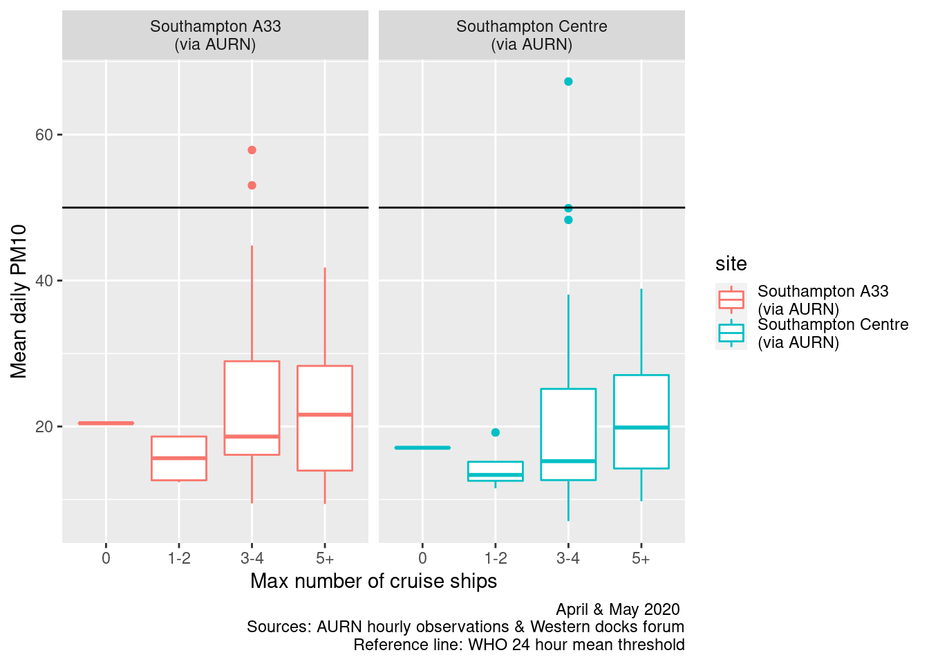
Figure 13.15: Box plots of daily mean PM10 by maximum cruise ship counts
ggplot2::ggplot(plotPM10DT, aes(x = maxCruiseCoded, y = maxPM10, group = maxCruiseCoded, color = site)) + geom_boxplot() +
    labs(x = "Max number of cruise ships", y = "Max daily PM10", caption = myCap) + facet_grid(. ~ site)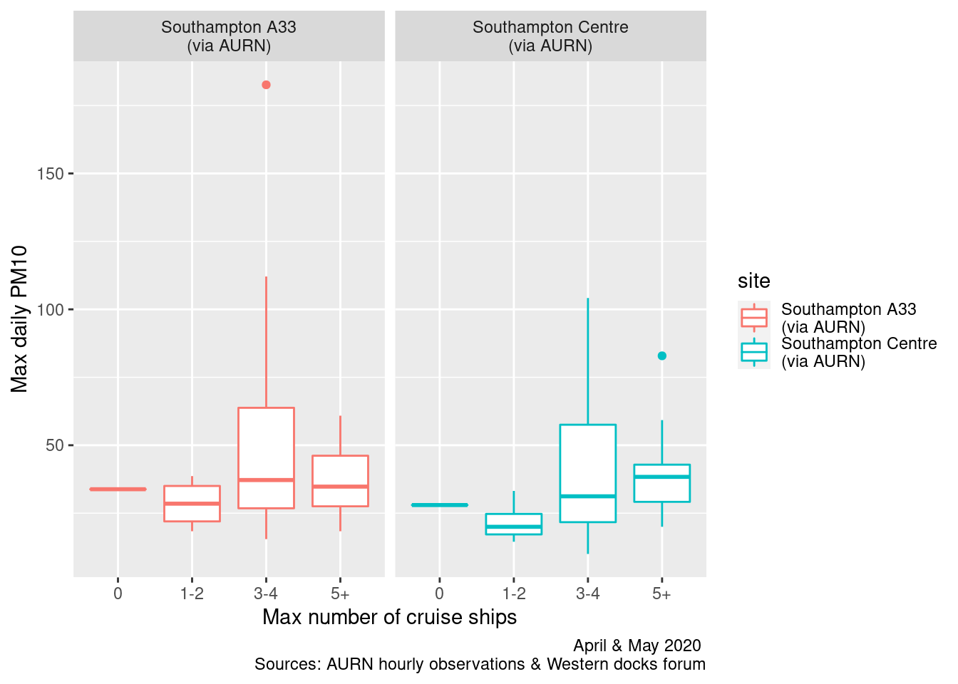
Figure 13.16: Box plots of daily max PM10 by maximum cruise ship counts
Figures 13.17 and 13.18 repeat this for all ships. In this case there appears to be a stronger relationship.
myCap <- "April & May 2020 (Sources: AURN & Western docks forum)"

ggplot2::ggplot(plotPM10DT, aes(x = allShipsCoded, y = meanPM10, group = allShipsCoded, color = site)) + geom_boxplot() +
    labs(x = "Max number of ships", y = "Mean daily PM10", caption = paste0(myCap, "\nReference line: WHO 24 hour mean threshold")) +
    facet_grid(. ~ site) + geom_hline(yintercept = myParams$dailyPm10Threshold_WHO)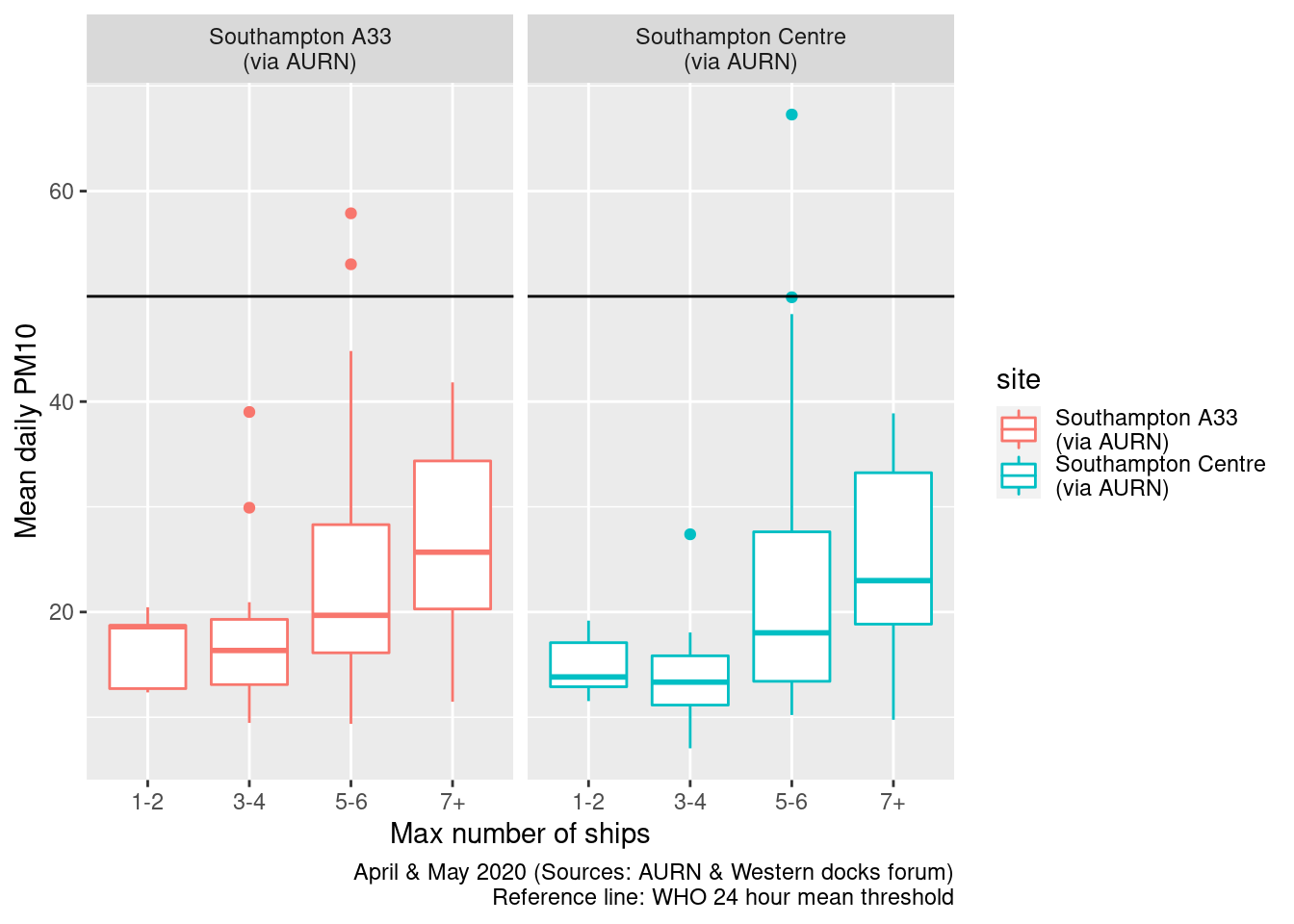
Figure 13.17: Box plots of daily mean PM10 by cargo + cruise ship counts
ggplot2::ggplot(plotPM10DT, aes(x = allShipsCoded, y = maxPM10, group = allShipsCoded, color = site)) + geom_boxplot() +
    labs(x = "Max number of ships", y = "Max daily PM10 ", caption = myCap) + facet_grid(. ~ site)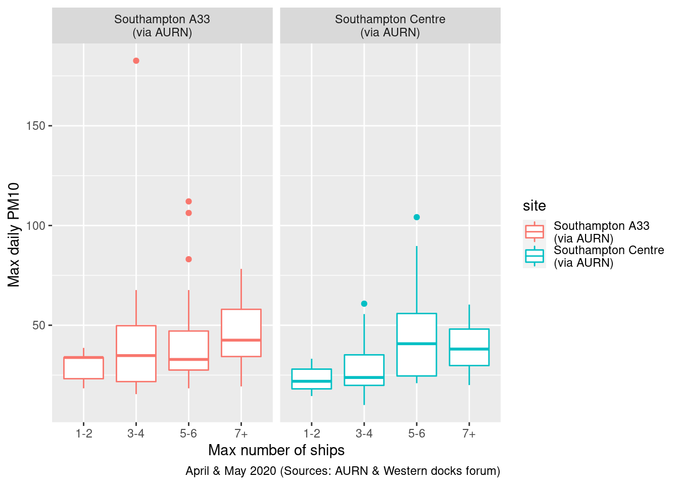
Figure 13.18: Box plots of daily max PM10 by cargo + cruise ship counts
Figures 13.19 and 13.20 show pollution roses for daily mean and daily max PM10 by the maximum number of cruise ships alongside per day.
It appears that when the wind is from the South East/East and more cruise ships are alongside then higher levels of PM10 are more frequent. But this is also the case when the wind is from the West in the 3-4 ships category.
plotPM10DT[, `:=`(wd, meanWd)]
plotPM10DT[, `:=`(ws, meanWs)]
plotPM10DT[site %like% "A33", `:=`(shortSite, "A33")]
plotPM10DT[site %like% "Centre", `:=`(shortSite, "Centre")]

openair::pollutionRose(plotPM10DT[max_cruise != 0], pollutant = "meanPM10", type = c("maxCruiseCoded", "shortSite"))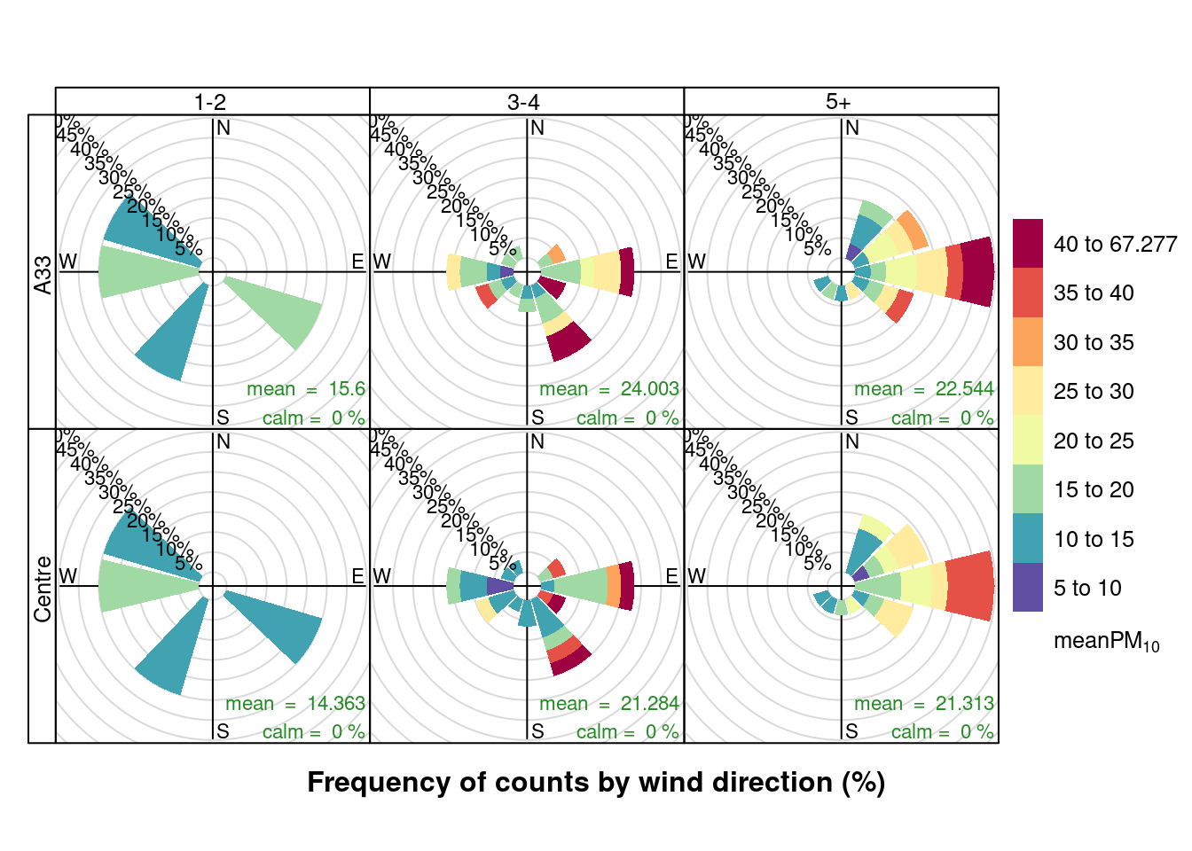
Figure 13.19: Pollution roses for mean PM10 for April & May 2020 by max number of cruise ships (AURN sites, single day with 0 cruise ships excluded)
openair::pollutionRose(plotPM10DT[max_cruise != 0], pollutant = "maxPM10", type = c("maxCruiseCoded", "shortSite"))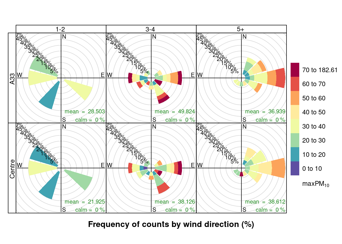
Figure 13.20: Pollution roses for max PM10 for April & May 2020 by max number of cruise ships (AURN sites, single day with 0 cruise ships excluded)
Finally, Figures 13.21 and Figures 13.22 show a pollution rose for daily mean and daily max PM10 by the number of all ships alongside per day. These plots appear to show a similar effect. As before it is not possible to discount the potential confounding effects of overall environmental conditions which the South East and Easterly wind directions can produce.
openair::pollutionRose(plotPM10DT, pollutant = "meanPM10", type = c("allShipsCoded", "shortSite"))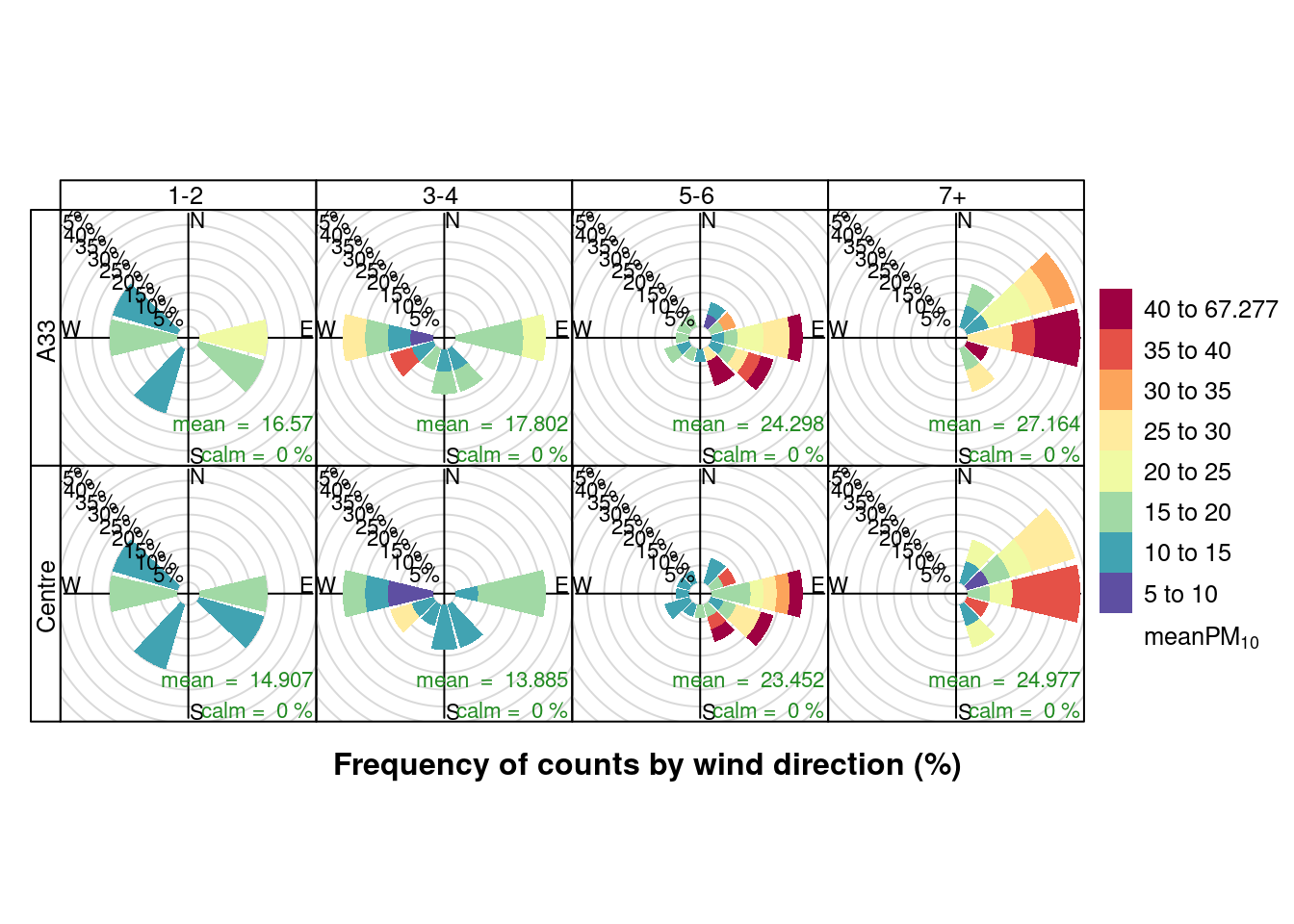
Figure 13.21: Pollution roses for mean PM10 for April & May 2020 by number of cruise + cargo ships (AURN sites)
openair::pollutionRose(plotPM10DT, pollutant = "maxPM10", type = c("allShipsCoded", "shortSite"))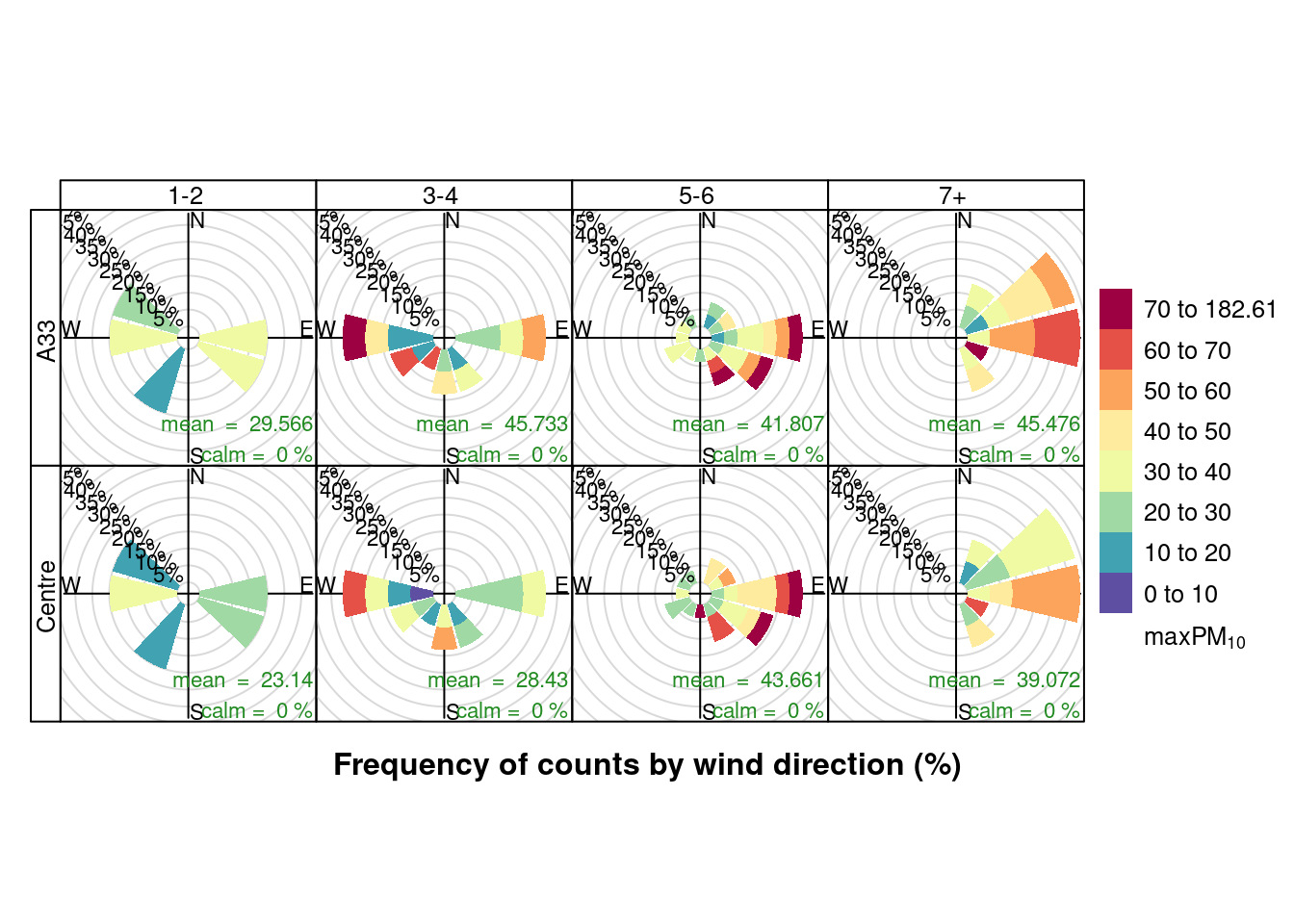
Figure 13.22: Pollution roses for max PM10 for April & May 2020 by number of cruise + cargo ships (AURN sites)
13.2.3 Focus on South to East winds
Given the above pollution rose analysis it is worth repeating the max NO2 and max PM10 box plots but splitting the data by wind quadrant. Note that this still does not remove the potential confounding effect of continental air...
To do this we code the wind direction as:
- "Q1: N -> ENE" wind from 0 - 70 degrees
- "Q2: ENE -> S" 70 - 180
- "Q3-4: S -> N" 180 - 360
Figure 13.23 shows mean NO2 split by wind quadrant and site while 13.24 shows mean PM10. Unfortunately the number of observations are so small that we really cannot see any pattern.
setWindQuad <- function(dt) {
    # assumes wd = degrees openair default is 30 degrees
    dt[, `:=`(windDir, ifelse(wd >= 0 & wd < 70, "Q1: N -> ENE", NA))]
    dt[, `:=`(windDir, ifelse(wd >= 70 & wd < 180, "Q2: ENE -> S", windDir))]
    dt[, `:=`(windDir, ifelse(wd >= 180 & wd < 360, "Q3-4: S -> N", windDir))]
    return(dt)
}
plotNO2DT <- setWindQuad(plotNO2DT)

ggplot2::ggplot(plotNO2DT, aes(x = allShipsCoded, y = meanNO2, group = maxCruiseCoded, color = site)) + geom_boxplot() +
    labs(x = "Max number of ships", y = "Mean daily NO2", caption = myCap) + facet_grid(windDir ~ site)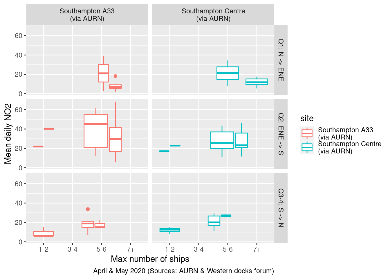
Figure 13.23: Mean daily NO2 by wind quadrant and total ships
plotPM10DT <- setWindQuad(plotPM10DT)

ggplot2::ggplot(plotPM10DT, aes(x = allShipsCoded, y = meanPM10, group = maxCruiseCoded, color = site)) + geom_boxplot() +
    labs(x = "Max number of ships", y = "Mean daily PM10", caption = myCap) + facet_grid(windDir ~ site)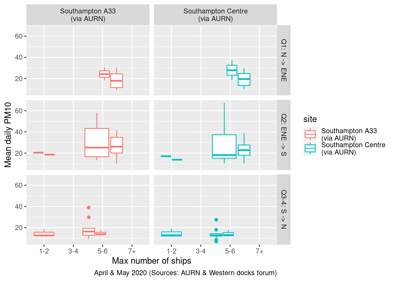
Figure 13.24: Mean daily PM10 by wind quadrant and total ships
13.2.4 Models
It is not clear that linear modelling is an appropriate method to use since the observations are not independent - the value at time t is closely related to the value at time t + 1.
# Need to convert to wide so we can subtract centre (backround)
table(fixedDT$site)
##
## Southampton - Onslow Road\n(near RSH) Southampton - Victoria Road\n(Woolston)
## 82232 60078
## Southampton A33\n(via AURN) Southampton Centre\n(via AURN)
## 220010 343216fixedDT[, shortSite := ifelse(site %like% "A33", "A33", "Centre")]
a33DT <- fixedDT[site %like% "A33" & year > 2019, .(dateTimeUTC, obsDate, shortSite, pollutant, value)]
centreDT <- fixedDT[site %like% "Centre" & year > 2019, .(dateTimeUTC, obsDate, shortSite, pollutant, value)]
a33DTw <- dcast(a33DT, dateTimeUTC + shortSite ~ pollutant + shortSite,
value.var = "value")
centreDTw <- dcast(centreDT, dateTimeUTC + shortSite ~ pollutant + shortSite,
value.var = "value")
a33DTw[,shortSite := NULL] # don't need
setkey(a33DTw, dateTimeUTC)
centreDTw[,shortSite := NULL]
setkey(centreDTw, dateTimeUTC)
wideFixedDT <- a33DTw[centreDTw]
# differencing - treat Centre as 'background'
wideFixedDT[, NO2_A33diff := no2_A33 - no2_Centre]
wideFixedDT[, obsDate := as.Date(dateTimeUTC)]
wideDailyDT <- wideFixedDT[, .(no2_A33 = mean(no2_A33),
pm10_A33 = mean(pm10_A33),
no2_Centre = mean(no2_Centre),
pm10_Centre = mean(pm10_Centre),
wd = mean(wd_A33), # these will be the same
ws = mean(ws_A33)
), keyby = .(obsDate)
]
wideDailyDT[,NO2_A33diff := no2_A33 - no2_Centre]
plotDT <- wideDailyDT[shipsDailyDT]In any case the table below shows the results of estimating a linear regression model of:
- NO2 (A33 site) = total ships * wind quadrant
This should show:
- the overall effects of total ships and wind quadrants
- what effect of the interaction between total ships and wind quadrant has
The results are more or less what we would expect given the small number of observations:
- the more ships there are, the lower the NO2 at the A33 site but this is not statistically significant (95% confidence intervals include 0);
- compared to the N -> ENE (contrast category omitted from the results), the ENE -> S wind quadrant is associated with nearly 8 times lower NO2 at the A33 site but this is not statistically significant;
- if the wind is ENE -> S then every extra ship increased NO2 at the A33 site by 5 units but this is also not statistically significant
plotDT <- setWindQuad(plotDT)
plotDT[, `:=`(date, obsDate)]
# openair::linearRelation(plotDT, x ='no2_Centre', y = 'no2_A33')

lmA33 <- lm(no2_A33 ~ allShips * windDir, plotDT)

stargazer::stargazer(lmA33, type = "text", title = "Model results", ci = TRUE, single.row = TRUE)
##
## Model results
## ========================================================
## Dependent variable:
## ---------------------------
## no2_A33
## --------------------------------------------------------
## allShips -2.175 (-9.407, 5.058)
## windDirQ2: ENE -> S -7.997 (-59.622, 43.627)
## windDirQ3-4: S -> N -13.292 (-64.928, 38.343)
## allShips:windDirQ2: ENE -> S 5.433 (-2.409, 13.275)
## allShips:windDirQ3-4: S -> N 3.687 (-4.677, 12.050)
## Constant 24.643 (-24.070, 73.357)
## --------------------------------------------------------
## Observations 59
## R2 0.402
## Adjusted R2 0.345
## Residual Std. Error 14.074 (df = 53)
## F Statistic 7.117*** (df = 5; 53)
## ========================================================
## Note: *p<0.1; **p<0.05; ***p<0.01# do not run - fails The 'car' package has some nice graphs to help here
car::qqPlot(lmA33) # shows default 95% CI
car::spreadLevelPlot(lmA33)
message("# Do we think the variance of the residuals is constant?")
message("# Did the plot suggest a transformation?")message("# autocorrelation/independence of errors")
car::durbinWatsonTest(lmA33)## lag Autocorrelation D-W Statistic p-value
## 1 0.2917613 1.333547 0.004
## Alternative hypothesis: rho != 0message("# if p < 0.05 then a problem as implies autocorrelation ut beware small samples")However the diagnostic durbinWatsonTest test suggests autocorrelation, as we would expect. This means the standard errors are likely to be underestimates and so the confidence intervals are too narrow.
message("# homoskedasticity: plot (should be no obvious pattern")
plot(plotDT[!is.na(no2_A33)]$no2_A33, lmA33$residuals)
abline(h = mean(lmA33$residuals), col = "red")  # add the mean of the residuals (yay, it's zero!)
message("# homoskedasticity: formal test")
car::ncvTest(lmA33)
## Non-constant Variance Score Test
## Variance formula: ~ fitted.values
## Chisquare = 11.63323, Df = 1, p = 0.00064784message("# if p > 0.05 then there is heteroskedasticity")message("# -> collinearity")
car::vif(lmA33)## GVIF Df GVIF^(1/(2*Df))
## allShips 13.84555 1 3.720961
## windDir 261.64036 2 4.021853
## allShips:windDir 216.21918 2 3.834631# if any values > 10 -> problem
message("# -> tolerance")
1/car::vif(lmA33)## GVIF Df GVIF^(1/(2*Df))
## allShips 0.072225368 1.0 0.2687478
## windDir 0.003822040 0.5 0.2486416
## allShips:windDir 0.004624937 0.5 0.2607813message("if any values < 0.2 -> possible problem")
message("if any values < 0.1 -> definitely a problem")In contrast, if we repeat this model for the city centre then we get more substantive results. In this case:
- the more ships there are, the lower the NO2 at the City Centre site but this is not statistically significant (95% confidence intervals include 0);
- compared to the N -> ENE (contrast category omitted from the results), the ENE -> S wind quadrant is associated with nearly 32 times lower NO2 at the City Centre site but this is not statistically significant;
- if the wind is ENE -> S then every extra ship increased NO2 at the City Centre site by 7 units and this is statistically significant although the 95% confidence intervals are quite wide (0.993-13.323)
- if the wind is in the S -> N quadrant (i.e. the prevailing westerlies) then every extra ship increased NO2 at the City Centre site by 6 units but this is not statistically significant at the 95% level
# openair::linearRelation(plotDT, x ='no2_Centre', y = 'no2_A33')

lmCentre <- lm(no2_Centre ~ allShips * windDir, plotDT)

stargazer::stargazer(lmCentre, type = "text", title = "Model results", ci = TRUE, single.row = TRUE)
##
## Model results
## ========================================================
## Dependent variable:
## ---------------------------
## no2_Centre
## --------------------------------------------------------
## allShips -3.831 (-9.730, 2.068)
## windDirQ2: ENE -> S -31.656 (-72.201, 8.889)
## windDirQ3-4: S -> N -28.521 (-69.271, 12.228)
## allShips:windDirQ2: ENE -> S 7.158** (0.993, 13.323)
## allShips:windDirQ3-4: S -> N 6.005* (-0.481, 12.492)
## Constant 40.707** (1.453, 79.961)
## --------------------------------------------------------
## Observations 52
## R2 0.406
## Adjusted R2 0.342
## Residual Std. Error 8.359 (df = 46)
## F Statistic 6.294*** (df = 5; 46)
## ========================================================
## Note: *p<0.1; **p<0.05; ***p<0.01# The 'car' package has some nice graphs to help here
car::qqPlot(lmCentre) # shows default 95% CI
car::spreadLevelPlot(lmCentre)
message("# Do we think the variance of the residuals is constant?")message("# autocorrelation/independence of errors")
car::durbinWatsonTest(lmCentre)## lag Autocorrelation D-W Statistic p-value
## 1 0.2768075 1.391239 0.006
## Alternative hypothesis: rho != 0message("# if p < 0.05 then a problem as implies autocorrelation but beware large samples")Again however, the durbinWatsonTest test suggests autocorrelation. This means the standard errors are likely to be underestimates and so the confidence intervals are too narrow. As a result effects we think are statistically significant are probably not...
message("# homoskedasticity: plot (should be no obvious pattern")
plot(plotDT[!is.na(no2_Centre)]$no2_Centre, lmCentre$residuals)
abline(h = mean(lmCentre$residuals), col = "red")  # add the mean of the residuals - ideally 0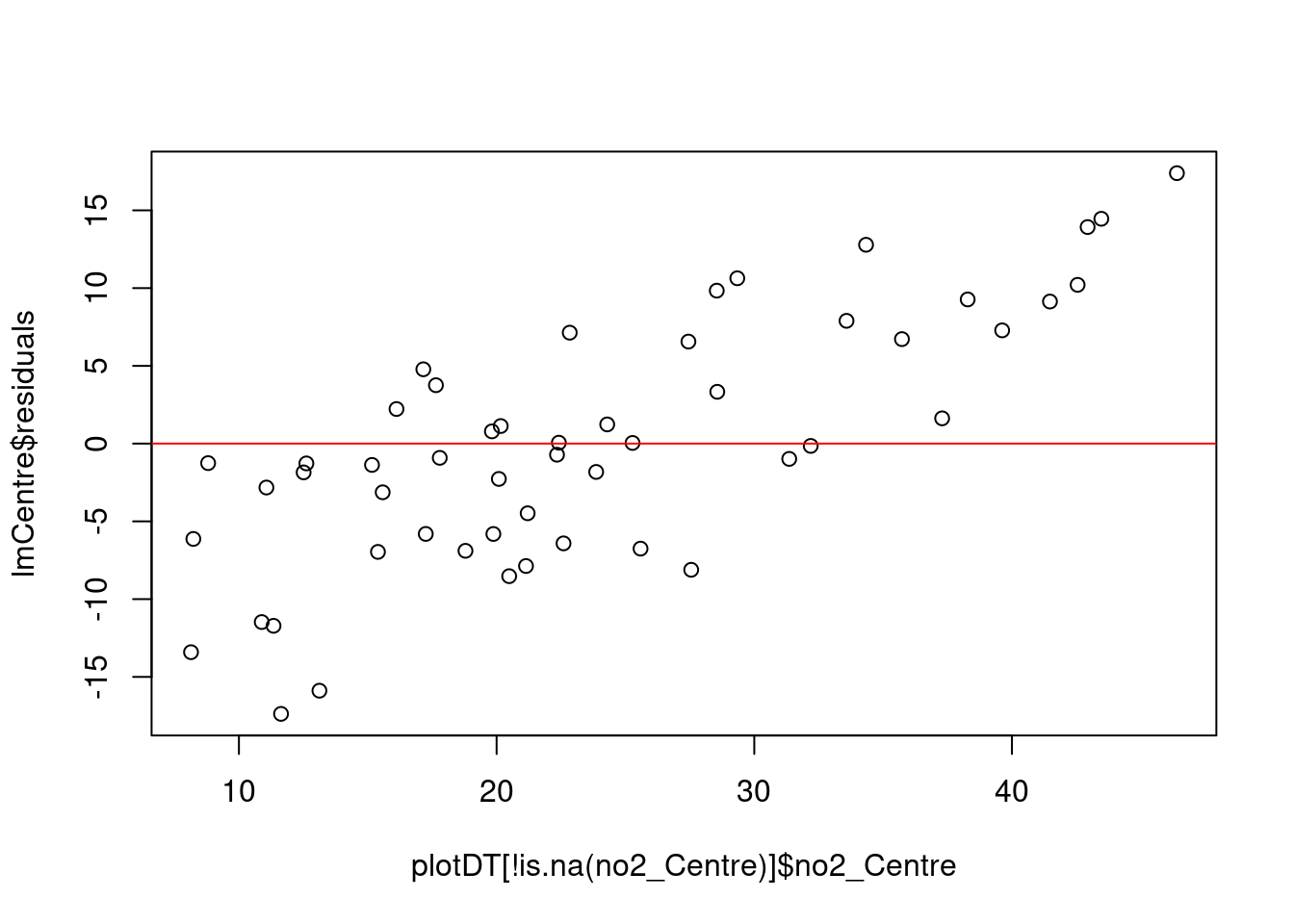
message("# homoskedasticity: formal test")
car::ncvTest(lmCentre)
## Non-constant Variance Score Test
## Variance formula: ~ fitted.values
## Chisquare = 4.111822, Df = 1, p = 0.042584message("# if p > 0.05 then there is heteroskedasticity")message("# -> collinearity")
car::vif(lmCentre)## GVIF Df GVIF^(1/(2*Df))
## allShips 22.46581 1 4.739811
## windDir 288.20845 2 4.120280
## allShips:windDir 280.96844 2 4.094156# if any values > 10 -> problem
message("# -> tolerance")
1/car::vif(lmCentre)## GVIF Df GVIF^(1/(2*Df))
## allShips 0.044512079 1.0 0.2109789
## windDir 0.003469711 0.5 0.2427020
## allShips:windDir 0.003559119 0.5 0.2442506message("# if any values < 0.2 -> possible problem")
message("# if any values < 0.1 -> definitely a problem")13.2.5 Summary
Overall while there appear to be correlations between larger numbers of ships and more frequent higher pollution levels under some wind conditions, the small number of observations and possible confounding meteorological effects mean they could just be spurious.
The linear regression model results are indicative of a relationship but suffer from methodological problems (autocorrelation).
We may need a better measure of ship emissions, we need to take out the meteorological effects and we need an approach to time-series regression which can allow for autocorrelaton.
13.3 Experiments with openair
The openair R package (Carslaw and Ropkins 2012) offers a number of pre-formed plot functions which are of potential use.
cutYear <- 2017 # use as comparison year(s)13.3.1 NO2 trends with Theil-Sen
openair's Theil-Sen function provides de-seasoned trendlines. Figure 13.25 shows the trend for NO2 in Southampton Centre over the last 3 years while Figure 13.26 shows the same plot but for the A33 site. Both sites show a faiirly consistent decline over time.
# looking for wide data
no2dt[, `:=`(date, obsDate)]  # set date to date for this one
no2dt[, `:=`(no2, value)]  # looks for named variable

openair::TheilSen(no2dt[site %like% "Centre"], "no2", ylab = "NO2 (ppb)", deseason = TRUE, type = c("site", "weekday"))
## [1] "Taking bootstrap samples. Please wait."
## [1] "Taking bootstrap samples. Please wait."
## [1] "Taking bootstrap samples. Please wait."
## [1] "Taking bootstrap samples. Please wait."
## [1] "Taking bootstrap samples. Please wait."
## [1] "Taking bootstrap samples. Please wait."
## [1] "Taking bootstrap samples. Please wait."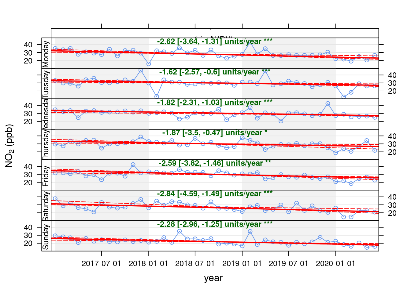
Figure 13.25: Theil-Sen plot for NO2 at Southampton Centre, data points are months
openair::TheilSen(no2dt[site %like% "A33"], "no2", ylab = "NO2 (ppb)", deseason = TRUE, type = c("site", "weekday"))## [1] "Taking bootstrap samples. Please wait."
## [1] "Taking bootstrap samples. Please wait."
## [1] "Taking bootstrap samples. Please wait."
## [1] "Taking bootstrap samples. Please wait."
## [1] "Taking bootstrap samples. Please wait."
## [1] "Taking bootstrap samples. Please wait."
## [1] "Taking bootstrap samples. Please wait."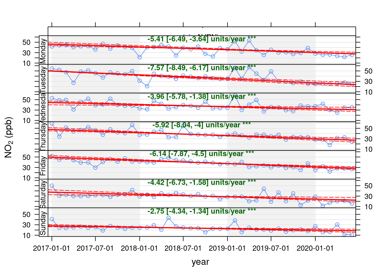
Figure 13.26: Theil-Sen plot by weekday for NO2 at Southampton A33 site, data points are months
13.3.2 24 hour NO2 patterns with timeVariation
openair's timeVariation function provides plots by time of day and weekday. Figure 13.27 shows the pattern for NO2 in Southampton Centre over the Figure 13.28 shows the same plot but for the A33 site. In each case we compare the period before lockdown (from the start of 2017) with the period since lockdown (from 2020-03-24).
These quite clearly show the difference in pollution for pre and during lockdown for specific times of day and days of the week. We can quite clearly see that NO2 has decreased at exactly the times we would expect given the reduction in transport use. This is especially apparent on Mondays and Tuesdays but less obvious on Wednesday to Friday (bottom right plot) with the weekly profile of NO2 emissions looking substantially different.
no2dt[, `:=`(date, dateTimeUTC)]  # set date to dateTime for this one

no2dt[, `:=`(lockdown, ifelse(dateTimeUTC <= myParams$lockDownStartDate, "Pre lockdown", "Lockdown"))]

openair::timeVariation(no2dt[site %like% "Centre" & year >= cutYear], "no2", ylab = "NO2 (ppb)", group = "lockdown")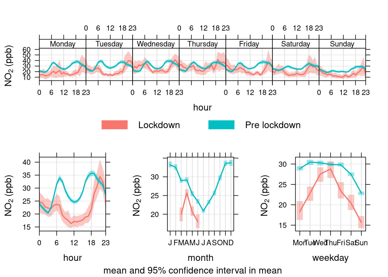
Figure 13.27: timeVariation plots for NO2 at Southampton Centre comparing lockdown 2020 with pre-lockdown starting in 2017
openair::timeVariation(no2dt[site %like% "A33" & year > cutYear], "no2", ylab = "NO2 (ppb)", group = "lockdown")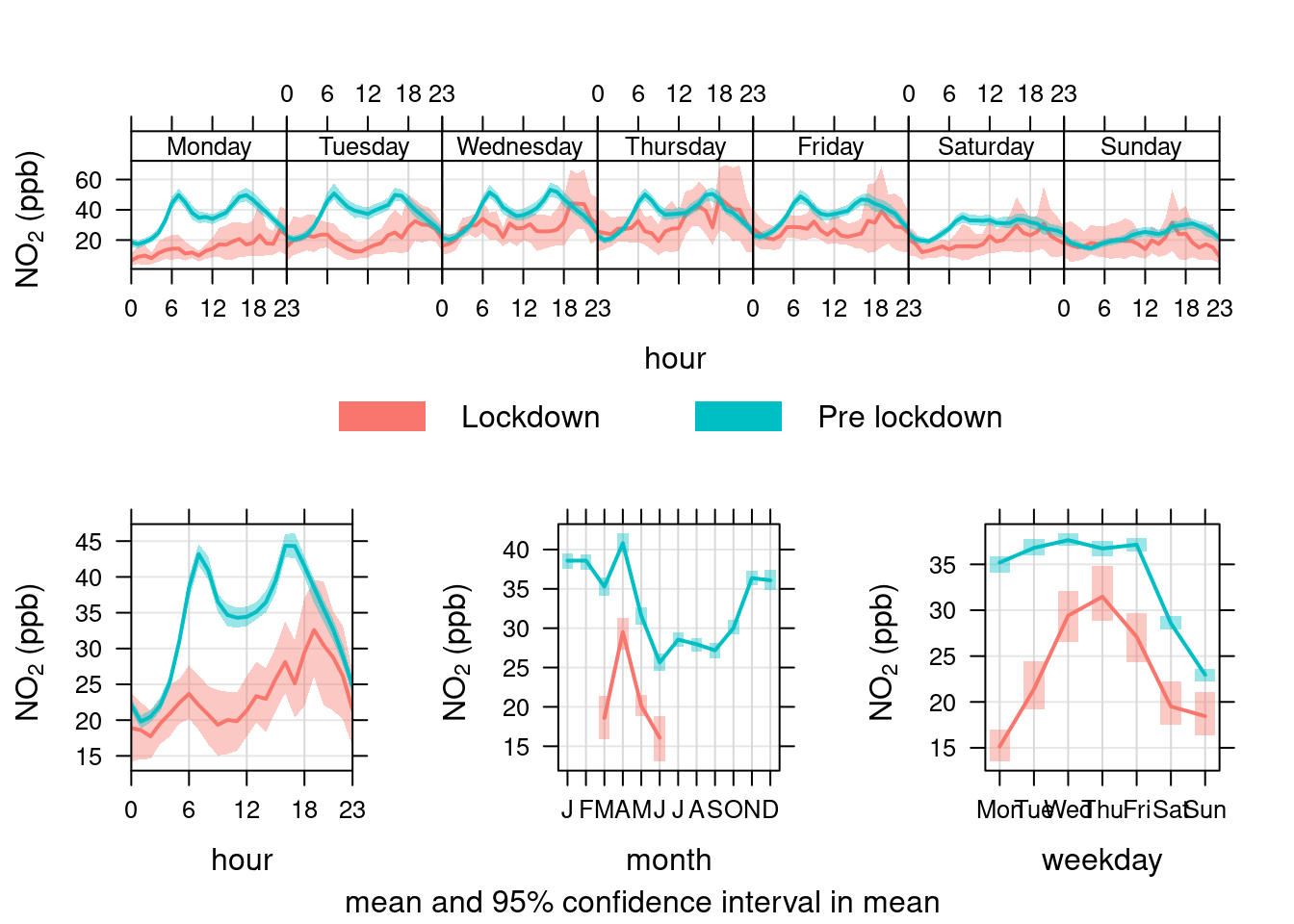
Figure 13.28: timeVariation plots for NO2 at Southampton A33 site comparing lockdown 2020 with pre-lockdown starting in 2017
13.3.3 PM10 trends with Theil-Sen
openair's Theil-Sen function provides de-seasoned trendlines. Figure 13.29 shows the trend for PM10 in Southampton Centre over the last 3 years while Figure 13.30 shows the same plot but for the A33 site.
pm10dt[, `:=`(date, obsDate)]
pm10dt[, `:=`(pm10, value)]

openair::TheilSen(pm10dt[site %like% "Centre"], "pm10", ylab = "PM10", deseason = TRUE, type = c("site", "weekday"))
## [1] "Taking bootstrap samples. Please wait."
## [1] "Taking bootstrap samples. Please wait."
## [1] "Taking bootstrap samples. Please wait."
## [1] "Taking bootstrap samples. Please wait."
## [1] "Taking bootstrap samples. Please wait."
## [1] "Taking bootstrap samples. Please wait."
## [1] "Taking bootstrap samples. Please wait."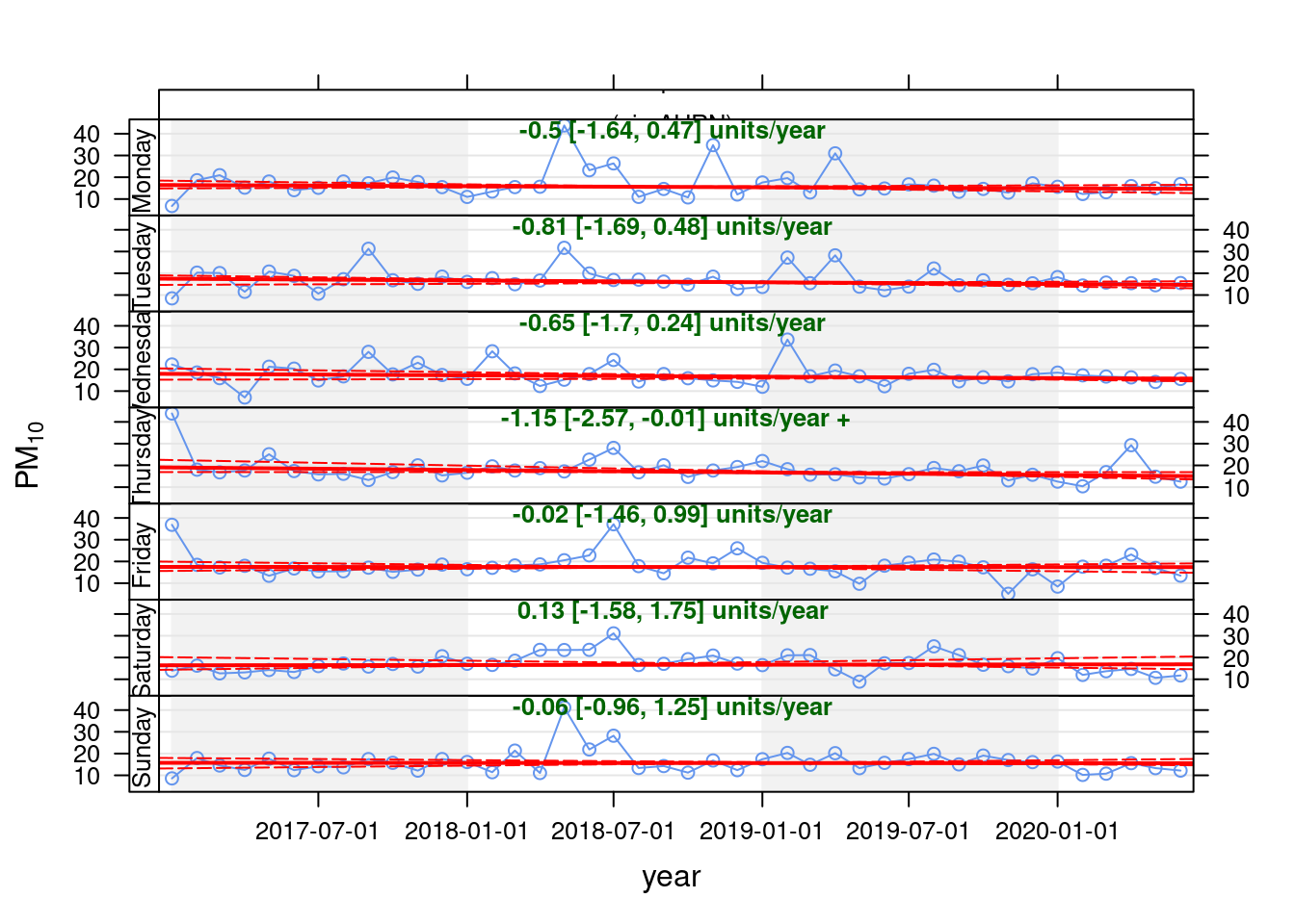
Figure 13.29: Theil-Sen plot for PM10 at Southampton Centre, data points are months
openair::TheilSen(pm10dt[site %like% "A33"], "pm10", ylab = "NO2 (ppb)", deseason = TRUE, type = c("site", "weekday"))## [1] "Taking bootstrap samples. Please wait."
## [1] "Taking bootstrap samples. Please wait."
## [1] "Taking bootstrap samples. Please wait."
## [1] "Taking bootstrap samples. Please wait."
## [1] "Taking bootstrap samples. Please wait."
## [1] "Taking bootstrap samples. Please wait."
## [1] "Taking bootstrap samples. Please wait."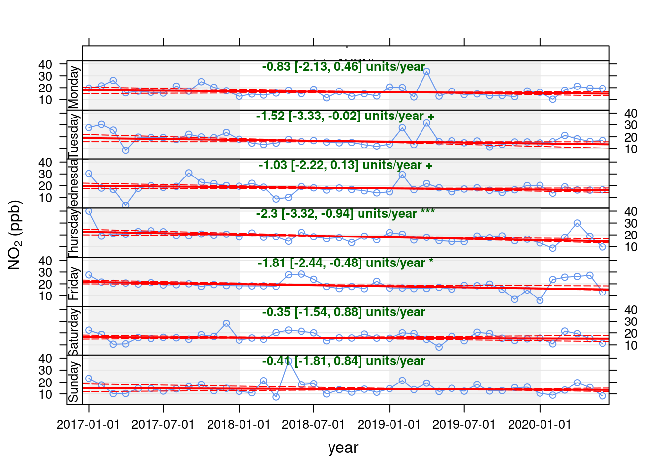
Figure 13.30: Theil-Sen plot by weekday for PM10 at Southampton A33 site, data points are months
13.3.4 24 hour PM10 patterns with timeVariation
Figure 13.31 shows the pattern for PM10 in Southampton Centre over the Figure 13.32 shows the same plot but for the A33 site. In each case we compare the period before lockdown (from the start of 2017) with the period since lockdown (from 2020-03-24).
Unlike NO2, PM10 has not declined presumably because it is not affected by reduced transport use etc.
pm10dt[, `:=`(date, dateTimeUTC)]
pm10dt[, `:=`(lockdown, ifelse(dateTimeUTC <= myParams$lockDownStartDate, "Pre lockdown", "Lockdown"))]

openair::timeVariation(pm10dt[site %like% "Centre" & year >= cutYear], "pm10", ylab = "PM10", group = "lockdown")  # use group to give before/after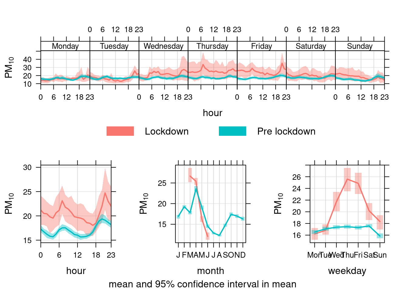
Figure 13.31: timeVariation plots for PM10 at Southampton Centre comparing lockdown 2020 with pre-lockdown starting in 2017
openair::timeVariation(pm10dt[site %like% "A33" & year > cutYear], "pm10", ylab = "PM10", group = "lockdown")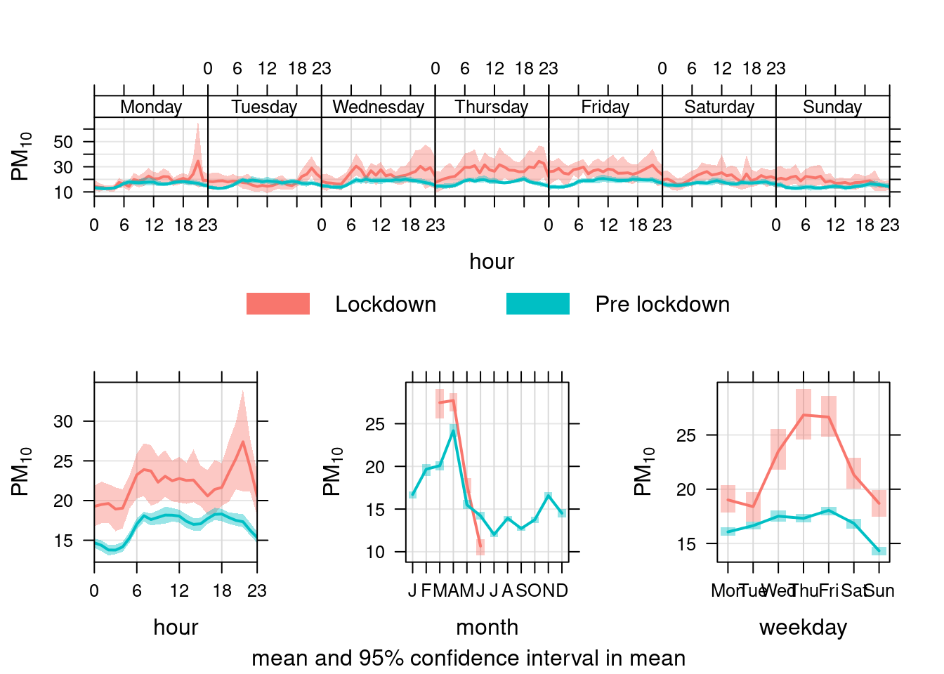
Figure 13.32: timeVariation plots for PM10 at Southampton A33 site comparing lockdown 2020 with pre-lockdown starting in 2017
13.3.5 PM2.5 trends with Theil-Sen
openair's Theil-Sen function provides de-seasoned trendlines. Figure 13.33 shows the trend for PM2.5 in Southampton Centre over the last 3 years.
pm25dt[, `:=`(date, obsDate)]
pm25dt[, `:=`(pm25, value)]

openair::TheilSen(pm25dt[site %like% "Centre"], "pm25", ylab = "PM2.5", deseason = TRUE, type = c("site", "weekday"))
## [1] "Taking bootstrap samples. Please wait."
## [1] "Taking bootstrap samples. Please wait."
## [1] "Taking bootstrap samples. Please wait."
## [1] "Taking bootstrap samples. Please wait."
## [1] "Taking bootstrap samples. Please wait."
## [1] "Taking bootstrap samples. Please wait."
## [1] "Taking bootstrap samples. Please wait."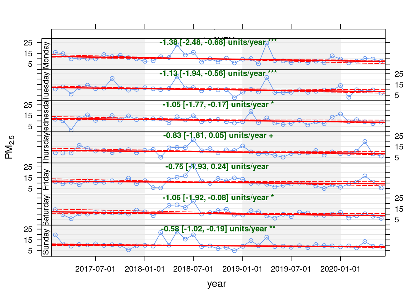
Figure 13.33: Theil-Sen plot for PM2.5 at Southampton Centre, data points are months
13.3.6 24 hour PM25 patterns with timeVariation
openair's timeVariation function provides plots by time of day and weekday. Figure 13.34 shows the pattern for PM25 in Southampton Centre. We compare the period before lockdown (from the start of 2019) with the period since lockdown (from 2020-03-24).
As with PM10, PM2.5 has not declined presumably because it is not affected by reduced transport use etc.
pm25dt[, `:=`(date, dateTimeUTC)]
pm25dt[, `:=`(lockdown, ifelse(dateTimeUTC <= myParams$lockDownStartDate, "Pre lockdown", "Lockdown"))]

openair::timeVariation(pm25dt[site %like% "Centre" & year >= cutYear], "pm25", ylab = "PM2.5", group = "lockdown")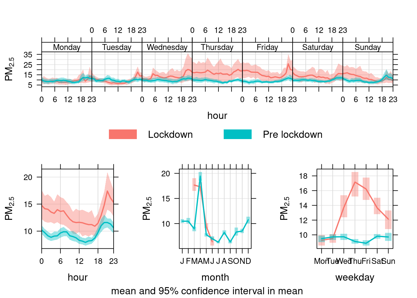
Figure 13.34: timeVariation plots for PM2.5 at Southampton Centre comparing lockdown 2020 with pre-lockdown starting in 2019
14 Runtime
Report generated using knitr in RStudio with R version 3.6.0 (2019-04-26) running on x86_64-redhat-linux-gnu (#1 SMP Thu May 7 19:30:37 EDT 2020).
t <- proc.time() - myParams$startTime

elapsed <- t[[3]]
Analysis completed in 151.112 seconds ( 2.52 minutes).
R packages used in this report:
- data.table - (Dowle et al. 2015)
- ggplot2 - (Wickham 2009)
- here - (Müller 2017)
- kableExtra - (Zhu 2019)
- lubridate - (Grolemund and Wickham 2011)
- openAir - (Carslaw and Ropkins 2012)
- skimr - (Arino de la Rubia et al. 2017)
- viridis - (Garnier 2018)
References
Arino de la Rubia, Eduardo, Hao Zhu, Shannon Ellis, Elin Waring, and Michael Quinn. 2017. Skimr: Skimr. https://github.com/ropenscilabs/skimr.
Carslaw, David C., and Karl Ropkins. 2012. “Openair — an R Package for Air Quality Data Analysis.” Environmental Modelling & Software 27–28 (0): 52–61. doi:10.1016/j.envsoft.2011.09.008.
Dowle, M, A Srinivasan, T Short, S Lianoglou with contributions from R Saporta, and E Antonyan. 2015. Data.table: Extension of Data.frame. https://CRAN.R-project.org/package=data.table.
Garnier, Simon. 2018. Viridis: Default Color Maps from ’Matplotlib’. https://CRAN.R-project.org/package=viridis.
Grolemund, Garrett, and Hadley Wickham. 2011. “Dates and Times Made Easy with lubridate.” Journal of Statistical Software 40 (3): 1–25. http://www.jstatsoft.org/v40/i03/.
Müller, Kirill. 2017. Here: A Simpler Way to Find Your Files. https://CRAN.R-project.org/package=here.
Wickham, Hadley. 2009. Ggplot2: Elegant Graphics for Data Analysis. Springer-Verlag New York. http://ggplot2.org.
Zhu, Hao. 2019. KableExtra: Construct Complex Table with ’Kable’ and Pipe Syntax. https://CRAN.R-project.org/package=kableExtra.
12.2 Comments and feedback
If you wish to comment please open an issue: